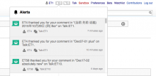
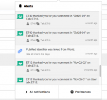
These two are uncomfortably close together:
Description
Description
Details
Details
| Subject | Repo | Branch | Lines +/- | |
|---|---|---|---|---|
| Add space between notification item buttons | mediawiki/extensions/Echo | master | +13 -7 |
Related Objects
Related Objects
Event Timeline
Comment Actions
Change 260769 had a related patch set uploaded (by Mooeypoo):
Add space between notification item buttons
Comment Actions
Checked in betalabs - there is more space.
And with a longer user name:
Comparing as it was before:


