textInputWidgets currently have no visual indication on :hover although it was layed out in M101.
Also the neutral button border color should be #ccc.
Real-world example: https://en.wikipedia.org/wiki/Special:Redirect/file
| Volker_E | |
| Jan 17 2016, 10:35 AM |
| F3543555: pasted_file | |
| Mar 6 2016, 2:28 PM |
| F3543559: pasted_file | |
| Mar 6 2016, 2:28 PM |
| F3372389: T123860_2016-02-18.mov | |
| Feb 18 2016, 11:37 PM |
| F3303494: T123860_MediawikiUI_copy_160120.sketch 2016-02-02.png | |
| Feb 2 2016, 6:12 PM |
textInputWidgets currently have no visual indication on :hover although it was layed out in M101.
Also the neutral button border color should be #ccc.
Real-world example: https://en.wikipedia.org/wiki/Special:Redirect/file
| Subject | Repo | Branch | Lines +/- | |
|---|---|---|---|---|
| MediaWiki theme: Apply `border-color` on `:hover` to textInputWidgets | oojs/ui | master | +10 -0 |
Change 264581 had a related patch set uploaded (by VolkerE):
MediaWiki theme: Apply :hover color to textInputWidgets
See my comments on M33, I am not completely convinced that the TextInputWidget needs a hover state. But if other people are convinced my view isn't a blocker.
Agreed. Not sure we have a need for this added complexity. Also there are a bunch if text input-like widgets that would behave inconsistently.
Providing :hover state functionality does help users orientate in their task and in the interface.
As some users are not as proficient with mouse usage or have visual impairments, it helps them to more easily identify where they are moving their mouse.
The one that is most similar from the demos is CapsuleMultiSelectWidget.
Dropdowns in contrast should behave differently.
A little highlight on hover can help as an invitation for the user to interact (anticipate the interactivity of the element and setting the user expectations). It's important not to make that highlight too distracting (the Google search input box is a good example); and we also need to think how that would be applied to other UI components.
I wouldn't be opposed to it if the state was as subtle as the Google example, but using the progressive color might be to distracting as Pau points out.
Seeing the demo I am not completely opposed to it. For me, I think the opinion stems from habit. Text boxes already change the mouse cursor and that is enough for me to tell that I am hovering on it. One could argue that the same is the true for links and buttons and that they don't need a hover state either but that wont be right.
Also, for links hover is an action that leads to something, like a tooltip or a hovercard, the same is not true for text boxes.
I had no time to look into this in detail yet, but some quick comments based on the video:
I've also discussed on another bug the possibility of removing the 2px inset border for active/focus.
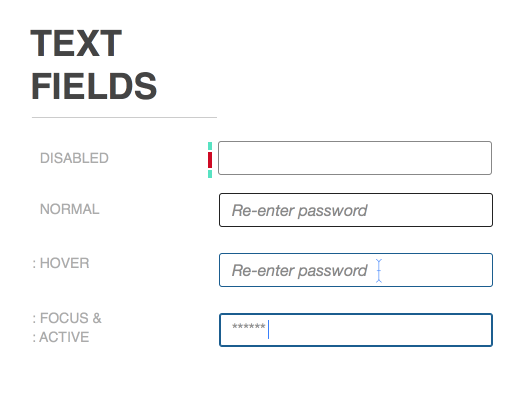
We are using #111 for the normal state. Between #111 and #000; #111 and the lightest before it fails to comply with WCAG 2.0 guidelines, there is little room to move in terms of changing the darkness or lightness of the 1px stroke color on hover. We wouldn't opt for lightening the stroke color since it makes sense to put the field in focus (darkening stroke color) on hover rather than out of focus (lightening stroke color). I think the change from #111 to blue is also slight, but it is a change from dark gray. We're open for suggestions.
- We need to be careful with the overlap of states. If an input field has a red border because of a validation error. Which color will be used when hovering it? what happens when it is active and also hovered? I want to avoid situations where I'm expecting to get a warning but I cannot see it because the cursor happens to be there making the warning state invisible.
I'm thinking the same. If there is an error on a text field, it shouldn't be blue on hover, it should be the warning color. However, warning color shouldn't be the only indication of an error. It should be used in addition to something else like an icon. This is just so when the user's keyboard focus moves away from the field with error, he will still be able to identify the fields with error. Not to mention using color in addition to something else is a good practice for aiding color blind users.
Some ideas in case they are useful:
I think we should get rid of making the borders thicker using inset-outline. They come with a number of unfixable bugs:
Scroll bars:
IE11:
Citing from latest patch set 8:
This has been sitting around for too long. Applying #aaa for now, same as we already do for DropdownWidget for example. And hopefully also unified on CapsuleMultiselectWidget https://gerrit.wikimedia.org/r/#/c/300348/ – will provide another patch set using the Less variable at those as well after this one gets merged.
This isn't solving the task completely as intended, but we will at least offer the functionality in a unified approach across widgets and can have a longer color/property discussion later.
Change 264581 merged by jenkins-bot:
MediaWiki theme: Apply border-color on :hover to textInputWidgets