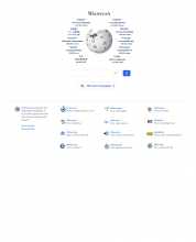
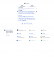
As a visitor to the wikipedia.org portal page, I want to see a clean interface that allows me to search for a preferred language effectively and efficiently.
As a Product Manager, I want to display a listing of all languages available, sorted by most articles to least by language, in a easy to use and read dropdown. I also want to ensure that a new display treatment of the available languages does not negatively affect the click through rate but will hopefully decrease the amount of bounces from the portal page.
The new format will show a scrolling modal that will be above the fold on the portal page and will list all available languages. When a visitor clicks on the new language dropdown, they will see the familiar look and feel of the existing languages by article count treatment, with the top most languages by article listed first.
The new layout of the page will show a new dropdown that will be centered underneath the search box and:
- an icon denoting languages will display to the left of the visible text of the dropdown
- text will display in the visible area of the dropdown and the copy will read: "200 more languages" (or similar icon denoting that more languages are available in the dropdown)
- the dropdown will include a down arrow that denotes that it is a dropdown in which the users can click on
- when the user clicks on the dropdown, a modal will appear that will contain all available languages
- the languages will be ordered by those languages with the most articles listed first to those languages that have the least amount of articles
- the languages will be segregated into the typical sections, as it currently exists - 1,000,000+ articles, 100,000+ articles, 10,000+ articles and so on
- the modal will display the book icon to the left hand side of the article amount number
Note: We will use the recently completed code for the re-sorting of the languages, based on the detection of the primary links code
Note: This test is not meant to decrease the click-through rate of the language by article count links, but to put the sometimes confusing information into a easier to understand interface. This test is also to see if the bounce rate of the portal page can be decreased with this new display of languages.
See attached images:


