After the recent Phabricator update, where most stuff was shuffled around the screen in different ways, I've observed myself using Maniphest for a few days and I noticed some patterns where I'm forced to scroll or move my eyes a lot to reach certain items which are essential for me and used to be readily available but are no longer.
Sidebar galore
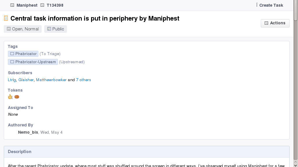
The main issue is the first section of the new sidebar, which is plethoric (many buttons, most of which rarely used) and overspaced. Its width makes all the rest of the page suffer and its height pushes task details outside the screen.

Crucial task information is too far
I noticed that some task "metadata" is in fact so integral to my process of understanding the report that it's even more important than the task summary, or anyway an indispensable aid in parsing the task summary. Such pieces of information should be identified and placed as near to the summary as possible, and by all means around the first lines of the description.
For me personally, what I keep looking for is:
- Tags, or rather component: this really must be near the title, to understand what the summary is talking about.
- Task author: it's impossible for me to interpret most reports if I don't see who wrote them.
I understand that our tags can be extremely numerous and lengthy (which I'd consider a problem in itself). In an ideal world, we'd be able to push the main component (most important "blue project" of the report) right under the title. In a sad world, we move all the tags up and we pay a significant cost every time a secondary tag is added (which would force us to reassess the existence or visibility of many projects and e.g. hide or delete many pink, green or yellow projects).
I also understand the task author name may mean little or nothing to most users, hence is not likely to be worth the space right below the title (<h1>), but perhaps it can still be added within the description area, e.g. in the top right of the description box with a "by Foo" element.
Risks
AntiPatterns I envisage if these two are not fixed:
- reporters are forced to start every description with a line explaining what relationship they have to the project (developer, user, tester etc.), so that the rest of the description can be parsed without scrolling down to the author name;
- reporters are forced to add the task component in brackets to every task summary, where not implicitly named by the summary already.
See Also
- https://secure.phabricator.com/T10926 in upstream