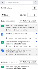
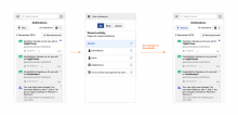
The Special Notifications page doesn't display properly on the mobile web site--in part because of the page's fixed width. A separate ticket, T140687, suppressed the left nav, as a stop-gap that makes the page usable. This page proposes a mobile friendly solution that re-introduces the filtering nav.
Description
Details
| Subject | Repo | Branch | Lines +/- | |
|---|---|---|---|---|
| Make mobile-friendly version of the Notifications page left nav | mediawiki/extensions/MobileFrontend | master | +280 -4 |
Related Objects
- Mentioned In
- T140687: Make Notification page on mobile usable by suppressing the left, filtering nav (for now)
T139708: Special:Notifications should allow for zooming and not create horizontal scrollbars
T137425: Set a max-width for Special:Notifications page - Mentioned Here
- T140687: Make Notification page on mobile usable by suppressing the left, filtering nav (for now)
Event Timeline
The idea is for small screens to hide the sidebar under a menu. I'll create some mockups to illustrate this.
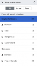
One idea to consider is to provide filters (both status and pages) as a secondary view:
- Users will get the list of notifications for the current wiki by default including both read and unread items. For further filtering, the filter action can be used.
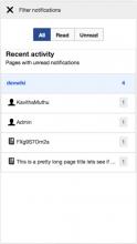
- Filtering allows the user to change both status and page based filters. As soon as an option is selected the user goes back to the list with the filtered results displayed.
I'm splitting this ticket into two: one (T140687) to stop the Notifications page on mobile from being unusable due to display of the left nav; and this one, for making the left, filtering nav actually available on mobile.
Change 323348 had a related patch set uploaded (by Kmuthu):
[WIP]Make mobile-friendly version of the Notifications page left nav
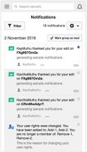
I did not make changes to the notifications header because the header was consistently centered in mobile frontend.
Please let me know if it looks fine.
Thanks @KMuthu. It looks good.
There is one detail that could help to clarify whether a filter has been applied. By default the filter button can use the "Filter" label, but when there is a filter applied different than the default, the label can read as "Filtered" to convey the idea that a filter is already applied. If this is not a trivial change, a different ticket can be created for future improvements.
@Pginer-WMF, I am guessing I will be able to change the label to Filtered, once the filter has been applied.
Also, I was wondering that if we change the label to Filtered, shouldn't it also let the user know whether if it is a read, unread or all filter ? (May be like another label indicating the read status). Please correct me if I am wrong.
Should we also (or instead) apply a visual treatment to the button, like making it look "active" or "depressed" or something? (Whatever those concepts are called in OOUI these days.)
Also, the filter panel allows you to filter by page, but it also allows you to select a different wiki entirely. Does that count as "filtered", even though the set of results you see is completely disjoint from the set of results you'd normally see?
Yes, the "filtered" status represent any view that is not the "all notifications from the current wiki". The idea is that by selecting "read", "unread", picking a different wiki than the current one, or focusing on notifications for a specific page will result in the button to read "filtered". Conversely, when the user selects the "all notifications from the current wiki" status, the button will become "filter" again.
Here the pressed/unpressed metaphor won't work well if we want to let people to adjust the filters as the result of the action (instead of just turn on/off). The proposed approach surfaces the status once the user already discovered the action, so I don't expect an action/status confusion in this context.
We can highlight the active state by using a progressive version of the button when it is active (i.e., has the "filtered" label). I created a quick mockup below:
Also, the filter panel allows you to filter by page, but it also allows you to select a different wiki entirely. Does that count as "filtered", even though the set of results you see is completely disjoint from the set of results you'd normally see?
I think so. Since we don't have an aggregated view for all notifications, I think that "all notifications from the current wiki" seems the most reasonable default. In this case, the user will see the "filtered" cue after changing the defaults, and it acts just as a reminder that those were changed in case she wants to undo those changes or adjust them differently.
Change 323348 merged by jenkins-bot:
[mediawiki/extensions/MobileFrontend@master] Make mobile-friendly version of the Notifications page left nav
