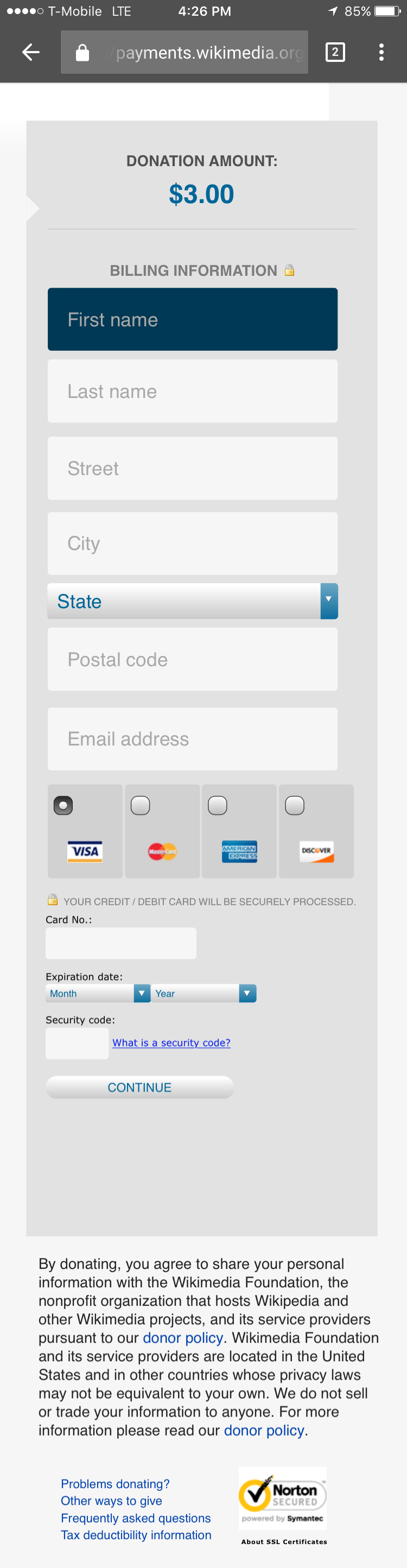
Page MenuHomePhabricator

Mobile web form style fixes
Closed, ResolvedPublic2 Estimated Story Points

Description

User story:

As a mobile user, I would like to have least friction while filling out billing information on donate.wikimedia.

Proposed changes

Changes proposed here are of cosmetic nature without any functionality changes. The sensitivity of this page is of most priority but within the constraints we can improve usability.

  • Form fields should have mobile friendly tap area
  • Affirmation on "donating to wikipedia" by using our brand
  • Single positive and strong call to action
  • cleaner and sharper credit card logos
  • consistency between form fields of our form and 3rd party form
  • Seriousness in treatment of "security message" (removing funny looking lock)
  • Usage of wikimedia styleguide colors form M82

Comparison of current situation and above changes
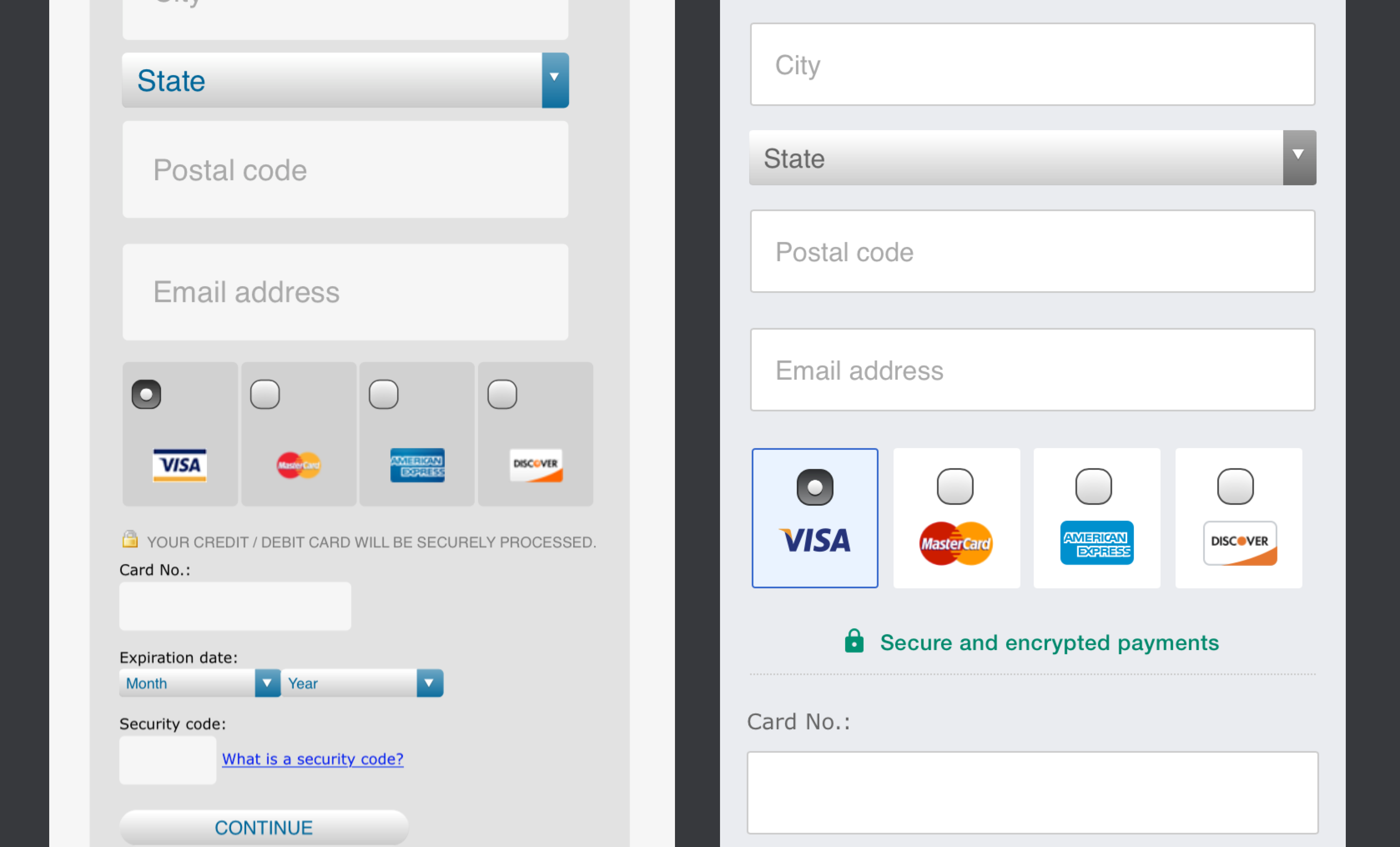
donation-right now.png (2×750 px, 290 KB)

donation-tomorrow.png (3×750 px, 294 KB)

comparison-8.png (2×3 px, 514 KB)

Technical details

  • These are ONLY css changes
  • The css changes automatically apply to any device below 400px width i.e. mobile

Method to test

  • We would like to create a test plan that gives us correct measure of how these css changes alone impact
  1. Bounce rate
  2. Conversion rate
  3. Failure rate
  • The test should be conducted with the Banner A + without new css and Same Banner A with new css
  • All environmental factor should be the same in order to get exact impact

Try it on your phone →

✌️

Event Timeline

Nirzar updated the task description. (Show Details)

@Nirzar thanks so much for this detailed work- it's great! I agree with all of it, although we cannot change anything within the iframe. Was thinking on the card buttons... they do look better, but do we need to keep the 'radio' button at all? Couldn't we just add a bigger version of the card icon, and make them blue to show selection? I think it would be even sleeker :)

@Ppena

although we cannot change anything within the iframe.

Do you mean we can't change any css in the iframe?

Couldn't we just add a bigger version of the card icon, and make them blue to show selection? I think it would be even sleeker

Yeah that seemed like a thing we can do.. and they would look sleeker but in past when we did usability around sub elements on web, the radio buttons are a great cue for an action vs just buttons with card icons on them. It would be definitely sleeker though. I am very concerned on usability for it though. radio buttons don't have any ambiguity.

@Nirzar Correct, AFAK we have very little input on iframe apart from removing fields, but that would be a @Ejegg question.

Gotcha on the buttons, thanks for the intel.

@Ejegg mentioned we can have css for iframe. not sure about the caveat in that. the small touch areas for credit card form are concerning. call to action alone can improve confidence in action. so I see it as an important part of this attempt of solving usability.

@Nirzar and @Ppena, both Ingenico and Adyen let us load our own stylesheet in their frame. Adyen also lets us customize header and footer elements.

At the end of the meeting we resolved to create 3 flows. Here are the notes.

Nirzar's designs that will be used on all variants:

  • Match sizing of text fields? Making the iframe match
  • Card logos updated
  • All color changes except continue button

The 3 variants will be differentiated with:

  • Continue button color and size change
  • The lock logo
  • Brand logo (WMF or Wikipedia)

Change 320941 had a related patch set uploaded (by Ejegg):
WIP Nirzar's mobile css fixes

https://gerrit.wikimedia.org/r/320941

Change 322135 had a related patch set uploaded (by Ejegg):
More unused CSS cleanup

https://gerrit.wikimedia.org/r/322135

Change 322803 had a related patch set uploaded (by Ejegg):
Set viewport meta tag on forms

https://gerrit.wikimedia.org/r/322803

Is there a particular reason to only apply these changes below a certain screen width? I think most of them would make sense on desktop too, and it seems better to be consistent.

@Pcoombe - I agree that it's generally a better look, my only concerns are:

  • some header data appears to be missing on the mobile interface such as logo, jimmyquote
  • the equal length fields look optimized for mobile
  • it's a departure from our historic look and it's almost December

Change 320941 merged by jenkins-bot:
Nirzar's mobile css fixes

https://gerrit.wikimedia.org/r/320941

Change 322135 merged by jenkins-bot:
More unused CSS cleanup

https://gerrit.wikimedia.org/r/322135

Change 322803 merged by jenkins-bot:
Set viewport meta tag on forms

https://gerrit.wikimedia.org/r/322803

Change 322971 had a related patch set uploaded (by Ejegg):
More CSS fixes

https://gerrit.wikimedia.org/r/322971

DStrine set the point value for this task to 2.Nov 23 2016, 11:37 PM