Page MenuHomePhabricator

increase the width of navigation drawer
Closed, ResolvedPublic1 Estimated Story Points

Description

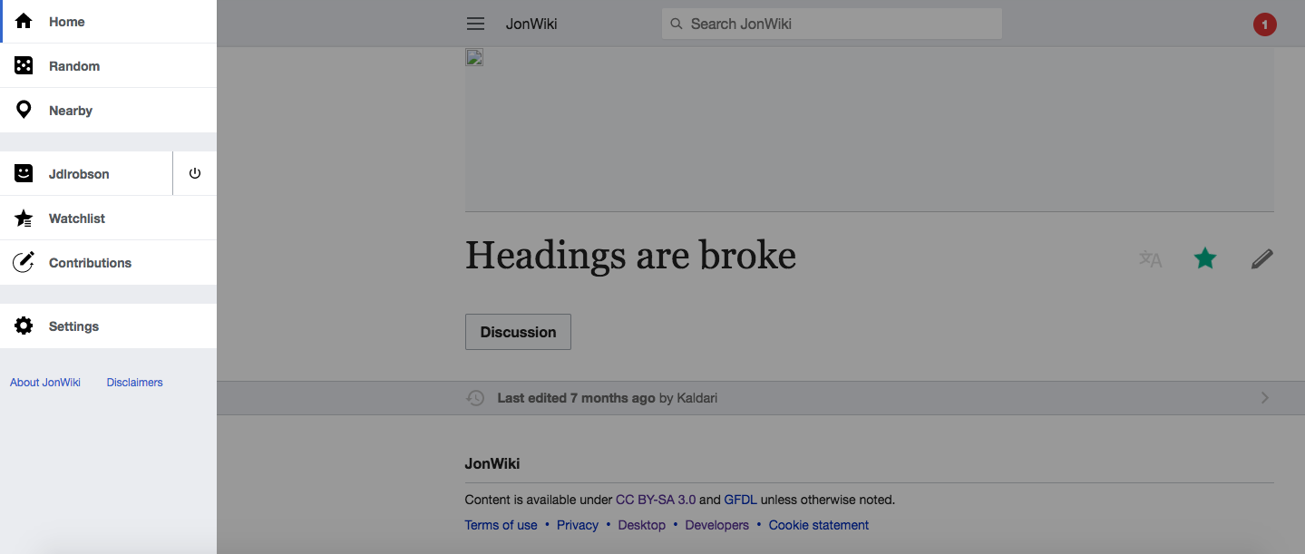
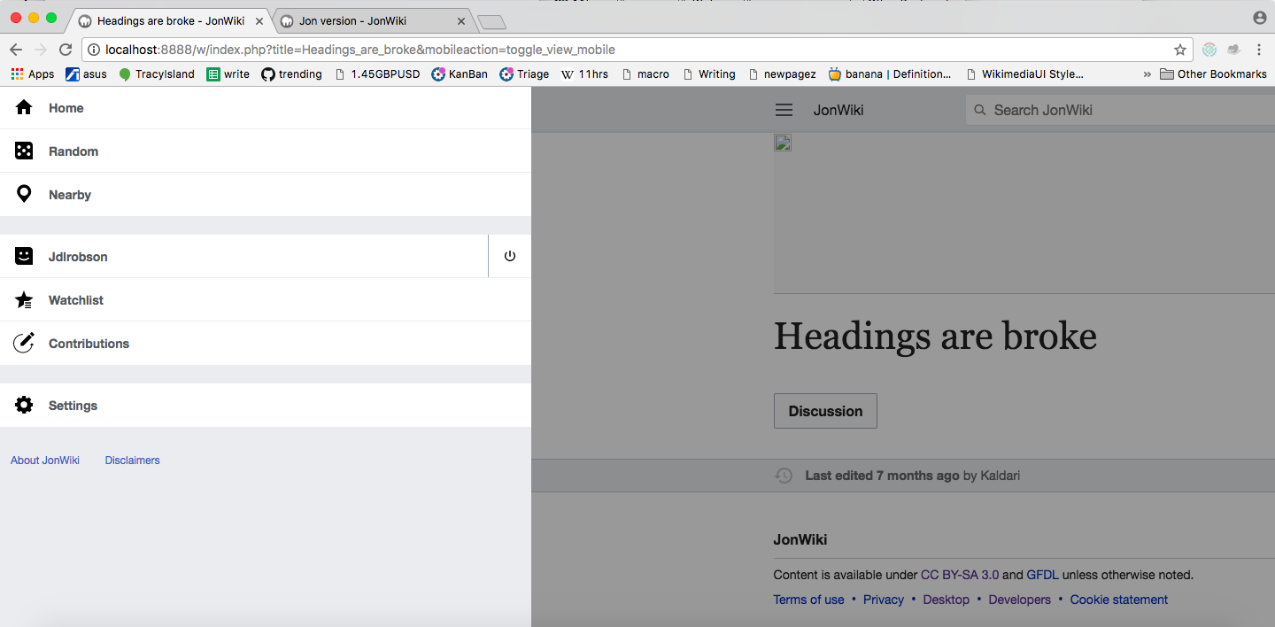
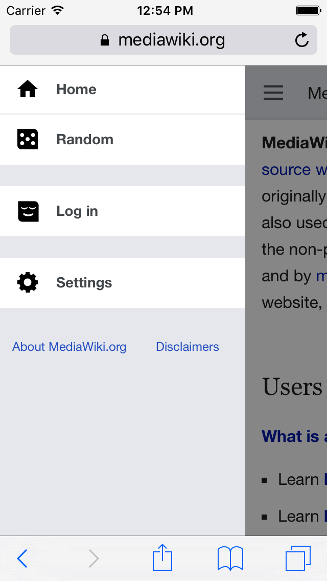
the navigation drawer doesn't take enough % width of the device screen.

  • the dismiss area - .shield should be narrower. not less than 50px though
  • for some languages, the menu items are longer so increasing this width will help too

The width should be 75% of device screen with a max width of 600px; the shield on right should be 25%
Notifications drawer not impacted.

zeplin: https://zpl.io/Z2cpOSU

Testing Criteria

View the navigation drawer in a number of browsers and note any inconsistencies

Event Timeline

jhobs set the point value for this task to 1.
jhobs moved this task from Incoming to Triaged but Future on the Web-Team-Backlog board.
jhobs subscribed.

This can probably even be Normal if you want @Nirzar.

Jdlrobson raised the priority of this task from Low to Medium.Apr 17 2017, 11:54 PM
Jdlrobson added a project: patch-welcome.
Jdlrobson added subscribers: Volker_E, Jdlrobson.

Doesn't look like Volker's work on this right now.

Change 359494 had a related patch set uploaded (by Bmansurov; owner: Bmansurov):
[mediawiki/extensions/MobileFrontend@master] Adjust the main menu width

https://gerrit.wikimedia.org/r/359494

the mocks don't mention what should happen on tablet mode. @Nirzar and @Volker_E can you confirm this is what you want?:

Before:

Screen Shot 2017-06-21 at 3.51.37 PM.png (611×1 px, 82 KB)

After:

Screen Shot 2017-06-21 at 3.50.17 PM.png (708×1 px, 123 KB)

with a max width of 600px

@Volker_E / @Nirzar his also seems a bit arbitary. did you mean @deviceWidthTablet (720px) ?

Change 361013 had a related patch set uploaded (by Jdlrobson; owner: Jdlrobson):
[mediawiki/extensions/MobileFrontend@master] Increase navigation menu size for mobile devices.

https://gerrit.wikimedia.org/r/361013

^ @bmansurov so here's what I came up with when I had a go at this. What am I missing about this solution? Am I overlooking something?

@Jdlrobson, in your solution there are a couple of cases where the calculation doesn't satisfy the requirements. For example the width of the navigation drawer is set at 600px for screen widths of 720px and above. According to the requirements though, 600px should be set when the screen width is 800px and above. So for a tablet with a width of 720px, the navigation drawer width is taking up 83% of the space, and not 75%.

Similarly, for mobile devices (whose screen widths are less than 720px) the navigation drawer is taking up 70% of the screen width, while it should take 75% of the width according to the requirements. If you change this value to 75%, then for screen widths of 200px and less, the dismiss area will be less than 50px, contrary to what's being asked.

Having said that, I think it's an acceptable solution given that no JS is involved. So from the technical perspective I'd go with your solution, but from the perspective of satisfying the requirements exactly I'd go with the alternative solution.

I'll happily merge your patch if @Nirzar is fine with your approach.

Not sure where I got the 70% from. I've switched it to 75% but I think my solution meets the description as written.

According to the requirements though, 600px should be set when the screen width is 800px and above.

That's not quite what it says. It says "with a max width of 600px". It doesn't mention when this should kick in.

The only issue with my solution is that the shield width will be under 50px for browsers under 200px but that's easily fixed or overlooked - this should be very rare. I don't know how many phones try to cramp our site into that much space AND run JavaScript.

Screen widthNavigation drawer sizeShield width
1000.75 * 100 = 750.25 * 200 = 25
2000.75 * 200 = 1500.25 * 200 = 50
3200.75 * 320 = 2400.25 * 320 = 80
4000.75 * 400 = 3000.25 * 400 = 100
5000.75 * 500 = 3750.25 * 500 = 125
6000.75 * 600 = 4500.25 * 600 = 150
7000.75 * 700 = 5250.25 * 700 = 175
7190.75 * 719 = 5390.25 * 719 = 180
720600px120
800600px200
1000600px400

Why are we showing 600px drawer width for screen width 720px with your solution? Shouldn't it be 540px (= 0.75 * 720)?

Why are we showing 600px drawer width for screen width 720px with your solution? Shouldn't it be 540px (= 0.75 * 720)?

Mathematically, yes, but as I pointed out earlier the number seems a little arbitrary and I'm not sure whether this is truly a big problem as it keeps the solution clean. If we want to keep it 75% all the way to 800px (75% of 800 is 600px) we can update the media query to kick in at 800px which feels a little messy but possible (We can rename @menuWidthTablet to @menuWidthMaximum) and make the media query @menuWidthMaximum / 0.75)

This needs input from @Nirzar and @Volker_E

This comment was removed by Jdlrobson.

a min....... thanks for holding it. is the current patch deployed anywhere?

doesn't have to be exact 75% the reading-web-staging looks great!!

Change 359494 abandoned by Bmansurov:
Adjust the main menu width

Reason:
See I41759ccf629e36f8a498e0ad9411a86d2cb93572

https://gerrit.wikimedia.org/r/359494

Change 361013 merged by jenkins-bot:
[mediawiki/extensions/MobileFrontend@master] Increase navigation menu size for mobile devices.

https://gerrit.wikimedia.org/r/361013

This needs testing criteria/notes before we assign it to @ABorbaWMF.

Looks good on. Tested against beta. Tried it on a number of devices/browsers. On iPhone 4 it takes up most of the screen but functions properly.

On iPhone 4 it takes up most of the screen but functions properly.

Just for documentation: on iphone 4 and 5 (narrow width) iphones, the dismiss area is larger than 44px so it falls under guidelines.

Simulator Screen Shot Jun 28, 2017, 12.54.28 PM.png (1×640 px, 90 KB)

otherwise

Macro votecat: looks  good