Page MenuHomePhabricator

Formatting issues with Edit Notices window
Closed, DeclinedPublic

Description

  • In Mac Chrome, go to this article
  • Click Edit to open Visual Editor
  • Click on Edit Notices button.

Expected result: read the edit notice
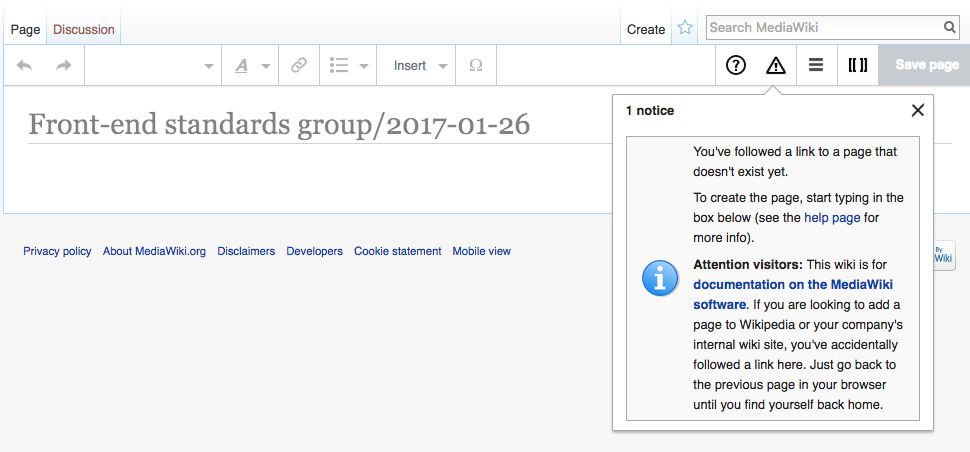
Actual Result: the Edit Notice window is cutting off the right side of the text, and there's a "Save Changes" button overlaying the text. See screenshot. I don't know if this is happening on all edit notices, but it might be worth checking.

Screen Shot 2017-01-26 at 11.35.07 AM.png (768×1 px, 471 KB)

T156407 edit notices _ Creating Front-end standards group:2017-01-26 - MediaWiki 2017-01-26.png (452×970 px, 92 KB)

Event Timeline

Today's Featured Article displays the template https://en.wikipedia.org/wiki/Template:TFA-editnotice

TFA-editnotice calls https://en.wikipedia.org/wiki/Template:Editnotice which I believe ultimately (via a couple of other templates) builds a one-row, two-cell table (first cell for the icon, second cell for the content).

It's great that you bring this up, @jmatazzoni – I've been looking into intermediate improvements to at least the fmbox/mbox layouts in the edit notices popups, which might come in handy here. My problematic example:

T156407 edit notices _ Creating Front-end standards group:2017-01-26 - MediaWiki 2017-01-26.png (452×970 px, 92 KB)

The use of a table to place the icon results in a lot of wasted space.

I'm sure that it looks nice when displayed on a full-width desktop browser window, which is what it was designed for.

@Whatamidoing-WMF The known problem for template authors not being able to visually test their templates in a smaller screen environment… :/
See T85587 and follow-ups.

My proposal to get this a bit under control:

T156407 edit notices _fixed Creating Front-end standards group:2017-01-26 - MediaWiki 2017-01-26.png (850×730 px, 154 KB)

T156407 edit notices_fixed Editing Ferugliotheriidae - Wikipedia 2017-01-26.png (1×692 px, 202 KB)

Hack Ambox/Mbox/FMbox by adding a few lines of CSS code in VE

  • set table to display: block and add padding,
  • make mbox-image float: right and at maximum 48px
  • set the mbox-text to display: inline and remove padding

I don't want to mess around more with the specific template code, that @jmatazzoni was filing the task for, because it has a lot of inline styles and they should probably go away anyways at some point in future (*hopefully*).

Would be great to hear feedback from @Whatamidoing-WMF or @Quiddity on this proposal…

Change 334444 had a related patch set uploaded (by VolkerE):
Fix mbox template layout in edit notices

https://gerrit.wikimedia.org/r/334444

Volker, your idea seems okay generally, but I don't know if the established editors at the English Wikipedia would accept these changes.

These are WMF specific styles, possibly en.wiki styles. If we're going to hack them then we should do it on-wiki where they are defined: https://en.wikipedia.org/wiki/MediaWiki:Common.css

@Whatamidoing-WMF What do you think would be challenged? The layout change of those message boxes within Visual Editor's edit notices (and only there) or adding VE related changes to MediaWikiCommon.css in general? Currently there already is

/* Workaround to keep editnotices readable in VE view.
   Long term, editnotices should become a core feature so that they can be designed responsive. */
.mw-ve-editNotice .mbox-image {
    display: none;
}

@Esanders Sounds reasonable. Assumed to have Mboxes in various languages.

Most wikis have created local rules and most of those warning templates have been created to fit a desktop environnement on Monobook. I think a good way fix that would be to have some best practices published somewhere, and ask communities to consider to change the current design from tables to real CSS.

@Esanders So after a little more research, it doesn't seem to be useful to add these to specific wiki styles. Citing from an conversation with @Quiddity

Volker_E> quiddity: do you have any idea on which/how many wikis ambox/mbox messages are used?
Q<quiddity> Volker_E, not beyond the wikis which have a local page for it, as tracked at wikidata. Mbox: https://www.wikidata.org/wiki/Q6063221 (~150) --- > Ambox: https://www.wikidata.org/wiki/Q5617634 (~270)
Q<quiddity> i would have to manually check each wiki, to see if (and how much) they actually utilize the template, though.
V<Volker_E> quiddity: Do we know for sure, that they are used extensively on more than just English Wikipedia?
Q<quiddity> Volker_E, on the big wikis, definitely. (e.g. click the sidebar interlanguage links at https://en.wikipedia.org/wiki/Template:Unreferenced -- and > then click "what links here" in the sidebar toolbox, to see transclusions.)>
Q<quiddity> (all the examples I just checked, except Dewiki, used the ambox styling.)
Q<quiddity> e..g https://ta.wikipedia.org/wiki/%E0%AE%87%E0%AE%9A%E0%AF%81%E0%AE%AA%E0%AF%8D%E0%AE%AA%E0%AF%81%E0%AE%9F%E0%AF%8D%E0%AE%A9%E0%AE%BF%E0%AE%95%E0%AF%8D_1

As this is a very widely used template, that is put into VE at various occasions, I'd recommend following to proceed:

  1. work with communities by giving them a table-less template
  2. put the code from patch into production until we're having a working size-restricted template layout in most big wikis.

Quick addendums:

  • Template code: Yes please, to divs instead of tables! - However, it might be prudent/practical to wait for Global Templates to arrive, before actually launching widespread changes. (But code them up beforehand, so that they're ready to propose/deploy)
  • Image-wrap/whitespace: When the template is displayed in the visual editor edit-notice box, I think it would be fine to make the text wrap around the icon.
  • Image location: In the above circumstance, relocating the image to the top-right corner (for LTR) seems potentially reasonable.
    • I assume relocating it to the top-left corner would cause some text line-wrap ugliness? Perhaps we could try out limiting the image height to a certain pixel limit, so that it only wraps after 2 lines or so?)

The community are responsible for the content of these templates, and fixes to their broken code should be discussed there.

Change 334444 abandoned by Jforrester:
Fix mbox template layout in edit notices

https://gerrit.wikimedia.org/r/334444