Page MenuHomePhabricator

[8 hours] Create a Page Previews performance dashboard
Closed, ResolvedPublic

Description

Before we begin to graduate the Page Previews beta feature across the groups of wikis, it's our responsibility to make sure that we have a clear overview of how the feature is performing on a day to day basis rather than, say, waiting for analysis of the latest batch of Event Logging data.

Initially we can this information to inform our rollout plan – especially for the group2 wikis (See T136602: Graduate the Page Previews beta feature on stage 0 wikis). Once we're fully rolled out though, we can use it a place to view the in-the-wild performance impact of any future work that we do.

AC

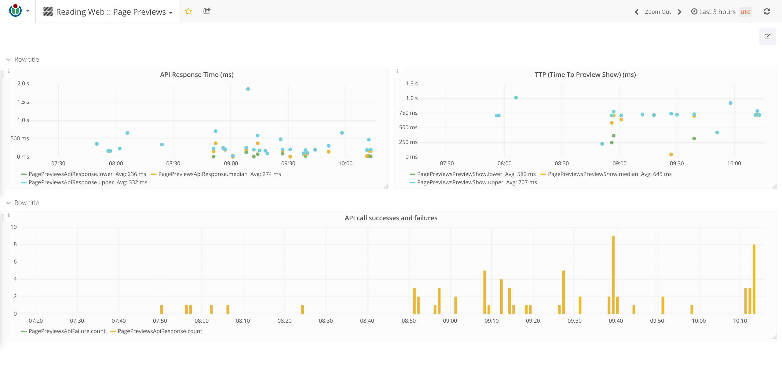
  • The Reading Web :: Page Previews dashboard is available at https://grafana.wikimedia.org and displays the following metrics:
    • Time taken for an API request
    • Rate of API request failures
    • Time taken to display a preview after the user dwells on a link.

Possible Metrics

The following aren't strictly performance metrics:

  • Number of logged out users enabling feature
  • Number of logged out users disabling feature
  • Empty (or "generic") previews shown per page
  • Extract previews shown per page

Implementation Notes

Grafana graphs get their data from Graphite, which in turn gets its data from statsd, primarily. There are a couple of ways that we could get the from the client into statsd to create the dashboard:

statsv

We'd add secondary instrumentation to the Page Previews codebase that sends data to statsv for a sample of users.

Pros
  • Familiarity – this is the approach we take with instrumenting features with EventLogging.
  • The existing instrumentation already accumulates timing information for the Popups schema, e.g. for the totalInteractionTime property.
Cons
  • Increased configuration complexity.
    • As usual, this behaviour must be disabled by default and the sample size should be configurable.
  • Increased bandwidth usage/resource consumption.
  • Generally speaking, a higher cost of making a change to the instrumentation.

EventLogging

We'd create a new EventLogging stream processor per https://wikitech.wikimedia.org/wiki/Graphite#EventLogging.

Pros
  • Lower cost of making a change to the instrumentation.
    • We can deploy a new version of the stream processor to hafnium whenever we require.
  • No changes to the codebase.
  • Enabled/disabled transparently to the client (in this context, the Page Previews code running in the UA).
  • Similarly – but worth pointing out – a change in the sampling rate for EventLogging is reflected immediately.
Cons
  • Generally speaking, unfamiliarity with the stack.
  • Increased architectural complexity.

Further Reading

Event Timeline

There are a very large number of changes, so older changes are hidden. Show Older Changes

@phuedx - what other metrics can we get from this?

@phuedx - what other metrics can we get from this?

Readily available:

  • Rate of generic/extract previews shown.
  • Rate of API request failures.
  • Rate of preview dismissals.
  • Number of logged out users who enable or disable the feature.

Could be easily instrumented:

  • Number of logged in users who enable or disable the feature via the Appearance tab on Special:Preferences.

I say we go with the EventLogging option as it doesn't require any changes to the codebase.

This seems like a lot of work.
We created a dashboard when we worked on lazy loading images. It's been a little neglected since that work dried up. Has anyone looked at it recently? Something to think about. I should also note we built this over the course of 2 months while we identified where we wanted to experiment... Not in one go.

our responsibility to make sure that we have a clear overview of how the feature is performing in near-realtime, which we can use to inform our rollout plan – especially for the group2 wikis

Yes it's our responsibility but do we need to be able to do real time?

Number of opt ins/outs feels like something we could check once in first day and revkew4 on a weekly/monthly basis. It doesnt feel like that needs to be real time.

Likewise "Time taken to display a preview after the user dwells on a link." We should know this before launching and if it's slow we'll want to break it down by where the slowdown occurs (e.g. Browser/site/location) ... A graph wont give you that.

By starting with the "we need a dashboard" angle we are kind of shooting ourselves in the foot.

It feels to me we should start with the questions we may want to ask and then work out how we would get those given current infrastructure and identify where we need to get answers quicker/more regularly.

We created a dashboard when we worked on lazy loading images. It's been a little neglected since that work dried up. Has anyone looked at it recently? Something to think about.

I'm not sure if that says more about our team than it does about the value of the dashboard… Where is this dashboard?

I should also note we built this over the course of 2 months while we identified where we wanted to experiment... Not in one go.

To be clear, this task is about giving the software engineers a place where they can see, at a glance, how Page Previews is performing (and how it was performing, say, a sprint ago) not in terms of high-level product goals but engineering goals – y'know, like, "How fast is it in the wild?".

our responsibility to make sure that we have a clear overview of how the feature is performing in near-realtime, which we can use to inform our rollout plan – especially for the group2 wikis

Yes it's our responsibility but do we need to be able to do real time?

By "near real-time" I meant "more up to date than the last round of analysis." I don't want to have to wait for @HaeB to tell me that there's been a regression… πŸ˜‰ I'll update the task to weaken the stance a little.

Likewise "Time taken to display a preview after the user dwells on a link." We should know this before launching and if it's slow we'll want to break it down by where the slowdown occurs (e.g. Browser/site/location) ... A graph wont (sic) give you that.

We should also monitor this as we're making changes to the system. A one-time analysis before we launch on a wiki won't give you that…

Also, we get information about the browser and the location based on data from the EventCapsule schema.

It feels to me we should start with the questions we may want to ask and then work out how we would get those given current infrastructure and identify where we need to get answers quicker/more regularly.

I'm curious what you mean by "current infrastructure" here. What I've suggested in this task is current infrastructure insofar as the Perf, RelEng, Interactive, Ops, and Wikidata teams are using it.

I agree with all the motivations. Don't get me wrong.. this is a good thing.
Essentially what I'm getting at is the scope is big there is a high risk and for a small team A/C is ambitious.

From what I understand about what we want to measure there will be a fair bit of wiring up to do to make the data available for display. When I built the 2g dashboard (now=broken :() for example a bunch of things I wanted were not available and I had to go into repos I was not familiar with to set up webpagetest jobs to make that data available. Even for EventLogging related work where the data is available you'll need to setup a view so grafana knows about it (remember EventLogging data needs to be sanitised before being made public)

There are other solutions to this other than dashboard - for example adding this activity to chore wheel for the 2 weeks after deployment and us running manual scripts to get answers to questions such as "are we logging the right number of events".

I won't be here while this is implemented but my recommendation if you want to go down this route, would be to make sure you know what you want answers for, pick the most important thing, get it on a dashboard and get a better sense of the effort involved before trying to put everything on the dashboard. Look for something that's about 3-5 story points not 8-13. Also timebox!

Hope this is helpful?

This is always good advice @Jdlrobson. Thanks!

"Time taken for an API request" and "Rate of API request failures" should be prioritised given we plan to switch to RESTBase soon.

I've removed the not-quite-performance related metrics from the AC. I think the remaining metrics are necessary.

We created a dashboard when we worked on lazy loading images. It's been a little neglected since that work dried up. Has anyone looked at it recently? Something to think about.

I'm not sure if that says more about our team than it does about the value of the dashboard… Where is this dashboard?

I should also note we built this over the course of 2 months while we identified where we wanted to experiment... Not in one go.

To be clear, this task is about giving the software engineers a place where they can see, at a glance, how Page Previews is performing (and how it was performing, say, a sprint ago) not in terms of high-level product goals but engineering goals – y'know, like, "How fast is it in the wild?".

our responsibility to make sure that we have a clear overview of how the feature is performing in near-realtime, which we can use to inform our rollout plan – especially for the group2 wikis

Yes it's our responsibility but do we need to be able to do real time?

By "near real-time" I meant "more up to date than the last round of analysis." I don't want to have to wait for @HaeB to tell me that there's been a regression… πŸ˜‰ I'll update the task to weaken the stance a little.

I guess this is informed by the memory of incidents like T144490#2843740 ;)
Just to be clear, checking for such regressions is normally not the main goal when I'm doing an analysis - rather, these are focusing on product-level data questions, and finding such bugs or regressions is a byproduct. But depending on the situation, I'm also happy to re-run an analysis/update a graph/do a quick check if it helps engineers finding such lower-level issues (like it actually happened in that example subsequently: T144490#2853370 ). That said, if we have the resources to create a dedicated dashboard, I'm all for giving people direct access to the relevant data.

I have some more thoughts on dashboard options and dashboards in general that may be relevant here, will try to write them up here soon.

β€’ bmansurov renamed this task from Create a Page Previews performance dashboard to [8 hours] Create a Page Previews performance dashboard.Feb 23 2017, 6:17 PM
β€’ bmansurov added a project: Spike.

Some more points:

  • Regarding dashboards in general, two common problems that I've seen several times across the organization are that 1) someone actually needs to look at them ;) (many regressions have gone unnoticed after the initial enthusiasm and attention has worn off) 2) they need to be maintained for an indefinite time into the future, or alternatively have a clear sunset defined. WMF servers are littered with broken dashboards. Regarding 1), it appears that some of the teams that successfully use dashboards have a routine where the data is regularly inspected.
  • The alert feature introduced in the recent Grafana update (T152473) could help to mitigate 1). To quote some marketing copy from http://grafana.org/blog/2016/12/12/grafana-4.0-stable-release/ : "Alerting is a really revolutionary feature for Grafana. It transforms Grafana from a visualization tool into a truly mission critical monitoring tool. The alert rules are very easy to configure using your existing graph panels and threshold levels can be set simply by dragging handles to the right side of the graph. The rules will continually be evaluated by grafana-server and notifications will be sent out [e.g. via email] when the rule conditions are met." I understand the Performance team has been trying this out, it might be worth pinging them for their thoughts.
  • Another new option is PAWS Internal, the Jupyter notebook infrastructure that recently became available as prototype, allowing to access both EventLogging and Hive data. Here, one could set up the relevant queries and charts once, and then re-run the notebook everytime fresh data is wanted; only the first step needs expertise. This would be somehow inbetween one-off queries and fully automated dashboards.

...

Likewise "Time taken to display a preview after the user dwells on a link." We should know this before launching and if it's slow we'll want to break it down by where the slowdown occurs (e.g. Browser/site/location) ... A graph wont (sic) give you that.

We should also monitor this as we're making changes to the system. A one-time analysis before we launch on a wiki won't give you that…

Also, we get information about the browser and the location based on data from the EventCapsule schema.

I assume "location" means country - this is no longer available from the capsule since IP information was removed there.

Given the other work that's in the sprint – especially the IE9-11 layout bug(s) that became apparent in T156800: Display Page Preview images when using the RESTBase endpoint – I haven't been able to carve out enough time to take a good run at this task.

Here are couple of notes that I made myself while investigating the two options a little more:

  • Currently, only the

Time taken to display a preview after the user dwells on a link.

metric can be extracted from a Popups event on the server side.

  • Not having the dashboard driven by data from the EL instrumentation means that it isn't affected by any of its bugs.
  • Users could be bucketed for instrumentation, i.e.
var instrumentationBucket = mw.experiments.getBucket( {
  control: 0.3,
  eventLogging: 0.3,
  statsv: 0.3
} );

Change 341471 had a related patch set uploaded (by bmansurov):
[mediawiki/extensions/Popups] WIP: Log events for monitoring PagePreviews performance

https://gerrit.wikimedia.org/r/341471

Change 341471 merged by jenkins-bot:
[mediawiki/extensions/Popups] Log events to statsv for monitoring PagePreviews performance

https://gerrit.wikimedia.org/r/341471

I guess an engineer other than @bmansurov can sign this off once rEPOP9a94300858d8: Log events to statsv for monitoring PagePreviews performance has been deployed and enabled. The train starts rolling today and will hit the group0 wikis on Thursday, 16th March.

For posterity: while reviewing rEPOP9a94300858d8: Log events to statsv for monitoring PagePreviews performance, I commented that we should have a set of instructions for enabling and configuring both the EventLogging and statsv instrumentation.

Change 342672 had a related patch set uploaded (by Phuedx):
[operations/mediawiki-config] pagePreviews: Enable perf instrumentation

https://gerrit.wikimedia.org/r/342672

@Jdlrobson: ^ If you could deploy rOMWCc9822a7fa03a: pagePreviews: Enable perf instrumentation during today's morning SWAT, then that'd be grand. If not, then I can get it deployed tomorrow.

I'm not sure how to test this. I will need to know how to if I'm going to SWAT.

The change can be tested by visiting https://grafana.wikimedia.org/dashboard/db/reading-web-page-previews and looking for data points. When successfully SWAT deployed, the patch will start sending events. In my local tests, it took about 10 mins between sending the data to the end point and seeing them on the dashboard.

Thanks @bmansurov https://gerrit.wikimedia.org/r/#/c/341471/ only just got merged so I'm a little confused.. won't that mean we can't get any data from production until next week?

Since the merge happened before the train rolled, we should see some results this week.

1.29.0-wmf.16 was not currently live on MediaWiki.org at the start of the swat window which delayed the entire swat window and led to very few patches making it through. Hoping @phuedx can get this in during European hours. Over to you Sam.

I'm not sure how to test this. I will need to know how to if I'm going to SWAT.

I've made a note to always leave instructions on how to test/what to expect from a change when getting it deployed during a SWAT. I shouldn't have rushed submitting the change to get it deployed.

Change 342672 merged by jenkins-bot:
[operations/mediawiki-config] pagePreviews: Enable perf instrumentation

https://gerrit.wikimedia.org/r/342672

Mentioned in SAL (#wikimedia-operations) [2017-03-15T13:37:47Z] <phuedx@tin> Synchronized wmf-config/InitialiseSettings.php: T157111: pagePreviews: Enable perf instrumentation (duration: 00m 42s)

I expect data will start rolling in after the train rolls through today (group1 wikis are updated to -wmf.16).

This should be signed off in sprint 94 when we can verify data is rolling in.
If data does not roll in we should talk about this in standup and decide whether to invest more time into this task.

I see data in graphite but not on the dashboard. Investigating.

Edit

I can't provide a short URL to an example graph that I created at the moment…

@phuedx I see this:

Screenshot from 2017-03-16 06-16-16.png (1Γ—2 px, 154 KB)

I see we've combined the success and failures graphs. Won't we have problems seeing data points if we have too many successes and too few failures? That was the reason why those graphs were created separately.

The dashboard is now displaying data: https://grafana.wikimedia.org/dashboard/db/reading-web-page-previews πŸ‘


@bmansurov: I've made the following changes to the dashboard:

  • I've made the Y axes for the timing graphs display milliseconds.
  • I've made the X axes for both of the timing graphs display the running averages of each plotted values.
  • I've displayed the timing graphs next to one another.
  • I've added an introduction explaining how we choose the sample.
  • I've made the default time range 3 hours.

I see we've combined the success and failures graphs. Won't we have problems seeing data points if we have too many successes and too few failures? That was the reason why those graphs were created separately.

I'm not sure. Let's wait until we have a lot of API failures… ;)

Question: is this dashboard representing all wikis e.g. those using RESTBase and those not using RESTBase?
What is time to preview - where does it measure from and to?
What API request are we measuring? Just RESTBase or RESTBAse and mwApi ?
Could this be made clearer on the dashboard?

What is time to preview - where does it measure from and to?

Screen Shot 2017-03-16 at 19.57.59.png (99Γ—333 px, 15 KB)

[I]s this dashboard representing all wikis e.g. those using RESTBase and those not using RESTBase?
What API request are we measuring? Just RESTBase or RESTBAse and mwApi?

I think we probably should distinguish between the two, given that it may take some time for RESTBase to become the default.

Jdlrobson claimed this task.

Okay, I think this is a good enough starting point. With respect to distinguishing between the two API requests I think that can be done in a follow up task. Lets open specific tasks for those.
I've linked to the new dashboard on https://www.mediawiki.org/wiki/Reading/Web/Performance

I see we've combined the success and failures graphs. Won't we have problems seeing data points if we have too many successes and too few failures? That was the reason why those graphs were created separately.

I'm not sure. Let's wait until we have a lot of API failures… ;)

Even a single API failure is not being visualized on the new graph. It is being masked by a success bar. Hover over bars and you'll see a popup with a non-zero failure rate that is not visible in the graph.

You can filter by clicking on the legend. I see a couple of failures. Can you be more specific? Maybe link to e graph you are referring to? Maybe I'm reading it wrong?

@bmansurov: You're right. You can click the metrics in the legend to only display that metric but we're likely more concerned with the failure rate than the success rate. I've reverted that part of the dashboard to your original layout.

Oh I see. I didn't know about the filtering part. On another note, wouldn't it make more sense to look at failures in terms of absolute values rather than relative to successes? Say we have 50 more failures than usual at a given time and by chance we have 500 more successes than usual at the time. By looking it the failure rate it would not be clear that the API has started failing more. Anyway, I think we can tweak the graph as we go.

Change 343828 had a related patch set uploaded (by Phuedx):
[operations/mediawiki-config] pagePreviews: Increase perf instrumentation sample

https://gerrit.wikimedia.org/r/343828

Looking at the API response time graph, I would advise to separate out the p95 into a separate one. Putting the median and the 95 on the same scale means that you have to mouse over to get a sense of whether the median is moving, because it's so small it's hidden by the p95. Similarly, the median seems to have high variance. I understand that you're going to increase the sampling rate. I think you should also use a moving average, which makes for a more readable graph when there's quite a bit of variance in the measure. Also something that we do in places is graph the amount of samples a given data point is based on.

Similar recommendations apply to the TPP graph.

Some backend metrics for the API calls would be useful as well. With p95 samples that have rtts in seconds, it would be good to rule out that it's not us, but that it's really slow internet on the client side causing this.

As a side note, regardless of where the blame is, if those are quite common, it might be worth considering aborting the load after a certain hard limit. It doesn't seem like a realistic/practical UX to me to hover a link for 10 seconds and expect something to happen. For clients that hit the limit a lot, it's probably worth putting the feature to sleep for a while, to avoid costly requests that the user probably isn't aware to be making.

I look forward to seeing the median with a higher sampling rate, the initial figures seem encouraging.

Change 343828 merged by jenkins-bot:
[operations/mediawiki-config] pagePreviews: Increase perf instrumentation sample

https://gerrit.wikimedia.org/r/343828

Mentioned in SAL (#wikimedia-operations) [2017-03-21T13:15:15Z] <dcausse@tin> Synchronized wmf-config/InitialiseSettings.php: T157111 pagePreviews: Increase perf instrumentation sample (duration: 00m 58s)

Looking at the API response time graph, I would advise to separate out the p95 into a separate one. Putting the median and the 95 on the same scale means that you have to mouse over to get a sense of whether the median is moving, because it's so small it's hidden by the p95. Similarly, the median seems to have high variance. I understand that you're going to increase the sampling rate. I think you should also use a moving average, which makes for a more readable graph when there's quite a bit of variance in the measure. Also something that we do in places is graph the amount of samples a given data point is based on.

Similar recommendations apply to the TPP graph.

Done.

Some backend metrics for the API calls would be useful as well. With p95 samples that have rtts in seconds, it would be good to rule out that it's not us, but that it's really slow internet on the client side causing this.

As a side note, regardless of where the blame is, if those are quite common, it might be worth considering aborting the load after a certain hard limit. It doesn't seem like a realistic/practical UX to me to hover a link for 10 seconds and expect something to happen. For clients that hit the limit a lot, it's probably worth putting the feature to sleep for a while, to avoid costly requests that the user probably isn't aware to be making.

I'll create a new task for each of these points. Thanks!