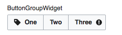
As of v0.19.1 OOjs UI demos feature ButtonWidgets with flagged (progressive) indicators.
This is a weak idea from an UI pattern perspective. It's also inconsistent between progressive and destructive widgets.
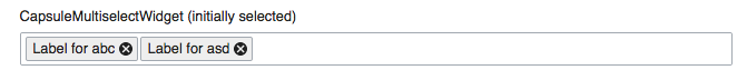
Originally, I intended to question using flags on indicators generally, but there might be use cases like colorizing the clear indicator of a CapsuleMultiselectWidget on :hover.
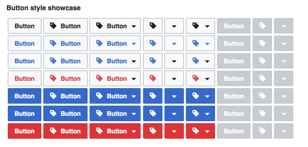
Expected outcome:
Limit indicators (on ButtonWidgets) to white/greyscale only.