Page MenuHomePhabricator

Mandatory / non-mandatory constraint UI
Closed, ResolvedPublic

Description

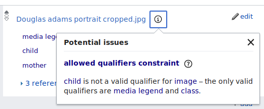
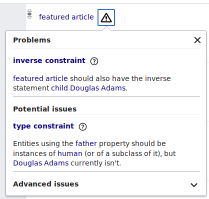
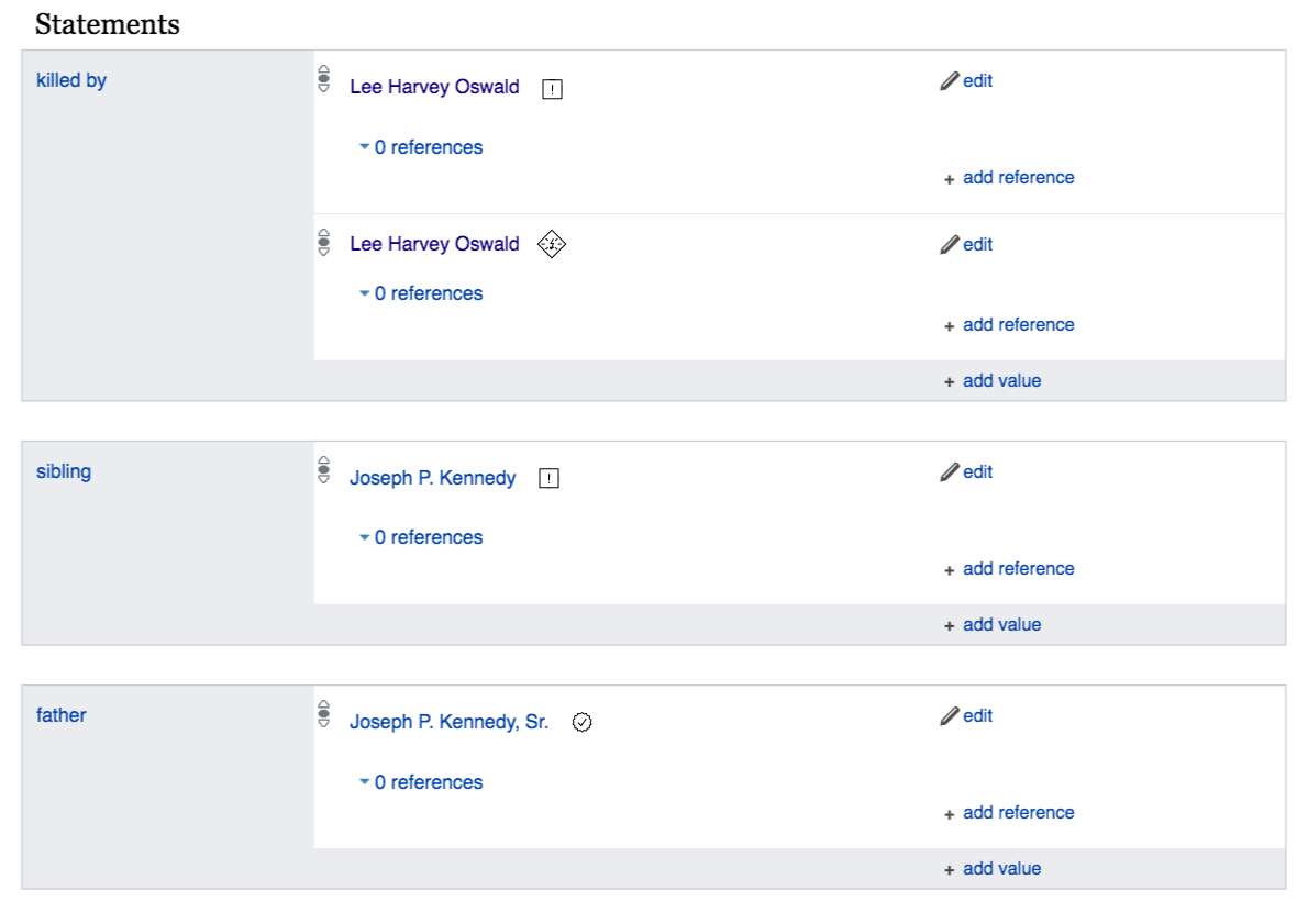
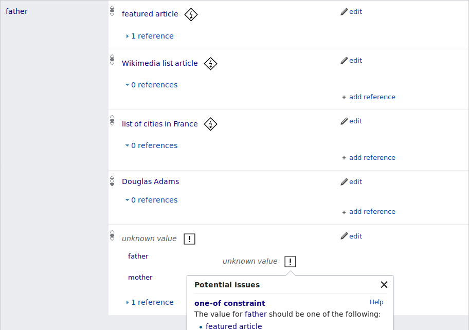
Currently, the icon is “info” if there are only violations of non-mandatory constraints (“warnings”) and “alert” if there are any violations of mandatory constraints, and warnings are under the heading “Potential issues” while violations are under the heading “problems”.

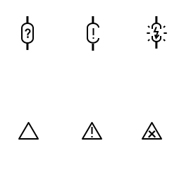
Different icon or icon style? Different headings? Different organization?

Patch-For-Review:

Event Timeline

For non-mandatory, @daniel suggested to use "suggestions"

In regards to the icons:
We could have a block icon
like

image.png (48×48 px, 3 KB)

and an attention icon
like
image.png (48×48 px, 2 KB)

(examples are from the tango iconset)

I find both slightly too alarming.

I could try to make an icon in a triangle, but with a i in it.

The problem with using an i in a circle is that this is the standard symbol for (get) "information"

like

image.png (48×48 px, 2 KB)

this is non standard, but it is an icon for something rather specific, so I don't expect us being able to find an icon.

As talked about with @Lydia_Pintscher: In case that mandatory constraints are rare, we could go with a red/dark-red icon for the mandatory ones and the optional ones get a black one. This would only work if mandatory constraint infos are rare, so that it is not terrible (or actually desirable) if they "scream" and "clutter" a bit, visually.

@Lucas_Werkmeister_WMDE: Do you know how frequent "mandatory constraints" are?

@Jan_Dittrich, Lydia_Pintscher: I don't think it's relevant how rare the constraints are - I'm not even sure I know what that means. What matters is how rare violations of mandatory constraints are. And these should, by definition, be rare. If we have a lot of violations of "strong" constraints, making them look nicer less threatening is not the way to fix the situation. Either the constraint needs to be changed, or the data.

What I'm saying is: violations of strong constraints are bad! We shouldn't hide errors, we should expose them, so they get fixed!

@daniel The concern was in the direction of "will it make Wikidata unusable/ugly/… for anything but constraint fixing". That being prevented, I am totally for showing all this here :-)

Currently, we have the following distinctions:

Statement with violations of non-mandatory constraints: “info”

image.png (216×521 px, 18 KB)

Statement with violations of mandatory constraints (and also non-mandatory ones): “alert”

image.png (398×418 px, 26 KB)

Invalid constraint statement on a property: “alert, warning”

image.png (247×425 px, 15 KB)

We could also consider using the “info” icon for non-mandatory constraints (just like we currently do – see first screenshot), “notice” for mandatory ones (same size as “info”, but with inverted color scheme and an exclamation mark instead of an “i”), and reserve “alert” (exclamation mark in triangle – see second and third screenshot) for just invalid constraint statements.

(Wikimedia UI does not seem to have any other variations for “alert” besides “warning”, so I think the difference between screenshots 2 and 3 is all the nuance we have for a single icon.)

I think a bit of putting the indicator in a box, so we get around the confusion of info-i in a circle (usually it means help) and the "attention" icon being used for something similar. What I have in mind would be three icons with rising severity, maybe like:

image.png (95×276 px, 3 KB)

Version without just ! as indicators and a "constraining" shape.

image.png (31×100 px, 1 KB)

I like these:

image.png (95×276 px, 3 KB)

I wouldn't go for the constraining shape because in the future it should also have other indicators in there like from checks against 3rd party databases.

I wouldn't go for the constraining shape because in the future it should also have other indicators in there like from checks against 3rd party databases.

The "clamp" shape would show that it is a (constraint) check, the inside could show its nature. The boxes have the problem that they don't signify that they are about constraints or basically anything special, since everything can be in a box and have an !.

So we need something that visually signifies the constraint-ness of the indicator (here the "constraint" outline), since there might be other indicators used together with the constraint indicator.

Here is another attempt on how to handle the warnings:

  • the current icons measure something around 24*24 px
  • the solutions favored before would lose clarity in details
  • the screenshot attached shows two ways factoring in the original size:
    1. the upper row shows a constraint-like/connecting shape and makes it visually loses connectivity the more severe it gets
    2. the lower row shows more general ways to go, while Jan mentioned we would need to be careful on that road as there might come more icons for other warnings later

170907_Constraints.jpg (244×271 px, 9 KB)

I'm happy to hear your thoughts. Thanks!

Thanks for your suggestions, Hanna! I like the upper row, specifically the ? / ! part, which seems to reflect the distinction between non-mandatory constraints (“are you sure this is right?”) and mandatory constraints (“this can’t be right!”) very nicely.

But coming back to this after a while, I’m not sure if it makes sense to view this as a series of three escalating icons. Perhaps there should be a greater distinction between any kind of constraint violation (warning, violation, whatever else – the first two cases, currently) and incorrect constraint parameters (currently third case), which are very different. Would it make more sense to always use the generic “alert” icon for broken constraint parameters, not something constraint-specific?

Thanks again Lukas for your feedback. It took me (and fair to say Lydia) quit a bit to understand the problem. I hope I got it right with the following solution.

As there gonna be explanation boxes for each problem, I decided to differ between non-mandatory constraints and mandatory constraints only. For the user it's just important to see if a certain problem should be changed immediately or not. I also did an icon for approved constraints (which are not shown yet, but will be in the future rumors say).
You can see a screenshot with the icons in a row:

Screen Shot 2017-09-25 at 12.11.42.png (181×461 px, 7 KB)

and in their natural habitat:

Screen Shot 2017-09-25 at 12.18.57.png (841×1 px, 93 KB)

Please let me know what you think. Thanks for your patience!

I like them! Putting the ! into a triangle would be more familiar to europeans, but a square box will do ;)

Thanks! Looks pretty nice.

I also did an icon for approved constraints (which are not shown yet, but will be in the future rumors say).

Hm, that’s news to me, I would think that’s a lot of unnecessary clutter… but on the other hand, it looks like a nice icon for e. g. signed statements IMHO :)

Is there any particular reason why you didn’t keep the ? / ! part?

To add these icons, it looks like I’ll need SVG versions, can you send me them? And OOui also supports RTL versions of icons, not sure if we need that here – perhaps the lightning should point to the other side?

Signed statements is what the icon is for - just naming confusion.

So here I have a zip with the icons as svgs included in original and 2x size. Let me know, if that works for you or if you need another format to implement them.
Also: as we are working with a new design tool, the export options are limited and I read they are not great in exporting svg's clutter free. I hope it works fine anyways.

Thanks!

Change 382462 had a related patch set uploaded (by Lucas Werkmeister (WMDE); owner: Lucas Werkmeister (WMDE)):
[mediawiki/extensions/WikibaseQualityConstraints@master] WIP: New icons for constraint violations

https://gerrit.wikimedia.org/r/382462

Thanks! I’ll see what I can do with those SVGs.

Okay, here’s what it looks like on the page:

Screenshot-2017-10-5 Douglas Adams.png (642×912 px, 29 KB)

The “non-mandatory” icon is much bigger than in your mockup, which makes it more prominent than the “mandatory” icon, I think. Strokes in both icons also look a bit more bold than in your screenshot, which makes especially the “mandatory” icon a bit crowded IMHO.
Can you perhaps try to fix these issues? I’m not sure how much I can do on the SVG directly, I hope it’s easier in your tool.

Oh my... That looks indeed very heavy and not as wanted. So let's give it another try. Thanks Lucas!

Thanks, the strokes look a lot better now. But the non-mandatory icon still looks too large in my opinion… what if we rotate it by 45° (matching the mandatory icon)? Then it would be smaller if it still had to fit within the 28×28 bounding box.

I don't know, why it enlargens the non-mandatory one, as I exported it in a smaller size. See the screenshot to compare:

Screen Shot 2017-10-05 at 21.55.54.png (850×830 px, 89 KB)

Is the 28x28 bounding box something that came with the exported svg or did you set that up? Otherwise I might try to shrink the bounding box I put it in for the export...

Oh, I see, one SVG has a bounding box of 29×29 and the other has a bounding box of 21×21, but it looks like the icon ignores that. Adjusting the width/height/viewbox and the canvas transform works.

Much better! :) I feel like it is still a bit too big for people to be comfortable with. Hanna?

The non-mandatory one. Not sure though if we should have different sizes. Might look weird if you have a mix of constraint violations on one item. But Hanna should comment.

@Hanna_Petruschat_WMDE will probalby look at them on Monday, if that is fine.

Yeah, sure. Just a quick note – I’ve already cleaned up the exported SVG files (I’m about to upload the new versions), so I’d prefer some simple transformations I can apply to them (scale, translate) over a new ZIP of SVGs that I then clean up again from scratch :)

Alright. @Lucas_Werkmeister_WMDE, do you just want to let me know, when you're in and free to work on it and I'll come over? I feel it's easier to look at it side by side. Also: I'm happy to hear about cleaner svg's we can provide so the workflow gets more efficient.

@Hanna_Petruschat_WMDE I’m here and mostly free now, feel free to come over.

So here it comes again. Hope the cleanup helped as discussed.

Hm, I think the outline thing on the non-mandatory icon isn’t so helpful, because now there are masks in the SVG, which I don’t understand at all :) fortunately, I was able to replace the entire border with an identical-looking <rect>, since all the required coordinates were very simple (20×20, stroke-width 2). (svgo then turned the <rect> back into a <path>.)

But also, the non-mandatory icon is larger again… it looks like OO.ui (or whatever it is that loads the icons – perhaps it’s a property of the browser directly?) just ignores the SVG’s declared size, so if you’re designing an icon set, the icons need to have the same base size and then be scaled within the image. I’ll try to fix the icon accordingly.

Change 382462 merged by jenkins-bot:
[mediawiki/extensions/WikibaseQualityConstraints@master] Add new icons for constraint violations

https://gerrit.wikimedia.org/r/382462