Page MenuHomePhabricator

Analysis of testing on 18 wikis with > 1% of search traffic
Closed, ResolvedPublic

Description

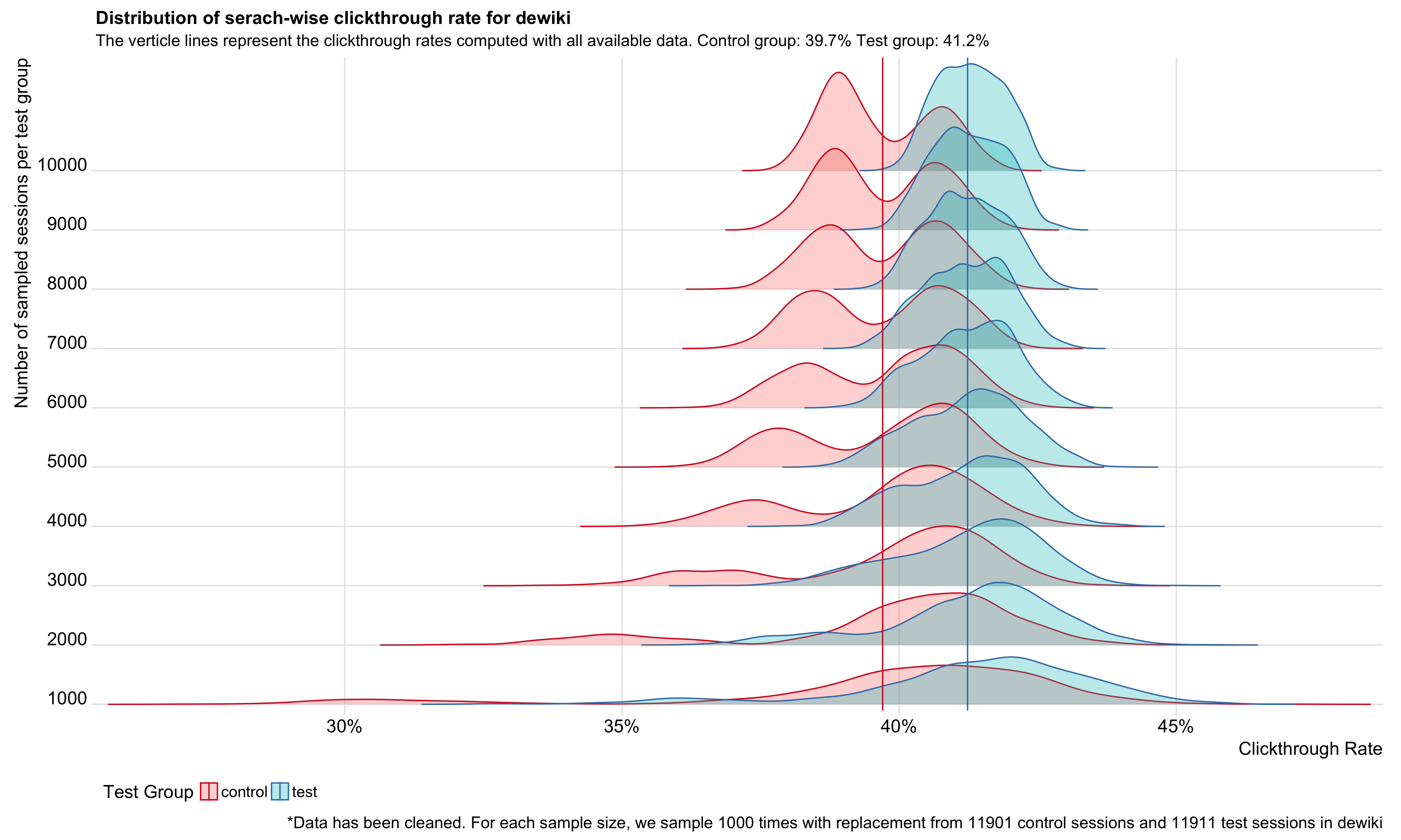
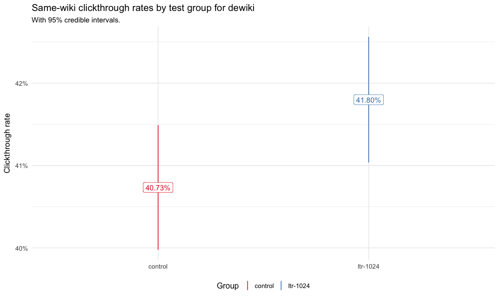
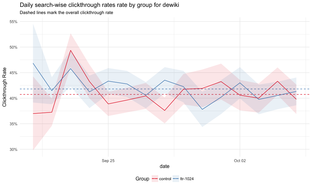
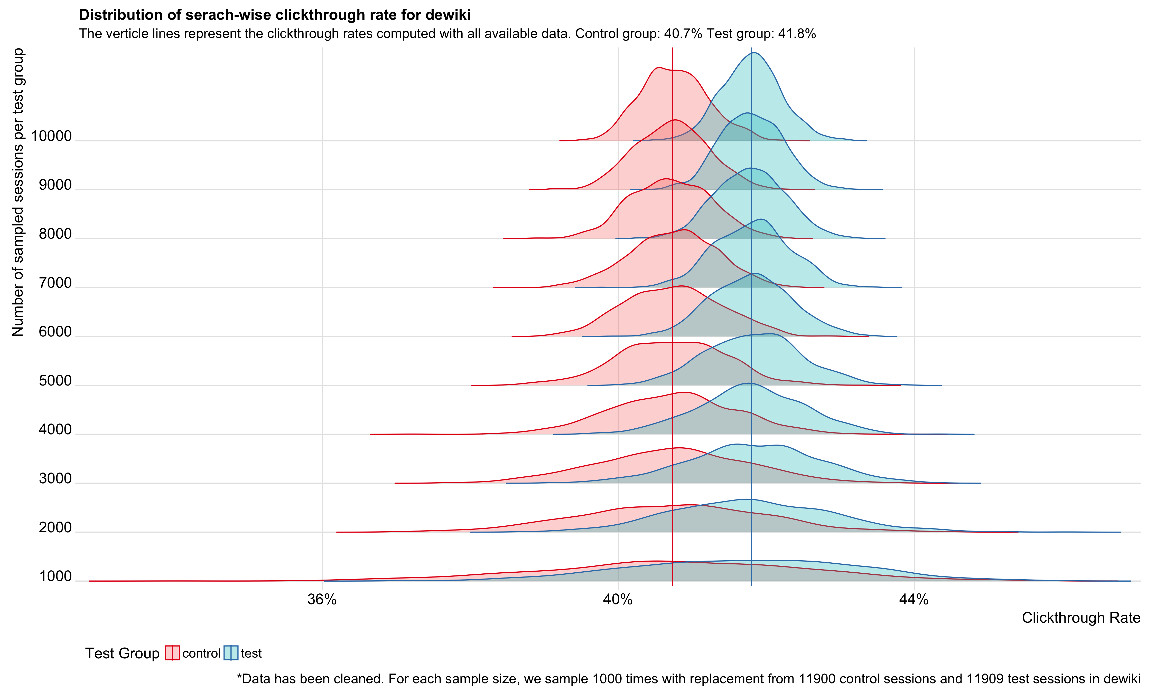
Since the enwiki test went well and it's been deployed in production, we wanted to see if running the same test on wikis that are as low as 1% of all search traffic would get the same results. This ticket is to do the analysis after the test finishes up: T175771.

(Edit: adding the explicit list of languages and codes for searchability: ar, de, fa, fi, fr, he, id, it, ja, ko, nl, no, pl, pt, ru, sv, vi, zh; Arabic, German, Persian, Finnish, French, Hebrew, Indonesian, Italian, Japanese, Korean, Dutch, Norwegian, Polish, Portuguese, Russian, Swedish, Vietnamese, Chinese.)

Event Timeline

This test was finished/stopped on Oct 5, 2017. Please go ahead and run the autogenerated A/B test report for this, if possible. :)

Auto-generated report is up: https://analytics.wikimedia.org/datasets/discovery/reports/CirrusSearch_MLR_AB_test_on_18_wikis.html. There are still some bugs in the report I need to fix and I will update the report later.

Also I notice there are only 91 SERPs from autocomplete in this test. This number is too small given the large amount of traffic.

Autocomplete data collection was intentionally turned off in this test, we were collecting much more data than usual and I wanted to avoid adding all of those events that I didn't think we would look at.

@chelsyx I dont think the ltr-i-1024 bucket should be included in this first look, it's an interleaved result set that can't really be interpreted with our standard metrics.

Might also be worth looking into: I increased the sampling rates significantly for this test. This new test ran for 16 days and contains 1.4M SERP events from 683k sessions, significantly higher than anything we've collected before. Is this increase in event counts useful in making the buckets differentiable, or is it simply more data to store and process? I realize though that because the data is split between so many wikis it may not be as useful as having 700k sessions all from a single busy site like dewiki or enwiki.

Might also be worth looking into: I increased the sampling rates significantly for this test. This new test ran for 16 days and contains 1.4M SERP events from 683k sessions, significantly higher than anything we've collected before. Is this increase in event counts useful in making the buckets differentiable, or is it simply more data to store and process? I realize though that because the data is split between so many wikis it may not be as useful as having 700k sessions all from a single busy site like dewiki or enwiki.

We can re-sample within each bucket for n times, and compute the distribution of the CTR and other metrics. Then change the re-sample size to different values, and see how the distribution changes.

I bootstrapped from the preprocessed data for 1000 times, and compute the distribution of the search-wise CTR. Then I changed the re-sample size from 1k to 10k, and then create joy plots for every wiki. Here is the most interesting one:

dewiki_joy.png (2×4 px, 794 KB)

I put the joy plots for 18 wikis on: https://people.wikimedia.org/~chelsyx/ctr_distribution.html

Looks like 1k sessions for each bucket are not enough, but the distributions don't change a lot from 8k to 10k. Next step:

  • Figure out how to determine the best sample size
  • What does the bimodal distribution of dewiki tell us

@EBernhardson @mpopov @TJones Any thoughts?

@chelsyx—cool analysis overall! The fact that this is mostly automated is amazing!

  • The joyplots are very interesting. The fact that jawiki, zhwiki, arwiki don't show big improvements is not a huge surprise, since they have the hardest to parse text. fawiki being clearly better is a surprise, since it uses the Arabic writing system. hewiki is in a group of its own because it has a hard-to-parse writing system, but also a change in language analyzer.
    • We should consider trying to think of some sort of additional features that might apply to spaceless languages (zh, ja) and highly ambiguous languages (vowelless ar, he, and fa) that we could add in to future training. Nothing jumps out at me at the moment, but I haven't thought about it too much.
  • The dewiki bimodal distribution is indeed bizarre. Anything in the data that might explain it? Is there some crazy outlier session that, if it gets into the sample twice (or multiple times, or just too many times) it heavily skews the results? That might align with the bimodal distribution being clearer as the number of sampled sessions increases, but I'm not sure.
  • @EBernhardson—is there any chance something was configured incorrectly for arwiki? The results being so similar is just too weird to accept at face value.
  • @EBernhardson—looking at hewiki ZRR results. Is it possible for the LTR to ditch results? Like, if something scores so low it gets dropped? With a 95% credible interval and 18 data sets, one showing statistically significant differences in ZRR is not a shock, but the fact that it is Hebrew is suspicious, since that's the one where the training data and the production data actually differ because of the language analyzer.
    • @chelsyx, any thoughts on why the overall ZRR is almost statistically significantly different?
    • Hmmm, hewiki engagement numbers are bizarre.
    • Does it make sense to consider hewiki an outlier in general because of the language analyzer effect?
    • I'd love to re-train hewiki and re-run the test just on hewiki. It would give us insight into how much a moderately big change to the language analyzer matters for the effectiveness of the model.
  • Sister search should not be strongly affected—though I suppose that better search results could decrease sister search usage because users click on the obvious good normal search result. I don't think that's a big effect; in general it's just good to see the sister-search clicks!
  • Minor edits:
    • "Deleted 53 events..." under Data Clean-up needs a space before it.
    • The joyplot page says "serach" rather than "search" at the top.
  • Minor UI suggestions:
    • For the engagement graphs, it wouldn't hurt to have some extra visual separation between graphs when there are so many—a line, extra space, something. After scrolling down a ways, it becomes unclear whether the label applies to the graph above or the graph below.
    • The joyplot page could use some text before or after each graph or a TOC so you can jump to the one you are interested in. Going back to find hewiki is hard. Alphabetizing them would also help.

Looks nice @chelsyx -- here's my notes:

  • "This test ran from 19 September 2017 to 05 October 2017 on all wikis
    • It actually ran on 18 wikis, not "all"
  • would it be possible to show the browser and OS in a table that can be sorted? It's really difficult to look at that table and make sense out of what is more popular.
  • under searches and number of searches - the long table isn't horrible, but a bit hard to read. For the charts--the legend is all the way at the bottom and requires a lot of scrolling to figure out what you're looking at, then scrolling back up to determine how to read the charts. Can the legend be at the top and bottom of the overall large chart image? (searches, searches with clicks, searches with results)
  • agree with @TJones on hewiki—super weird looking
  • for the data summary of sister project snippets—yay! can the legend for the various projects be on each of the charts? Otherwise, you have to do a lot of scrolling to remember which project is being show for each wiki, especially since each wiki has their 'favorite' sister project to click though to! :) (Same for inter-wiki charts re: legend for each chart)
  • for the sister projects—do you know why there were more clickthroughs on about half the wikis for the test group than for the control group?
  • @EBernhardson—is there any chance something was configured incorrectly for arwiki? The results being so similar is just too weird to accept at face value.

The per-wiki configuration is very minimal, just a name of a model to use. I double checked and the model does exist with the configured name (and if it was wrong, the search would fail as opposed to return the un-rescored results). I agree it's odd to be so similar, but I don't see anything obvious. Perhaps we could load the prod model and arwiki dump into relforge and run a test to see how much the results change, if somehow the model is predicting results very close to the control ranking that could explain it (and would be surprising).

  • @EBernhardson—looking at hewiki ZRR results. Is it possible for the LTR to ditch results? Like, if something scores so low it gets dropped? With a 95% credible interval and 18 data sets, one showing statistically significant differences in ZRR is not a shock, but the fact that it is Hebrew is suspicious, since that's the one where the training data and the production data actually differ because of the language analyzer.

Looking at the daily graphs, it seems there was an abnormally high ZRR on the first day or two of the test. I wonder if there is perhaps a very high volume session throwing things off? IIUC this is per-search ZRR. Adding in a per-session ZRR (does at least 1 query have results) might remove that. Completely removing high volume sessions as "probably bots", like we did for the enwiki MLR analysis, might also do the trick?

  • @chelsyx, any thoughts on why the overall ZRR is almost statistically significantly different?
  • Hmmm, hewiki engagement numbers are bizarre.
  • Does it make sense to consider hewiki an outlier in general because of the language analyzer effect?
  • I'd love to re-train hewiki and re-run the test just on hewiki. It would give us insight into how much a moderately big change to the language analyzer matters for the effectiveness of the model.

Seems easy enough, i'll re-train models for hewiki and dewiki and we can rerun the tests on both since they look pretty odd. hewiki sampling was already at 80%, so to get the same amount of data we have to run the test for two weeks. dewiki only used 3% sampling so that could be run in a single week.

Seems easy enough, i'll re-train models for hewiki and dewiki and we can rerun the tests on both since they look pretty odd. hewiki sampling was already at 80%, so to get the same amount of data we have to run the test for two weeks. dewiki only used 3% sampling so that could be run in a single week.

On second thought, I wonder if the difficulty of applying language analysis is also affecting our ability to group together similar queries which leads to less representative training data. Perhaps it would be possible to use hebmorph instead of lucene stemming during the grouping phase, although i would have to spend some time to figure out how exactly that would work.

On second thought, I wonder if the difficulty of applying language analysis is also affecting our ability to group together similar queries which leads to less representative training data. Perhaps it would be possible to use hebmorph instead of lucene stemming during the grouping phase,

Oh, I'd forgotten about/repressed that bit.

although i would have to spend some time to figure out how exactly that would work.

Yeah, similar stemming for training and in production seems very useful, but there's an extra wrinkle—unlike most other stemmers, HebMorph almost always returns multiple stems per token, and unlike, say, a folding_preserve analyzer that returns just 2 tokens, it can return up to 14 tokens, which is ... complicated. It also has lots of configuration options, and some of them do weird things, like include "exact" tokens with a final $. The unpacked version we are using in prod returns duplicated tokens, so deduping will sometimes reduce the number, but not always. See the table here for examples, and despair (maybe just a bit).

Sorry this is looking to be a pain.

  • @EBernhardson—looking at hewiki ZRR results. Is it possible for the LTR to ditch results? Like, if something scores so low it gets dropped? With a 95% credible interval and 18 data sets, one showing statistically significant differences in ZRR is not a shock, but the fact that it is Hebrew is suspicious, since that's the one where the training data and the production data actually differ because of the language analyzer.

Looking at the daily graphs, it seems there was an abnormally high ZRR on the first day or two of the test. I wonder if there is perhaps a very high volume session throwing things off? IIUC this is per-search ZRR. Adding in a per-session ZRR (does at least 1 query have results) might remove that. Completely removing high volume sessions as "probably bots", like we did for the enwiki MLR analysis, might also do the trick?

Yeah, there seems to be some outliers in hewiki during the first two days. In the data cleansing step, I have removed sessions with more than 100 searches, but only have searchResultPage events and no click. Maybe I should remove all high volume sessions regardless of click.

I removed all sessions with more than 100 searches (Previously, I removed sessions only when they have more than 100 searches AND only have SERP events.), now the dewiki distribution is not bimodal anymore. Yay!

dewiki_ctr_no_outlier.png (600×1 px, 37 KB)

dewiki_daily_ctr_no_outlier.png (600×1 px, 95 KB)

dewiki_joy.png (2×4 px, 738 KB)

For hewiki, the problem doesn't seem to be bots... Still working on it

@EBernhardson @TJones For hewiki, I fetched several query strings with zero result from ltr-1024 group of hewiki on 9/20 and 9/21 (the first two days of this experiment when ltr-1024 had very high zero result rates). I ran them in hewiki and most of them returns some results. So I think there may be some bugs in the test configuration for those days on hewiki, which result in null event_hitsReturned.

After removing data of the first two days, the ZRR are not significantly different:

hewiki_zrr_remove_2days.png (600×1 px, 42 KB)

hewiki_daily_zrr_remove_2days.png (600×1 px, 101 KB)

@chelsyx I dont think the ltr-i-1024 bucket should be included in this first look, it's an interleaved result set that can't really be interpreted with our standard metrics.

@chelsyx I'll try to carve some time out this week to add interleaved CIs to wmf (there's currently a patch that adds interleaved preference calculation) so that the report can also output stuff for interleaved groups (defined as having "-i-" in the name).

@chelsyx —thanks for the updates! I'm glad everything seems more reasonable now. We always have weird outliers and general odd behavior. (OTOH, it could always be worse: Salesforce—according to their Solr/Revolution talk—can't look at their customers' data or queries; that's definitely doing it in hard mode.)

I agree that it's very reasonable to drop high-volume sessions. While any threshold is arbitrary, I think it's pretty clear that by the time you get to 100 searches in a session, that user isn't one we're trying to help here. Could be a bot, an editor doing something editorial rather than trying to find information to read, a researcher of some sort, or someone messing around—all the use cases I can imagine are either an expert who can fend for themselves, someone doing something pretty unusual, or someone messing around with no purpose. I hope our future work on power searching can help the expert and maybe the "weird" searcher, but they are not like the general searcher we are trying to understand here.

  • "This test ran from 19 September 2017 to 05 October 2017 on all wikis
    • It actually ran on 18 wikis, not "all"
  • would it be possible to show the browser and OS in a table that can be sorted? It's really difficult to look at that table and make sense out of what is more popular.
  • under searches and number of searches - the long table isn't horrible, but a bit hard to read. For the charts--the legend is all the way at the bottom and requires a lot of scrolling to figure out what you're looking at, then scrolling back up to determine how to read the charts. Can the legend be at the top and bottom of the overall large chart image? (searches, searches with clicks, searches with results)
  • for the data summary of sister project snippets—yay! can the legend for the various projects be on each of the charts? Otherwise, you have to do a lot of scrolling to remember which project is being show for each wiki, especially since each wiki has their 'favorite' sister project to click though to! :) (Same for inter-wiki charts re: legend for each chart)

Yep, I'm working on it.

  • for the sister projects—do you know why there were more clickthroughs on about half the wikis for the test group than for the control group?

Which chart are you referring to? I didn't see a big difference in sister projects clicks between the two groups.

@chelsyx I'll try to carve some time out this week to add interleaved CIs to wmf (there's currently a patch that adds interleaved preference calculation) so that the report can also output stuff for interleaved groups (defined as having "-i-" in the name).

Thanks @mpopov ! No rush!

@chelsyx—thanks esp. for the joyplot updates! They are fun to stare at and ponder.

We'll need to figure out 'how much data is enough'...getting bigger datasets will need to be added to Hadoop and would require updating the report generator, etc.

For estimating enough, the next test (starting tomorrow, tentatively) is running against enwiki and sampling ~15% of sessions into the 5 buckets of the test (for ~3% per bucket). This should hopefully give us more data than necessary to figure out how much we actually need going forward. It will of course only be able to tell us with certainty about the effect size we see on enwiki for this test, but hoepfully it can be extrapolated (or maybe there is a something more rigorous).

During our Analysis meeting today, the amount of data that might be collected raised some eyebrows...that it might be close to 100K sessions? We're concerned that the auto report generator won't be able to easily handle it and that getting it into Hadoop has it's own issues.

@EBernhardson are you expecting to get near that 100K sessions with the upcoming test?

previous multi-wiki test was ~13k sessions per bucket per wiki, or 13*2*18, or ~480k sessions total. Rough estimates for 7 days at the set sampling rate on enwiki is 160k sessions per bucket per wiki but on a single wiki and with 5 buckets, so 800k sessions. More sessions for a single wiki, but less sessions overall. Getting the data out of hadoop and into a TSV file for ingestion into R is relatively easy, I can take care of that. I of course don't know that that's any easier for R, if there are suggestions i can try out different ways. If that's too much data for the report generator i can sample down by session id when generating the TSV and only use the full data size for purposes of calculating how # of sessions effects the separability of the two groups on CTR (basically the joy plots run previously).

In the longer run, analytics is removing the mysql server that hosts event logging next quarter, so things are going to have to move off mysql anyways sooner than later. I know our analysts were not particularly impressed with sparkR, but the analytics team has made that available now on our hadoop cluster. Any calculation that can be done on slices of the data can be distributed to hundreds of cores and then aggregated together (i'm not actually sure if bootstrapped CTR can be sliced this way, it seems plausible but i would have to actually dig into it to be sure).

Hmm...I might have gotten the numbers wrong - I'm checking with @mpopov and @chelsyx. But, you're right, we'll need to figure out the path off of MySQL soon, @Tbayer might have some thoughts on that.

@EBernhardson Thanks for offering to get the data into tsv file! :) Are you going to parse the json string in hadoop eventlogging? Because doing this in R would take a long time, unless we can get sparklyR or sparkR work.

Given that analytics is going to abandon mysql soon, @mpopov and I will start to test sparkR, or see if getting sparklyr is an option.

@chelsyx yes, spark makes it pretty easy to read in a text file containing a json string per line, it's motsly just reading it in and spitting it back out. If helpful can probably do some other minor pre-processing like only taking the last checkin event per pageViewId.

At a high level, this is all the spark code it takes to read in the json and write it back out at tsv:

# input is a hadoop sequence file, but to get magic json handling we need text files
sc.sequenceFile("hdfs://analytics-hadoop/wmf/data/raw/eventlogging/eventlogging_TestSearchSatisfaction2/hourly/2017/11/*/*").map(lambda r: r[1]).saveAsTextFile("hdfs://analytics-hadoop/user/ebernhardson/tss2_nov_json")
# read in json and spit back out as tsv
sqlContext.read.json("hdfs://analytics-hadoop/user/ebernhardson/tss2_nov1_json").select('*', 'event.*').drop('event').write.option("sep", "\t").option("codec", "gzip").option("header", True).csv("hdfs://analytics-hadoop/user/ebernhardson/tss2_nov1_tsv")

And then we have a bunch of .csv.gz files that represent the data and each have a header. If necessary all those files can be merged together as well.

For future reference this is what i came up with for extracting a TSV. This can be pasted into the spark scala shell (/usr/lib/spark2/bin/spark-shell --master yarn):

import org.apache.spark.sql.{functions => F, types => T}
import org.apache.hadoop.io.{IntWritable, Text}
import org.apache.spark.sql.catalyst.encoders.RowEncoder

val rdd = spark.sparkContext.sequenceFile[IntWritable, Text]("/wmf/data/raw/eventlogging/eventlogging_SearchSatisfaction/hourly/2017/11/*/*")
val df = spark.read.json(rdd.map { case (k, v) => v.toString }).where(F.col("event.source") === "fulltext")
val eventCols = df.schema("event").dataType.asInstanceOf[T.StructType].fieldNames.map { n => F.col("event." + n).alias("event_" + n) }
val df_x = df.select(Array(F.col("*")) ++ eventCols : _*).drop("event")

val df_checkins = (df_x
    .where(F.col("event_action") === "checkin")
    .groupByKey { row => row.getString(row.fieldIndex("event_searchSessionId")) +
                         row.getString(row.fieldIndex("event_pageViewId")) }

    .reduceGroups((x,y) => if (x.getLong(x.fieldIndex("event_checkin")) > y.getLong(y.fieldIndex("event_checkin"))) x else y)
    .map { _._2 } (RowEncoder(df_x.schema)))

val df_done = df_x.where(F.col("event_action") !== "checkin").unionAll(df_checkins)
// cache forces this to not pre-coalesce
df_done.cache().count()
df_done.coalesce(1).write.options(Map("sep" -> "\t", "header" -> true.toString, "compression" -> "gzip")).format("csv").save("/user/ebernhardson/tss_tsv")
df_done.unpersist()

...

In the longer run, analytics is removing the mysql server that hosts event logging next quarter, so things are going to have to move off mysql anyways sooner than later.

I was curious about the provenance of this statement, so Erik and I talked a bit about this yesterday. It turned out to be based on a remark by @Milimetric on IRC last week, but @Milimetric has since clarified that while the Analytics Engineering team does start to recommend to move schemas/analysis to Hive, there are no set plans to switch off the MySQL access at this point. (In fact Ops spun up a new MySQL server for EventLogging just last week, which I understand alleviates some of the immediate infrastructure concerns.) The Analytics Engineering team has previously stated that they don't want to take decisions about the future setup of EL unilaterally (T159170#3064701).

Right. Apologies if my statement caused undue stress. At the time I made it, the servers were in such bad shape that we didn't even hope their replacement would ease the problem. But SSDs being awesome, it seems they bought us more time than we thought we had.

@chelsyx I pulled the data out for 11/2 00:00 to 11/9 00:00 into a single tsv file at stat1005.eqiad.wmnet:/mnt/hdfs/user/ebernhardson/tss_tsv/part-00000-7faa8246-4477-421e-8c91-df291eec70cc.csv.gz This is about 234M compressed and 1.18G uncompressed. If necessary i can re-sample this on session ids to get smaller data.

@chelsyx I pulled the data out for 11/2 00:00 to 11/9 00:00 into a single tsv file at stat1005.eqiad.wmnet:/mnt/hdfs/user/ebernhardson/tss_tsv/part-00000-7faa8246-4477-421e-8c91-df291eec70cc.csv.gz This is about 234M compressed and 1.18G uncompressed. If necessary i can re-sample this on session ids to get smaller data.

Thanks @EBernhardson ! I will let you know if re-sampling is needed.

Change 392102 had a related patch set uploaded (by Chelsyx; owner: Chelsyx):
[wikimedia/discovery/autoreporter@master] Add interleaved test analysis

https://gerrit.wikimedia.org/r/392102

Change 392102 merged by Chelsyx:
[wikimedia/discovery/autoreporter@master] Add interleaved test analysis

https://gerrit.wikimedia.org/r/392102

Report of test on 18 languages is updated with interleaved results: https://analytics.wikimedia.org/datasets/discovery/reports/CirrusSearch_MLR_AB_test_on_18_wikis.html

The report for the DBN test on enwiki is running.

Thanks!

I think it's pretty clear from the results that users prefer the existing DBN settings (min 10 queries per group) over the more restrictive settings that were tested. That's interesting as a human review of the DBN generated labels suggest the larger groups generate better labels, but our concern was that the larger groups also exclude significant numbers of queries from training. It appears those longer tail queries are particularly important. This leaves open a question posed on another ticket (i forget who, was either @dcausse or @TJones), considering *smaller* dbn groups. I hadn't expected this result, so only prepped the test for larger groupings, but perhaps we run it again going the other direction.

Thoughts?

Report of test on 18 languages is updated with interleaved results: https://analytics.wikimedia.org/datasets/discovery/reports/CirrusSearch_MLR_AB_test_on_18_wikis.html

Thanks for the report, @chelsyx—the interleaving info is cool!

I have one UI suggestion for Page Visit Times in general: would it be possible to consistently use two colors (say, red for A and blue for B) on each sub-chart? There are 36 lines in the graph, but only two of them ever overlap, and it's difficult to hold the subtle color differences in your mind and then compare them in the chart. It seems like 2 colors (or 3—red/blue/green—for an A/B/C test) are enough.

I haven't been keeping up on this test and I didn't quite recall what the test was testing until I read Erik's comment above. Could we get just a little bit more explanation of the groups in the DBN report? Also, is the control dbn10, or pre-LTR? That would be nice to make explicit, too.

Something like this, maybe?

  • Our current DBN training requires 10 instances of a particular query to create training data. We looked at increasing that minimum to 20 instances (dbn20) or 35 instances (dbn35). The control is the production LTR model trained with the current standard DBN minimum of 10.

(Assuming that the description of the control is correct here.)

It appears those longer tail queries are particularly important. This leaves open a question posed on another ticket (i forget who, was either @dcausse or @TJones), considering *smaller* dbn groups. I hadn't expected this result, so only prepped the test for larger groupings, but perhaps we run it again going the other direction.

Thoughts?

When your optimization pushes a parameter to the edge of the parameter space, you need to expand the parameter space. I think we should try a smaller minimum groups size. One problem is picking what actual values to try. For larger values, ±1 probably doesn't matter much, but there's a huge difference between, say, 2 and 3. My intuition is that those are both way too low, but we were worried 10 was too low. I say we proceed in small steps—try 9 and 8, or maybe 8 and 6—perhaps depending on the differences in the amount of training data using those values would result in.

BTW, if smaller values show worse results, it's unlikely that 10 is actually the perfect setting. We might want to look at 12 and 15 in case the optimum is hiding between 10 and 20. (This is probably the most expensive hyper-parameter tuning I've ever seen! I'm glad we can try to do it, though!)

I have one UI suggestion for Page Visit Times in general: would it be possible to consistently use two colors (say, red for A and blue for B) on each sub-chart?

Thanks @TJones ! Fixing it.

Could we get just a little bit more explanation of the groups in the DBN report? Also, is the control dbn10, or pre-LTR? That would be nice to make explicit, too.

Will do! :)

Reports are update:
https://analytics.wikimedia.org/datasets/discovery/reports/CirrusSearch_MLR_AB_test_on_18_wikis.html
https://analytics.wikimedia.org/datasets/discovery/reports/Experiement_with_different_grouping_of_queries_that_get_fed_into_the_DBN.html

debt awarded a token.