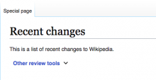
Page MenuHomePhabricator

Small changes to "Other review tools" link
Closed, ResolvedPublic

Description

Please make the following small style tweaks to the Other review tools link on Recent Changes:

  • Reduce the separation between the label and the expand/collapse icon.
  • The expand/collapse icon should be using the same color as the label (blue).

See screenshot below
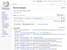
RC-combined.png (768×1 px, 273 KB)

Event Timeline

@Volker_E, this is a second request to have progressive version of down/up indicator, but no indicator is progressive. The mockups for personal header redesign on Content Translation dashboard also use progressive down indicator - T160918: Adjust the personal header to align with the design styleguide.

Should I request changes to upstream or such design isn't following style guides?

@jmatazzoni @Petar.petkovic We've been removing “flagged”(blue) drop down indicators a while ago upstream, as it didn't apply consistently nor did it seem to provide a useful logic for users especially in related combinations like icon-only plus indicator buttons.
See current (as of v0.24.1) combinations of framed ButtonWidgets:

image.png (468×1 px, 67 KB)

In my opinion that should be an upstream request, as it doesn't make sense to solve this on a per project base. Either we identify this as generally useful or we don't. Involving @Pginer-WMF as well.

In my opinion that should be an upstream request, as it doesn't make sense to solve this on a per project base. Either we identify this as generally useful or we don't. Involving @Pginer-WMF as well.

I agree in resolving it upstream. The specific case of Recent Changes can serve as one example of application. I think that the general usecase would be to create link-like actions. These actions are intended to be low prominence and represent navigation.

For those cases frameless buttons are used, and the fact that modifiers use a different color breaks the link aspect (for example, compared with external links and the icon that follows them). Maybe a frameless button is not the right component for this (which one should it be?), or we just don' wan't to support such usecase.

Two questions:

  • How long do we need to wait for this upstream solution?
  • What would this look like with your new thingamjiggy?

Change 393770 had a related patch set uploaded (by Petar.petkovic; owner: Petar.petkovic):
[mediawiki/core@master] Small change to "Other review tools" link

https://gerrit.wikimedia.org/r/393770

Until down/up indicator color is resolved upstream, I have reduced the separation between the label and the indicator.

I'm not sure what the wanted outcome should be with the latest comments?

There was actually another reason to have the dropdown indicators black, it hints at the action not taking the user to another screen but gives them a menu on the same screen.

Change 393770 merged by jenkins-bot:
[mediawiki/core@master] Small change to "Other review tools" link

https://gerrit.wikimedia.org/r/393770

I'm not sure what the wanted outcome should be with the latest comments?

Your first comment suggested that there is upstream request to be solved.

In my opinion that should be an upstream request, as it doesn't make sense to solve this on a per project base. Either we identify this as generally useful or we don't. Involving @Pginer-WMF as well.

That made me think you are considering if request to have progressive indicator is valid.


Since first request (reduce the separation between the label and the expand/collapse icon) is done, I leave the "expand/collapse blue icon" problem for @jmatazzoni to rethink.

The following spec is done:

Reduce the separation between the label and the expand/collapse icon.

current production wmf.10betalabs with the fix
Screen Shot 2017-12-04 at 5.11.26 PM.png (210×407 px, 22 KB)
Screen Shot 2017-12-04 at 5.11.41 PM.png (180×418 px, 23 KB)

@jmatazzoni - the following spec is not implemented - see @Petar.petkovic comment above.

The expand/collapse icon should be using the same color as the label (blue).

QA Recommendation: Product should weigh in

@jmatazzoni @Petar.petkovic Thanks for taking the outlined concern into consideration!