Page MenuHomePhabricator

Redesign tested Iterations of the Language Box (aka Term Box)
Closed, DuplicatePublic

Authored By
Hanna_Petruschat_WMDE
Nov 13 2017, 4:14 PM
Referenced Files
F10900400: Term box rework – Kitchen Test.pdf
Nov 20 2017, 1:15 PM
F10810666: termbox.png
Nov 15 2017, 5:04 PM
F10810343: Start Alt4-1.png
Nov 15 2017, 4:48 PM
F10810344: Start Alt4-3.png
Nov 15 2017, 4:48 PM
F10810345: Start Alt4-2.png
Nov 15 2017, 4:48 PM
F10804922: box.png
Nov 15 2017, 11:44 AM
F10804946: Start Alt4 copy 2.png
Nov 15 2017, 11:44 AM
F10804912: Start All.png
Nov 15 2017, 11:44 AM

Description

Issue:
In past user tests we found out the current clickdummy wasn't understandable. The fact to save languages for future language boxes was not clear enough.

Solution:
Design a layout which lets users understand how to select and save languages for language boxes.
Event Timeline

There is currently a small wmde internal testing round taking place, which looks at the following suggestions:

The two versions have the following approaches:

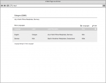
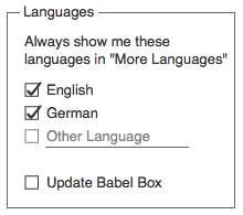
  1. Have an extra a settings box to add, save and remove languages from the list as well as adjusting your babel box through the pop up. The positioon for it could be either next to the edit button, the cog wheel or below the language box:

Start All.png (778×1 px, 30 KB)

This would show a pop up like this:
box.png (184×207 px, 8 KB)

  1. The other approach tackles the task more organically. You can add single languages to the list and then decide to pin them for future language boxes or unoin them if not want them anymore. The pin/unpin solution would be smoother than a simple button or just automatical adding and then an "x" to remove the line as people might be worried to delete the language from the data set.

Start Alt4 copy 2.png (778×1 px, 35 KB)

The test will be held until Monday morning, 20th of November. Test results are gonna be put here asap.

Neither of them seems to tackle the issue of showing more languages that are in the item but that the user doesn't currently have shown. Is that intentional?

I don't fully understand your question. Maybe a little further explanation from my side helps:

  1. Signed in users gonna see the languages they have in their babel box as default. IP's gonna see languages connected to the geolocation.
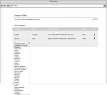
  2. The second version has the "Other Languages" drop down.
  3. When choosing another language this language will be shown additionally and the "other language" dropdown will jump to the next line.

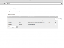
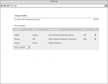
Like this:

Start Alt4-1.png (778×1 px, 28 KB)

Start Alt4-2.png (889×1 px, 56 KB)

Start Alt4-3.png (778×1 px, 31 KB)

If a user is currently editing there would be a "add language" underneath the "show all entered languages" in the expanded view.

  1. To have a language shown up ("saved") in future language boxes, one would check the pin or unpin an item if not wanting to see it in future language boxes anymore.

The pop up in version one offers a similar behaviour.

Does that help?

I am talking about what is ishown when this link is clicked currently:

termbox.png (348×998 px, 20 KB)