Page MenuHomePhabricator

Item lable table opened/closed by a link, should indicate visual connection between both states.
Closed, InvalidPublic

Description

Issue: Follow UI standards, least surprise for users when using a function.

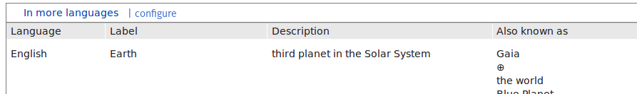
The table for the different languages/names of an item is currently shown via a link:

Screenshot from 2017-02-08 15-52-03.png (50×297 px, 1 KB)

and looks opened this way:
Screenshot from 2017-02-08 15-52-11.png (92×601 px, 6 KB)

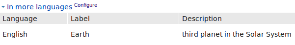
The shown/collapsed and the not-shown/collapsed version should bear some visual connection, instead of using a link with a triangle to indicate its function as a open/close trigger.

Easiest would be introducing a line:

lineWiktionary.png (42×953 px, 1 KB)

Indicating the hidden table.
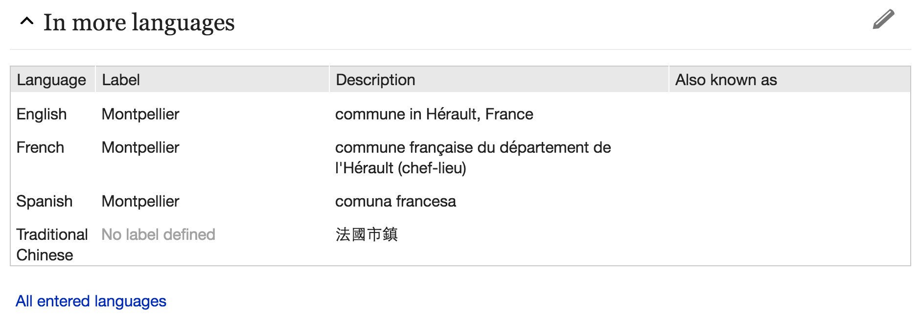
A more heavy, but also more standard way would be using an accordion-element:
akkordionWiktionary.png (42×953 px, 1 KB)

wiktionaryAkkordion.png (133×893 px, 11 KB)

Event Timeline

Jan_Dittrich renamed this task from Item Title Table triggered by a link, should indicate visual connection between both states. to Item lable table opened/closed by a link, should indicate visual connection between both states..Feb 8 2017, 3:09 PM

I'm gonna give my 2 cents on the topic:

Design critique

  • The current version (blue link preceded with right or down arrow) is, I believe, very inconsistent with any other user interface. I think the solution should aim at changing that too.
  • Introducing a line below the text does not make it more intuitive to me. I'd rather avoid the line and add a left margin to the table to display some hierarchy.
  • The accordion-element-like option does not make it more intuitive either. In fact, I think it makes the table more confusing (there is now another header row to the table, although not helping the rows and columns definition) and makes the presentation more cluttered in general.

Suggestion

  • If possible, I think I would like to see something similar as the collapsible sections in MobileFrontend (minerva skin)

Screen Shot 2017-02-08 at 4.11.20 PM.png (666×1 px, 114 KB)

Side note

  • For the record there is also this option Manual:Collapsible_elements, but I can't see it as an interesting solution (imho, doesn't look very good and wouldn't fit well in the UI).

After the weekly engineering meeting we decided the following:

  • Expand-link
    • We start with the adding a line below the link-option (border bottom and changing the width of the link to the width of the expanded term box
    • Later we may add a full box around it instead of just a line
  • "configure"
    • Keep with "In more languages" link
    • Change the wording to "configuration help"
  • "All Languages"
    • we draw a box around the bottom "All languages link". Its top border collapses with the bottom border of the term box.
    • "All languages" gets a little blue arrow

Revision Slider has also an accordion (T145934), so has advanced search (T101087)

Lydia_Pintscher moved this task from incoming to ready to go on the Wikidata board.

Will be handled as part of the current term box redesign/restructering in T180368.