Page MenuHomePhabricator

Small-screen testing and adaptation for Compact Language Links
Closed, ResolvedPublic

Description

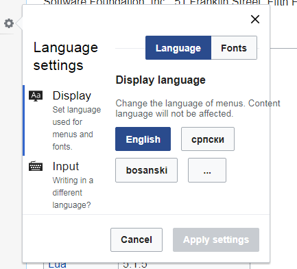
Compact Language Links should be tested on small desktop screens, and possibly be made more responsive.

Note that this is not about complete adaptation for mobile web, because at the moment MobileFrontend has its own completely separate interlanguage links selector. This is only about smaller desktop screens.

Event Timeline

Restricted Application added a subscriber: Aklapper. · View Herald Transcript
Amire80 triaged this task as High priority.Jan 2 2018, 2:04 PM

Is there any exact number behind what "small desktop screen" is?

For CX responsiveness, we settled on 500px-700px-1200px breakpoints. But that includes and mainly revolves around adding the mobile support. However, those numbers need to be revisited (soon) in the future. Since you claim this is not about adaptation for mobile web, I wonder how small desktop sizes we want to support? I doubt there are issues on 1000px+ screen sizes, and for values below, do we even consider that as desktop?

Let me preface by saying we have three width classes for ULS - narrow, medium and wide, defined by following CSS rules:

.uls-wide {
    min-width: 715px;
    width: 45%;
}

.uls-medium {
    min-width: 360px;
    width: 30%;
}

.uls-narrow {
    min-width: 180px;
    width: 20%;
}

Here are some observations of three types of ULS dialogs we display in various forms: CLL, ULS on the top (like one on CX) and language settings (above CLL).

Language settings

This dialog is always displayed with wide width. Adding sidebar width on Vector skin, that results in 900px+ needed to display whole dialog. Here is how it looks if we change wide class to medium class. The min-width rule makes it look like this until 1250px+, when percentage width rule kicks in. We may need new design for smaller widths layout.

language-settings-with-uls-medium-class.png (392×433 px, 17 KB)

Besides that, there is "scroll into view" problem that appears on both monobook and vector. Here is a gif showing what's happening (after clicking the cog, browser window is scrolled by code, and I scroll down using mouse wheel afterwards):
click-on-language-settings-scrolls-window.gif (674×927 px, 2 MB)

Also, the cog seems unclickable on "Modern" skin.

Compact language links

CLL tries to be a little smarter by taking number of languages into account, when deciding one of three possible widths. Here is the table showing the rules applied:

NarrowMediumWide
Up to 25 languages25-99 languages100+ languages

This leads to similar situation when there are 100+ languages - screen size above 900px is needed to fit the content. There are also Timeless skin-specific problems, shown on screenshots below:

Overflow on 860px sizeCLL becomes detached
timeless-cll-problem-860px-screen-size.png (936×844 px, 109 KB)
timeless-cll-detached-860px-screen-size.png (927×844 px, 126 KB)

ULS at the top

This regards ULS for UI language change, like on CX or multi-lingual wikis like mediawiki.org. Since there are currently well over 100 possible languages, this dialog is also displayed always as wide. Since we have min-width: 715px;, the dialog not fitting the browser window can occur on screen sizes smaller than 715px. Not sure if this falls into small desktop category, but certainly looks unprofessional when ULS does not fit browser viewport.

Since CX is essentially responsive web app, not using Mobile Frontend, I needed to make adjustments with custom code calculating the ULS width, depending on screen width and number of languages. Here is the current behavior:

Wider than 1200px AND more than 24 languagesWider than 500px AND more than 12 languagesElse
widemediumnarrow

My suggestion

We should upstream modified version of my custom code from CX. The width of ULS should depend on BOTH screen width and number of languages. That will solve ULS not fitting the browser viewport.

Other problems described in this comment should be fixed separately, with their own tickets, and skin-specific ones should be external.

We definitely should fix this in jquery.uls like you propose. I also propose we get rid of the unused and unmaintained mobile rules while we do it.

I would also split fixing the language list (coming form jquery.uls) and fixing the language settings (ULS extensions) as separate tasks and prioritize them independently.

Petar.petkovic added a subscriber: Etonkovidova.

For @Etonkovidova, while doing QA:
This ticket doesn't reflect what has been done as part of the patch. The ULS is changed to adopt to screen size before appearing. It currently isn't resizing correctly if you have ULS open and resize browser window, but takes new screen size into account on next appearance.

I checked CLS on a small screen (browser), the mobile emulator in Chrome browser, and some real mobile devices - UX might not be perfect, but it's not jarring. Aside from the issues filed by @Petar.petkovic, all functionality and all visual elements are in place.

One thing though: MinervaNeue skin does not display access to CLL (at least I did not see it). @Amire80 Since, MineraNeue is the skin for the mobile web, would it be desirable to have ULS there?