Page MenuHomePhabricator

Adjust the labels shown in the responsive approach for the dashboard title
Closed, ResolvedPublic

Description

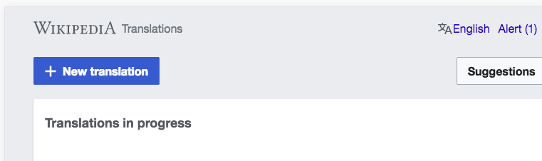
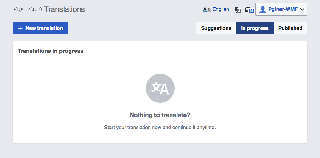
The Translation Dashboard shows a Wikipedia logo and a title ("Translations"). These get adapted depending on the screen size (T160918). On large screens, the full wordmark ("Wikipedia") is shown while on small screens the "W" icon is used instead.

The current behaviour is shown below:

Wide screenMedium screenSmall screen
Screen Shot 2018-02-09 at 11.53.47.png (503×1 px, 49 KB)
Screen Shot 2018-02-09 at 11.56.01.png (503×842 px, 44 KB)
Screen Shot 2018-02-09 at 11.56.46.png (522×400 px, 32 KB)

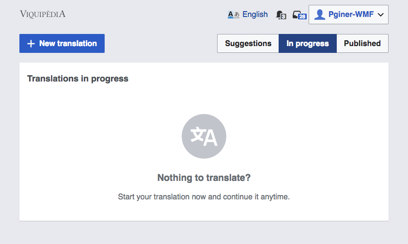
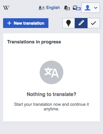
For small and wide screens the behaviour is as expected. However, for medium size screens adjustments are needed.

  • The "Translation" label should be visible to communicate the title of the tool.
  • The "W" icon should be used instead of the full Wikipedia wordmark, when more room is needed for the title to fit.

Event Timeline

Pginer-WMF triaged this task as Medium priority.Feb 9 2018, 11:27 AM
Pginer-WMF added a subscriber: Petar.petkovic.

Change 412904 had a related patch set uploaded (by Petar.petkovic; owner: Petar.petkovic):
[mediawiki/extensions/ContentTranslation@master] Adjust personal header labels

https://gerrit.wikimedia.org/r/412904

This was done on purpose. I assumed wordmark is more important than displaying tool name, which isn't always nice and short as "Translations". Localized messages can be longer. Also, we use personal header in translate view and Content Translation Stats page, where text is longer in English and can be pretty long in localized messages. Also, overrides apply on those messages too, like we saw on T185277.

I plan to revisit the values, but as it currently stands, breakpoints are:

  • very-narrow: below 500px
  • narrow: 500px-699px
  • medium: 700px-1199px
  • wide: 1200px

Having those in mind, my proposed change for this ticket looks like this:

Below 500px500-699px700-999px1000px+
personal-menu-450px.PNG (57×433 px, 3 KB)
personal-menu-560px.PNG (53×544 px, 4 KB)
personal-menu-750px.PNG (57×734 px, 5 KB)
personal-menu-1050px.PNG (54×1 px, 6 KB)

This is code is somewhat fragile as we do not query directly whether there is enough space to display the wordmark or the title (it might be possible with some new CSS queries someday). Especially on the stats page it is quite easy to cause an overflow. But given the overflow works nicely and nothing breaks or overlaps, that's probably acceptable.

This is code is somewhat fragile as we do not query directly whether there is enough space to display the wordmark or the title (it might be possible with some new CSS queries someday). Especially on the stats page it is quite easy to cause an overflow. But given the overflow works nicely and nothing breaks or overlaps, that's probably acceptable.

That was my initial idea, to allow overflows and make them usable. But, I made an effort to keep overflow cases as low as possible by showing the text after 1000px mark. Content translation statistics page has lengthy message and big paddings around the content.
Elements that can grow in size - tool name (such as "Translations"), ULS autonym and username are textual and can be truncated to keep whole toolbar on one line, but that idea wasn't accepted.

I would like @Pginer-WMF to take a look at proposed changes.

I would like @Pginer-WMF to take a look at proposed changes.

This seems a good approach. Breakpoints are defined to work well on common cases, and wrapping can be good-enough for the edge cases.
I'd proceed with this approach and evaluate some of the edge cases later if needed.

Change 412904 merged by jenkins-bot:
[mediawiki/extensions/ContentTranslation@master] Adjust personal header labels

https://gerrit.wikimedia.org/r/412904

Etonkovidova subscribed.

Checked in testwiki (wmf.23)

Below 500px500-699px700-999px1000px+
Screen Shot 2018-02-27 at 3.20.15 PM.png (238×379 px, 17 KB)
Screen Shot 2018-02-27 at 3.19.58 PM.png (301×690 px, 25 KB)
Screen Shot 2018-02-27 at 3.13.18 PM.png (412×772 px, 40 KB)
Screen Shot 2018-02-27 at 4.04.53 PM.png (226×761 px, 26 KB)

@Pginer-WMF There is one small issue - the font for 'Special:ContentTranslationStats' title looks rather small comparing with other fonts on the page:

Screen Shot 2018-02-27 at 4.02.25 PM.png (459×833 px, 52 KB)

@Pginer-WMF There is one small issue - the font for 'Special:ContentTranslationStats' title looks rather small comparing with other fonts on the page:

Screen Shot 2018-02-27 at 4.02.25 PM.png (459×833 px, 52 KB)

I tried and I don't see it that small. Maybe some punctual issue was happening when you tried that caused some styles not loading for you (note that notification badge icons are also missing in that screenshot)

I tried and I don't see it that small. Maybe some punctual issue was happening when you tried that caused some styles not loading for you (note that notification badge icons are also missing in that screenshot)

I cannot see smaller font either. If that keeps coming back and proves to be real problem, please report as separate ticket @Etonkovidova.