Page MenuHomePhabricator

Improve language icon discoverability in mobile by using icon in desktop
Closed, InvalidPublic

Description

It's important to have consistency across mobile and desktop in certain ways to help bridge the gap between interfaces.

Many users have commented that the ability to change language is impossible in mobile. This is likely because the icon in mobile is currently not accompanied by text and given space is a constraint in mobile design, difficult to fix.

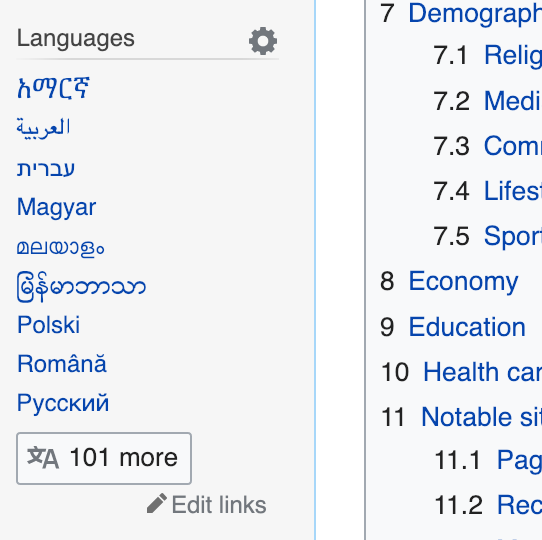
To unify these UI's we can add an icon to the languages heading in Vector like so:

language-icon-vector.png (479×480 px, 228 KB)

This should strengthen the language icon's meaning for users in desktop and help people navigate between languages better on mobile.

See T210865 for more background

Event Timeline

Change 479718 had a related patch set uploaded (by Jdlrobson; owner: Jdlrobson):
[mediawiki/skins/Vector@master] A language icon shows next to languages header

https://gerrit.wikimedia.org/r/479718

Jdlrobson triaged this task as Medium priority.Dec 14 2018, 4:46 PM
Jdlrobson moved this task from Incoming to Triaged but Future on the Web-Team-Backlog board.

I would be very careful with introducing such. We're all clear that the current link garden could see improvements.
But this doesn't seem to improve user-experience to me for several reasons:

  • Icons in the Vector sidebar are currently all interactive elements (the edit pencil underneath languages. the cog wheel), this would be only decorative one opposing the logic elsewhere
  • When we add an icon there, people will ask why “Tools”, “Interaction” and “Print” don't carry ones?
  • The icon does give the area more focus, but it's not clear to me from the description if this is really needed. The focus should be the content and not the functions around it.

As a matter of fact, the icon already appears on desktop.

This is not what most people see in Wikipedia articles:

language-icon-vector.png (479×480 px, 228 KB)

This is what most people see in Wikipedia articles:

Screenshot_2018-12-20 Yangon - Wikipedia.png (540×542 px, 50 KB)

By default, the Compact Language Links feature is enabled to anonymous users, so if there are more then 9 languages in the sidebar, the "More" button is shown, and it includes Wikimedia's "文A" language icon. (Caveat: The Compact Language Links feature doesn't work on the main page in several projects, including the English Wikipedia. It's a complex issue tracked at T179140. But everywhere else the list is compact.)

This icon is not shown if there are less than 9 languages, and when it is shown, it is shown at the bottom of the list and not at the top as the initial task description suggests. So yeah, it's not perfectly consistent as it should be.

For esthetics and consistency it may be a good idea to always show the icon and perhaps the "More" button, even when the languages list is small. However, I am skeptical about the effectiveness of this measure in strengthening the language icon's meaning for desktop users. Maybe it will work and maybe it won't. See also my long comment at T210865#4837020 about the generally problematic concept of "language icon".

To sum up, while I'm not squarely opposed to the suggestion in this task, I don't think that it will actually be a big step towards making languages more accessible on either desktop or mobile environments. A more comprehensive solution is needed, and it has to involve proper goal setting and design research. Some food for thought about this can be seen at https://www.mediawiki.org/wiki/Interlanguage_links/Implementation_comparison.

Change 479718 abandoned by Jdlrobson:
A language icon shows next to languages header

https://gerrit.wikimedia.org/r/479718

As @Amire80 points out the icon is already used in some places. With the roll out of Desktop Improvements (Vector 2022) this should get better. AS task creator - resolving :)