Page MenuHomePhabricator

Increase readability of the Saved filters box
Open, Needs TriagePublic

Description

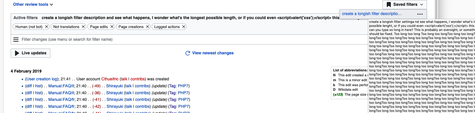
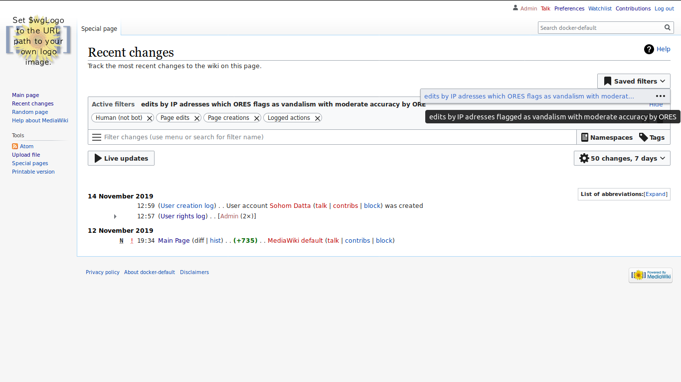
At the moment, the box for Saved filters is narrow. Long filter descriptions are not easy to read, unless you hover them to get a tooltip. The request is to have them readable entirely.

For GSoC 2019, the microtask objectives will be:

  1. limit the max input length for the filter description. We don't have a finalized input length, but we could start with 128 characters and then get feedback
  2. expand the width of the saved filter display. Again we don't have a finalized width, but use your judgement and we can get feedback

Event Timeline

image.png (391×1 px, 181 KB)

We might want to also limit the maximum input length for the description.

I want room for a long descriptive title on one wide line. Not a long title spread out over several lines. I want to be able to scan a list of filter set titles. That can be done quickly if each filter set title is on one line. And if there is no need to hover to get the full description.

Change 551160 had a related patch set uploaded (by Sohom Datta; owner: Sohom Datta):
[mediawiki/core@master] Expanded size of saved filter popup and added character limit

https://gerrit.wikimedia.org/r/551160

While fiddling around the interface, I found that the title element does not update when the filter is renamed.. Should I file a separate task for this bug ?

Screenshot from 2019-11-15 22-06-30.png (768×1 px, 110 KB)

Change 551160 abandoned by Sohom Datta:
Expanded size of saved filter popup and added character limit

Reason:
Nah, too many errors, I should probably be doing this from inside the model itself and then adding constrains to the UI

https://gerrit.wikimedia.org/r/551160

Soda removed Soda as the assignee of this task.Dec 4 2019, 4:06 PM
Soda subscribed.