Why are we doing this?
As we work on updating the history and diff pages, we would like to make it easier for users to be able to tell how active editing on an article is.
User story
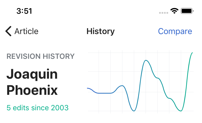
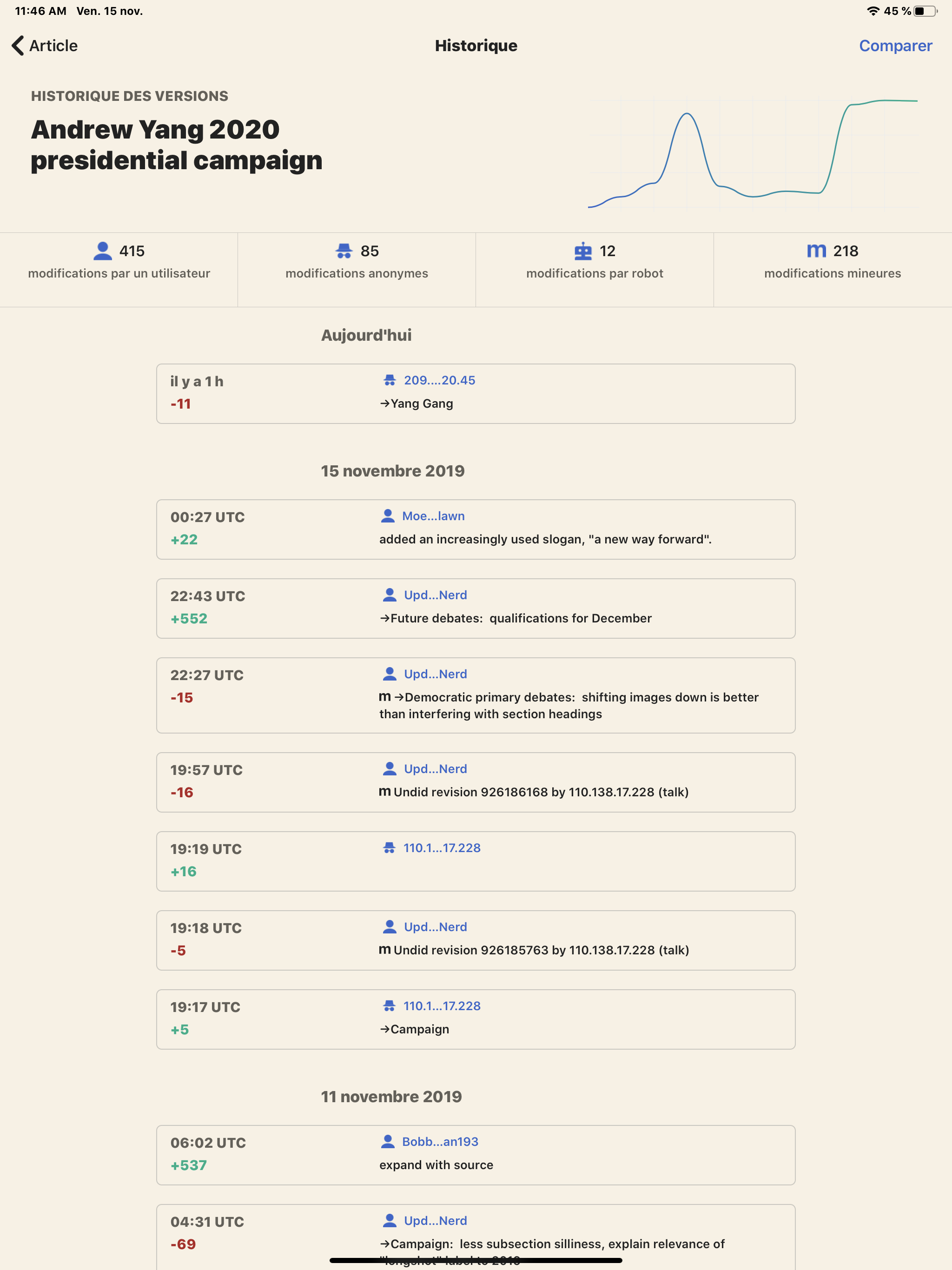
As a curating reader or a contributor I want to see the recent editing activity level as a spark line so that I have a quick understanding of how an article has changed over time.
Design details
Design principles
- Glanceable: The spark line should illustrate an overall trend or pulse of editing activity on an article, rather than specific measurements
- Tailored: Rather than creating a 'one-size-fits-all' graph for all articles of all ages, we should tailor the axes measurements based on the specific editing history of the article at hand.
Defining the X and Y axes
X axis
Time as represented in months with a span of one year (as is available from the API)
Y axis
Number of edits with the top of the Y axis defined by the maximum number of edits that had occurred in the articles defined time period (eg. if there were 500 one month the Y axis would be 600).
Empty states
- If there is no editing data or not enough editing data to chart, do not show the graph
Questions
- Should we make the graph clickable so that users can see more granular information about the graph and article?
- Should we label the axes?