Page MenuHomePhabricator

ContentTranslation's sticky translation filter should feature a box-shadow
Open, MediumPublic

Description

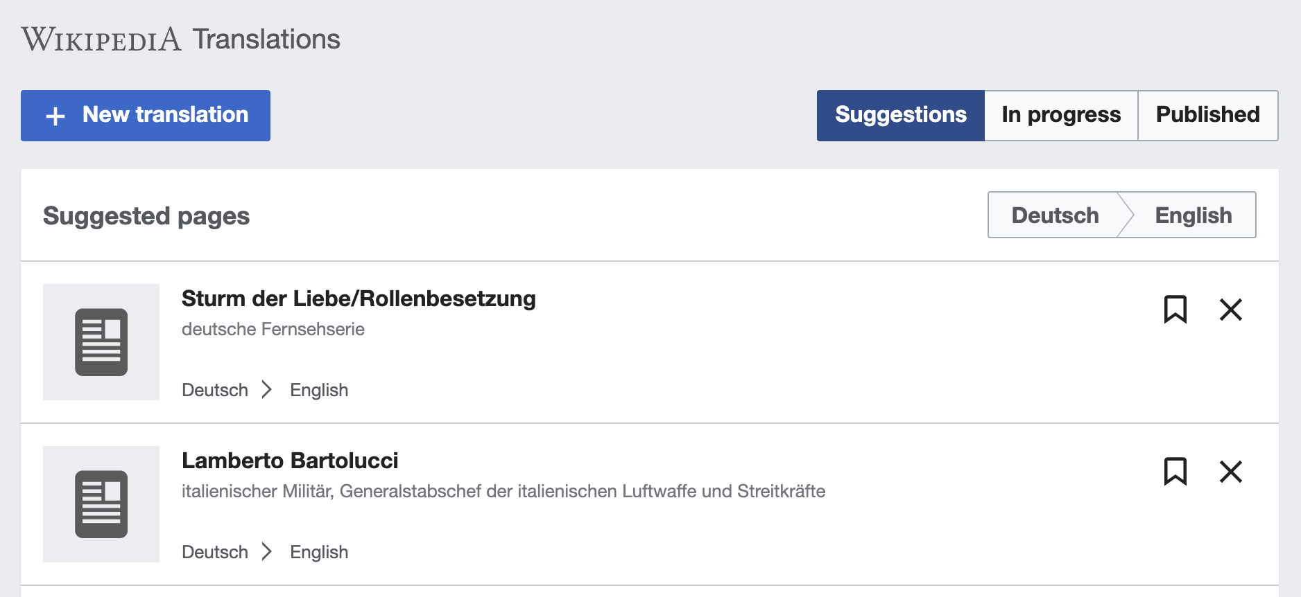
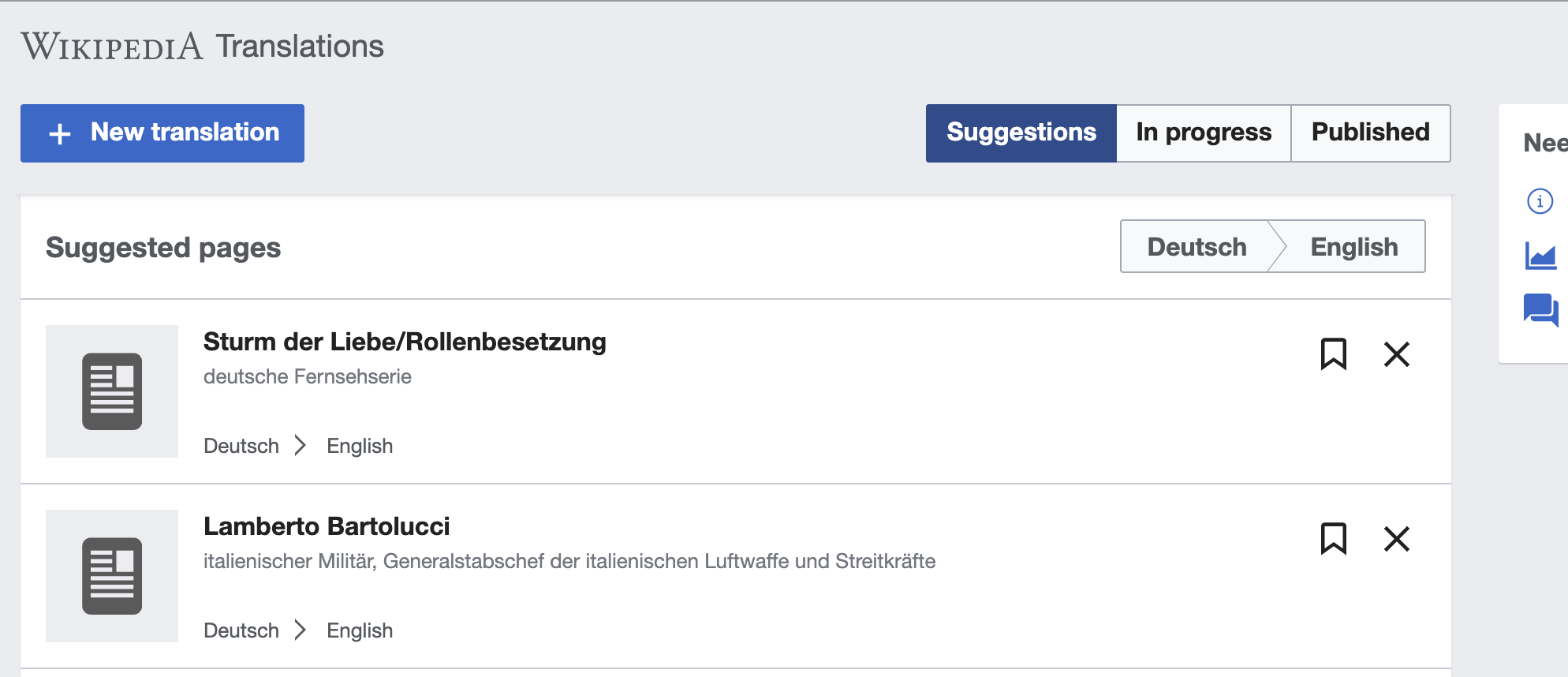
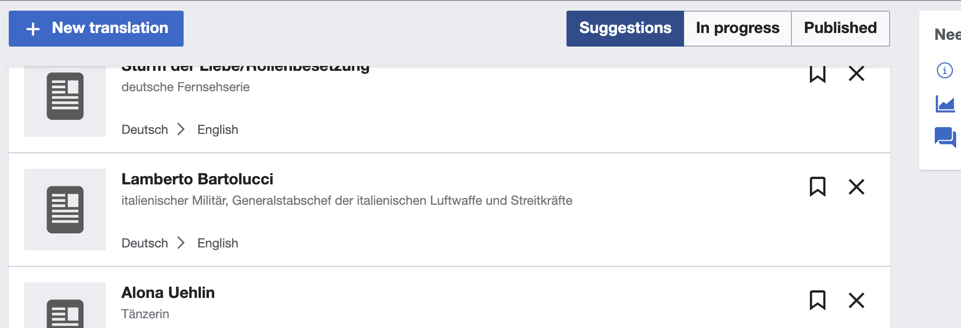
ContentTranslation's sticky translation filter currently stays flat in visual terms, while it's position: sticky.
It should feature a one-sided, bottom box-shadow to emphasize scrollability of content underneath. On GUI systems like macOS, with hidden scrollbars, that's an additional hint for better discoverability.
Also it's in line with our default approach where to use drop shadows and with the card-like appearance of “Need help translating” aside.

StatusProposedProposed while scrolling
image.png (862×1 px, 106 KB)
image.png (858×1 px, 115 KB)
image.png (676×1 px, 89 KB)

Event Timeline

Restricted Application added a subscriber: Aklapper. · View Herald Transcript

Change 575798 had a related patch set uploaded (by VolkerE; owner: VolkerE):
[mediawiki/extensions/ContentTranslation@master] Add box-shadow to sticky translation filter bar to emphasize scrollability

https://gerrit.wikimedia.org/r/575798

Change 575798 merged by jenkins-bot:
[mediawiki/extensions/ContentTranslation@master] Add box-shadow to sticky translation filter bar to emphasize scrollability

https://gerrit.wikimedia.org/r/575798

I think it makes sense to add the shadow when the list is scrolled, but not initially. Adding it before any scroll adds more noise than clarity in my opinion.

I think it makes sense to add the shadow when the list is scrolled, but not initially. Adding it before any scroll adds more noise than clarity in my opinion.

Based on team input, supporting this seems too complex for the current dashboard, and the effort may not be worth it since the dashboard is in the process of a refactoring (T243583).

Let's revert the change, and consider the requirement for the new dashboard.

Pginer-WMF triaged this task as Medium priority.
santhosh subscribed.