Page MenuHomePhabricator

First steps towards a better search
Closed, ResolvedPublic5 Estimated Story Points

Assigned To
Authored By
scblr
Aug 5 2020, 3:31 PM
Referenced Files
F32366471: Pixel 3.png
Sep 28 2020, 1:56 PM
F32366464: Screenshot_20200928-144220.png
Sep 28 2020, 1:56 PM
F32366455: Screenshot_20200928-143041.png
Sep 28 2020, 1:56 PM
F32366461: main-search-05 2.png
Sep 28 2020, 1:56 PM
F32366469: Pixel 3.png
Sep 28 2020, 1:56 PM
F32351627: IMG_20200915_163644.jpg
Sep 15 2020, 2:40 PM
F32351622: IMG_20200915_163227.jpg
Sep 15 2020, 2:33 PM
F32349865: Screenshot_20200914-121710.png
Sep 14 2020, 11:17 AM

Description

First steps towards an improved search experience (👉 Zeplin)

These is are the first action items for an improved search experience on Android. The discussions and feedback in the design team to achieve consistency across products and innovation is ongoing. Consider this as an advanced prototype that’ll serve as as a blueprint for further discussions / optimizations.

1) Move search to main navigation.

search-01.png (1×720 px, 595 KB)

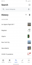
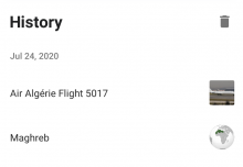
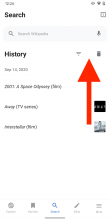
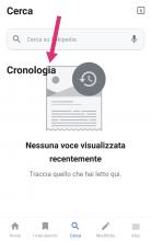
2) Combine History and Search in one tab.

main-search-01.png (1×720 px, 182 KB)

  • Keep Filter and Clear history functionality
  • Align filter and trash icon with History label
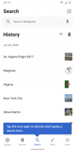
3) Incorporate onboarding tooltip when users access search for the first time.

main-search-02.png (1×720 px, 182 KB)

  • Copy: `Tap the icon again to directly start typing a search term.
  • The tooltip informs users about how to quickly access the search (by tapping one more time).
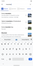
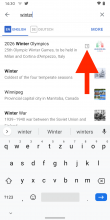
4) Include up to 3 relevant search results from My lists, History and Open tabs (from all languages).

search-05.png (1×720 px, 269 KB)

  • Show top result/article from 1. Open tabs 2. My lists 3. History (max 3 personalized results)
  • Avoid duplication of results
    • If results from Wikipedia, My lists, Open tabs or History overlap, show it once.
  • Surface articles from My lists, not the list itself.
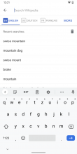
5) Search on Explore or Article takes users to a search modal with the keyboard enabled

main-search-03.png (1×720 px, 153 KB)

  • Tapping back leads users to where they came from (Explore or Article)
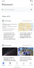
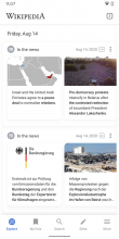
6) Keep floating search bar on Explore, but remove the magnifying class icon that appears on scroll.

main-search-00.png (1×720 px, 558 KB)

Event Timeline

scblr updated the task description. (Show Details)
Charlotte updated the task description. (Show Details)
Charlotte set the point value for this task to 5.
scblr updated the task description. (Show Details)

@schoenbaechler This is obvious... but just mentioning it here for posterity:

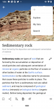
  • In article overflow menu it will show 'Search' instead of 'History'

pageOverflow.png (2×1 px, 1 MB)

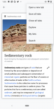
  • In tabs overflow menu it will show 'Search' instead of 'History'

tabOverflow.png (2×1 px, 1 MB)

Hi @schoenbaechler, I have a few qs:

When you open search from main bottom nav tab, history needs to be shown:

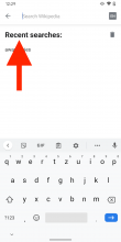
And… when opened from article, recent searches need to be opened.

  • Should History be shown here?

Also, just to clarify, search results look like this, no matter where you search from: https://app.zeplin.io/project/57a120b91998d8977642a238/screen/5f2bdb850b110f263d943ff9v

Thx checking @Sharvaniharan

What happens when no history items are available?

Should we still have History 'filter' icon next to the 'delete' icon here: https://app.zeplin.io/project/57a120b91998d8977642a238/screen/5f2bdb88098e0e277b5b346b ?

Please hide all interface elements related to history when there’s no history yet. As soon as there is one, show it.

And… when opened from article, recent searches need to be opened.
Should History be shown here?

No, let’s keep recent searches when the keyboard is active — we don’t want to remove this functionality.

Also, just to clarify, search results look like this, no matter where you search from: > https://app.zeplin.io/project/57a120b91998d8977642a238/screen/5f2bdb850b110f263d943ff9v

Yes, exactly!

Hi @schoenbaechler thank you so much for the timely answers :)

I have a couple suggestions which would make it very easy for us to use the same fragment at both search places, Bottom Nav and from article:

  • 1. Would it be possible to unify the design for Search bar at the top for both cases : From Nav Tab and from article search

Screen Shot 2020-08-11 at 4.48.50 PM.png (156×922 px, 23 KB)
Screen Shot 2020-08-11 at 4.46.09 PM.png (128×712 px, 17 KB)

It would still be ok to have minor differences between them like whether to have elevation, back arrow, or not based on where it is shown, etc.., but if they could look alike, that would be great.

  • 2. Would it be possible to unify the design between the 'Recent searches' and 'History'?

Both of them just show different lists with a label and delete button, so if we could have same font styles, etc we can use the same list to display different things at different places:

Screen Shot 2020-08-11 at 5.12.00 PM.png (368×940 px, 31 KB)

Screen Shot 2020-08-11 at 4.49.22 PM.png (496×716 px, 49 KB)

@Sharvaniharan

I have a couple suggestions which would make it very easy for us to use the same fragment at both search places, Bottom Nav and from article:

  • 1. Would it be possible to unify the design for Search bar at the top for both cases : From Nav Tab and from article search

Screen Shot 2020-08-11 at 4.48.50 PM.png (156×922 px, 23 KB)
Screen Shot 2020-08-11 at 4.46.09 PM.png (128×712 px, 17 KB)

We need to make a distinction here.

  • The image at the top should be the active state with keyboard from the article and nav.
  • The lower image is a floating search bar, which is displayed at the top of the Search nav item. It should work similar to the search on Explore. Tapping it leads to the active state with keyboard (the first image).

The two scenarios can’t be unified, as these are two separate states..

  • 2. Would it be possible to unify the design between the 'Recent searches' and 'History'?

Both of them just show different lists with a label and delete button, so if we could have same font styles, etc we can use the same list to display different things at different places:

Screen Shot 2020-08-11 at 5.12.00 PM.png (368×940 px, 31 KB)

Screen Shot 2020-08-11 at 4.49.22 PM.png (496×716 px, 49 KB)

Great suggestion, let’s go with the design for History and no separator lines.

@schoenbaechler Could we please have a generic icon for the tabs search result? Having the actual tabscount view is causing some rendering issues.

Also, about the icon in the top 3 search results, is it aligned to the center of the thumbnail image? If so, how should it be when there is no image? Or, can we just align it to vertical center in any case?

Thank you.

@Sharvaniharan

Could we please have a generic icon for the tabs search result? Having the actual tabscount view is causing some rendering issues.

Can you always use the [1] tab icon? (without dynamic number)

image.png (158×178 px, 5 KB)

It’s more clear than the actual tab icon from Material Design.

Or, can we just align it to vertical center in any case?

Yes, let’s try this and see how it looks / feels.


Thx!

@schoenbaechler Thank you.

Could you please confirm the priority for the top 3 items? I see on zeplin it is Reading Lists -> History -> Tabs. However, If I am not mistaken, I remember discussing on a call to make it Tabs -> Reading lists-> History.

@Sharvaniharan

@schoenbaechler Thank you.

Could you please confirm the priority for the top 3 items? I see on zeplin it is Reading Lists -> History -> Tabs. However, If I am not mistaken, I remember discussing on a call to make it Tabs -> Reading lists-> History.

You’re right ...

  1. Articles from tabs
  2. Articles from reading lists
  3. Articles from History

... makes most sense to me. Will update the task’s description. Thanks for checking.

Great work so far @Sharvaniharan. Having search at tab bar center feels right! But there are some things left to tackle, see below.

01) From the task’s description
  1. Keep floating search bar on Explore, but remove the magnifying class icon that appears on scroll.

This is no yet implemented.


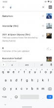
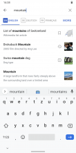
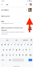
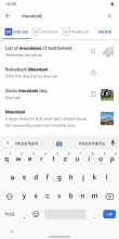
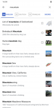
02) Trigger personalized results after 2+ characters, otherwise it leads to situations like this, where users see three personalized results that are based on 1 character.

Screenshot_20200914-130220.png (2×1 px, 207 KB)


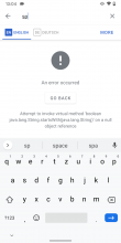
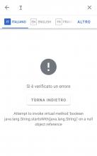
03) Seeing this error quite a lot when searching

Screenshot_20200914-130451.png (2×1 px, 111 KB)


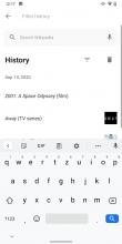
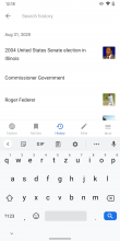
04) Tapping the filter icon in the main view should lead users to a view without a Search bar, History label, Filter or Trash icon (similar to production, see image below). Showing everything at once is currently confusing.
AlphavsProduction
Screenshot_20200914-121710.png (2×1 px, 129 KB)
Screenshot_20200914-121821.png (2×1 px, 162 KB)

05) Gap between Filter and Trash icon is too big. Use the same spacing as for the app bar at the top.
AlphavsZeplin
Screenshot_20200914-122611.png (2×1 px, 161 KB)
main-search-01.png (1×720 px, 146 KB)

06) Label is too big. Use font-family: Roboto Bold; font-size: 16sp here

Screenshot_20200914-122924.png (2×1 px, 132 KB)


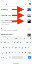
07) I made some updates to icon size that indicate a personalized result, as they felt too small (from 16sp to 20sp). Please also make sure to get the left and right margin for the icons right.
AlphavsZeplin
Screenshot_20200914-125630.png (2×1 px, 277 KB)
main-search-04.png (1×720 px, 204 KB)

https://app.zeplin.io/project/57a120b91998d8977642a238/screen/5f2bdb850b110f263d943ff9/


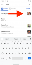
08) Align icons for personalized results when there’s no image, like this:
AlphavsZeplin
Screenshot_20200914-124558.png (2×1 px, 196 KB)
main-search-07.png (1×720 px, 234 KB)

https://app.zeplin.io/project/57a120b91998d8977642a238/screen/5f5f4ab6a176516b5debf400/

  1. 06) Label is too big. Use font-family: Roboto Bold; font-size: 16sp here

@schoenbaechler Since we decided that the styles of 'History' and 'Recent searches' labels should match,

  • should we reduce size only for this or history label too?
  • Also do you still want to unify the styles.

@Sharvaniharan

Since we decided that the styles of 'History' and 'Recent searches' labels should match,

I think haven’t been part of that decision. The label for History should stay the same. The use case for Recent searches is different as users made a conscious decision to tap the search field. At this point, the focus should be on Search. Therefore Recent searches does not to be that big.

But you’re right, if this is implemented...

04) Tapping the filter icon in the main view should lead users to a view without a Search bar, History label, Filter or Trash icon (similar to production, see image below). Showing everything at once is currently confusing.

... we can use the same size for both the History and Search active state (font-family: Roboto Bold; font-size: 16sp).

Let me know if you quickly want to talk about it, e.g. today after standup if it’s unclear. Thx.

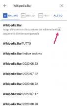
I keep receiving this message while searching

IMG_20200915_163227.jpg (1×1 px, 106 KB)

I've also noted that in my phone when you delete the History, the "History" title hides a little part of the bottom icon.

IMG_20200915_163644.jpg (1×1 px, 133 KB)

  • 2. Would it be possible to unify the design between the 'Recent searches' and 'History'?

Both of them just show different lists with a label and delete button, so if we could have same font styles, etc we can use the same list to display different things at different places:

Screen Shot 2020-08-11 at 5.12.00 PM.png (368×940 px, 31 KB)

Screen Shot 2020-08-11 at 4.49.22 PM.png (496×716 px, 49 KB)

Great suggestion, let’s go with the design for History and no separator lines.

This is what I was referring to @schoenbaechler 😅 But what you said now also makes sense, So i will go with the current decision of slightly different style for 'Recent searches'.

This is what I was referring to @schoenbaechler 😅 But what you said now also makes sense, So i will go with the current decision of slightly different style for 'Recent searches'.

Ah sorry @Sharvaniharan, thx for your understanding 🙈

@Sharvaniharan One other note: the order of the local search results still needs to be updated. Per the notes above, it should be tabs > reading lists > history, whereas right now it's still reading lists > history > tabs.

Thanks @Dbrant . That is done and now in alpha along with a couple design improvements from Dmitry's PR too. @schoenbaechler

Thx @Sharvaniharan & @Dbrant, we’re almost there! 👇

01) Use tab icon [1] from designs, it uses a different style (the number seems to use a different font style?)

ImplementationvsDesign
Screenshot_20200928-143041.png (2×1 px, 270 KB)
main-search-05 2.png (1×720 px, 266 KB)

02) From design review → use filled / saved bookmark icon here.

Screenshot_20200928-144220.png (2×1 px, 248 KB)

03) Make sure the search bar is vertically positioned at the same place as on Explore. Currently, it sits lower.

Pixel 3.png (1×1 px, 669 KB)

04) Make sure Icons for History are aligned with app bar icons

Pixel 3.png (1×720 px, 217 KB)

Success @Sharvani 👏 Thx for the hard work on this!