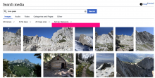
When we removed the gray bar behind the filters it made the padding between the filters and the results too large. It appears to be around 30px right now via a few different elements above and below, I think halving that to about 16px would resolve this while still giving it enough room.
Description
Details
| Subject | Repo | Branch | Lines +/- | |
|---|---|---|---|---|
| Media Search: Decrease padding below filters | mediawiki/extensions/WikibaseMediaInfo | master | +1 -1 |
Event Timeline
Notes:
- @media screen and (min-width: 720px) .wbmi-select__content:
- padding: 6px 36px 6px 12px;
- .wbmi-select__content:
- padding: 11px 36px 11px 12px;
- .wbmi-media-search-filters
- min-height: 2.5em
- padding: 6px 0px
- .wbmi-media-search-results
- margin: 16px 0
@mwilliams Just taken a gander at this. At the moment there is 12-17 px of white space with padding associated with the filters and 16 px of whitespace associated with the search results from a margin.
Do you want to just drop the margin on the search results to 0px to keep the space above above and below the filters symmetric or do you want a degree of asymmetry?
In which case we could keep 4 or 5px on the margin on the search results.
@Jseddon Tested out removing the 16px from the search results and that seems like it does the job nicely!
Change 666385 had a related patch set uploaded (by Seddon; owner: Seddon):
[mediawiki/extensions/WikibaseMediaInfo@master] Media Search: Decrease padding below filters
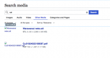
@Jseddon your solution looks great! One question for @mwilliams: do you think the new decreased padding works on the Other Media tab, or do we need a little more space here?
Yeah, I wondered that when I took a look at this @AnneT, thanks for bringing that up.
After spending some more time with it, I think we could offer a bit more space, let's switch that 16px to 6px instead of 0px. Does that sound reasonable?
@mwilliams Sounds good! Just to be clear, do you want that 6px just on the Other Media tab only, or on all tabs?
Change 666385 merged by jenkins-bot:
[mediawiki/extensions/WikibaseMediaInfo@master] Media Search: Decrease padding below filters
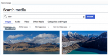
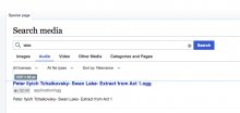
Checked in commons wmf.34 - Audio and Categories and Pages tabs display more space than other tabs (it doesn't seem to me as a bug; it's just visually inconsistent).
| Images (the same for Video, Other Media) | Audio | Categories and Pages |
|---|---|---|
For @mwilliams review - if anything needs to be done. The screenshots are from Chrome.


