Looking at the initial implementation of the language selector (T253303) available for Section Translation at test wiki, the search field needs some adjustments:
- Adjust border radius. Since the search input goes from edge to edge it should use 0px border radius when it is in contact with other elements. That is:
- When there is a header on top (i.e., when the selector is full-screen), use 0px radius on all corners.
- When the search bar is the only element on top (i.e, when the selector is shown as a dialog), use the standard 2px border radius for the top corners, and use 0px radius for the bottom corners.
- Adjust default borders. Use "transparent" for the default border color to increase the edge-to-edge feel on the default border style. The border when active will remain a 2px blue (accent50: #34C) on all 4 sides.
- Make search input sticky. Currently only the header is sticky when the user scrolls through the list. The search bar should also stick with the header to remain visible.
- Add bottom shadow. To better separate the search input from the list, a box shadow will be applied at the bottom side: Base0 at 25% opacity 1px down, 2px of blur.
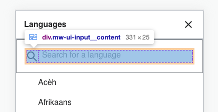
- Adjust placeholder label. The placeholder label, according to T253303 should be "Search languages", currently it is "Search for a language".
- Adjust icon and label misplacement. The search icon seems to be 25px tall based on the inspector (image below) where it was expected to be 20x20px. In addition, the label seems to be aligned to the top part instead of centered vertically. The expected result would be a 20px icon adding no extra space and a label that is vertically centered to it.
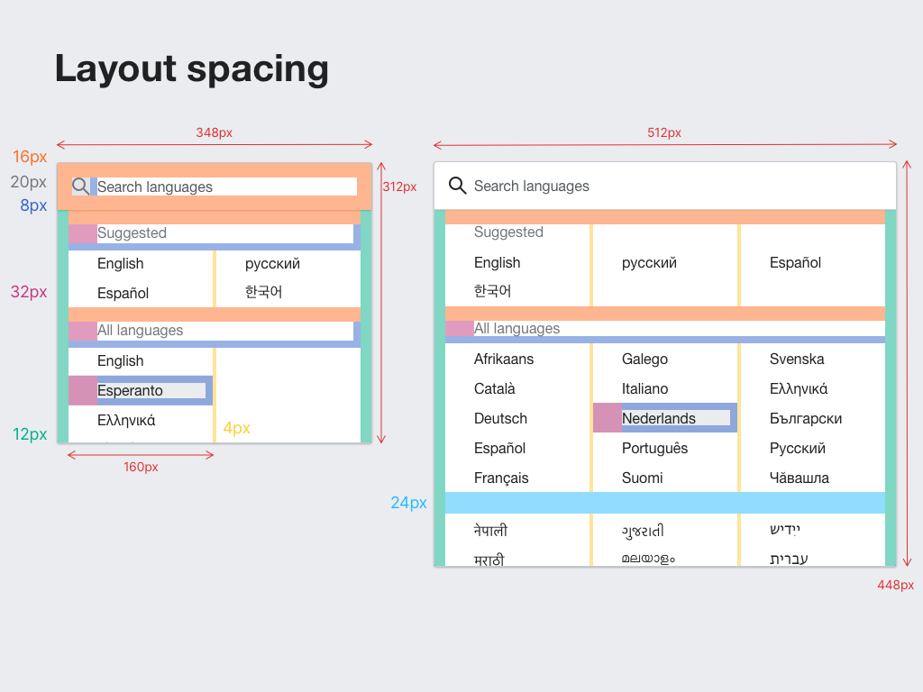
- Adjust padding. The spec defined a 16px distance around the unit that form the search icon and label. However as illustrated in the image above, some elements introduce additional margins that increase the total distance (e.g., in orange you can see an extra 4px added to the 16px separation to the edge). This extra separation needs to be either avoided or accounted for in order to achieve a total of 16x distance with the edges. As a reference from the spec in T253303: