Page MenuHomePhabricator

Evaluate if we want to update the arrow icons
Open, Needs TriagePublic

Assigned To
None
Authored By
bmartinezcalvo
Mar 16 2022, 10:27 AM
Referenced Files
F35009844: Option2.png
Mar 17 2022, 10:30 AM
F35008975: image.png
Mar 16 2022, 5:17 PM
F35008964: image.png
Mar 16 2022, 5:17 PM
F35008960: image.png
Mar 16 2022, 5:17 PM
F35008898: Current component.png
Mar 16 2022, 4:18 PM
F35008902: Option1.png
Mar 16 2022, 4:18 PM
F35008559: Captura de pantalla 2022-03-16 a las 11.21.37.png
Mar 16 2022, 10:27 AM
F35008549: Captura de pantalla 2022-03-16 a las 11.17.16.png
Mar 16 2022, 10:27 AM

Description

Background/Goal

Our Arrow icons (Previous, Next, Expand and Collapse) look too big, specially when they are placed next to text. We need to evaluate if we want smaller arrow icons.

Captura de pantalla 2022-03-16 a las 11.20.11.png (410×824 px, 167 KB)

Captura de pantalla 2022-03-16 a las 11.17.16.png (720×1 px, 461 KB)

Also, we have 2 variants of arrows in our icon system: big and small.

Captura de pantalla 2022-03-16 a las 11.21.37.png (284×1 px, 84 KB)

Use cases

image.png (268×1 px, 59 KB)
Dropdown using the big size of arrow.
image.png (682×2 px, 164 KB)
Dropdown using the small size of arrow.
image.png (246×1 px, 31 KB)
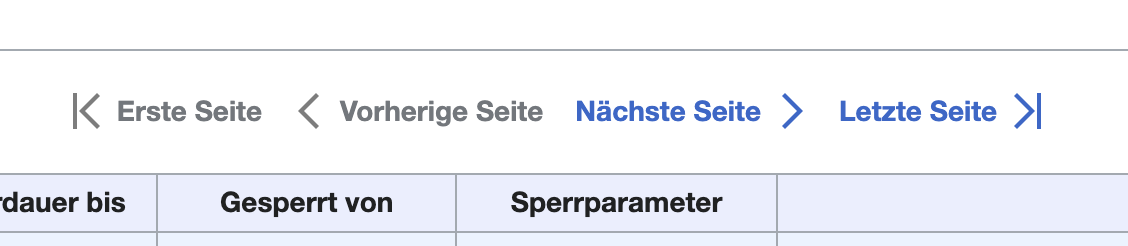
Pagination using the big size of arrow.

User stories

As a designer, I need arrow icons that best suit the design needs and that, when placed them next to the texts, the arrows aren't more important than the text.

Criteria for done

Design

  • Redesign arrow icons
    • Previous
    • Next
    • Expand
    • Collapse
  • Export them as optimize SVG

Code

  • Replace icons:
    • Codex
    • OOUI

Event Timeline

Hi all,

As you know, our current arrow icons (Previous, Next, Expand and Collapse) are too big and they take too much importance in the designs (specially when accompanying texts).

Here you can view how they are and how they work with texts:

  • Our current arrows are too big when we use them as controls (next-previous, expand-collapse)
  • They have different type of padding (1px, 2px or 4px)
  • We have arrows duplicated because we have them in big (Expand) and small (Dropdown) sizes

Current component.png (736×1 px, 53 KB)

Solutions:

  • Update icon padding with 4px in all icons.
  • Unify duplicated arrow icons (Expand-Collapse and Dropdown-DropdownUp)

Option1.png (736×1 px, 46 KB)

cc: @Sarai-WMDE @Volker_E

HI @bmartinezcalvo are you thinking about optimizing towards 16px font-size?
How would we deal with other use cases besides normal text:

image.png (268×1 px, 59 KB)

In the case of dropdowns the reduced size made a lot of sense, pointing towards another icon size token, that is limited to very few icons in our system:

image.png (682×2 px, 164 KB)

Use case of pagers:

image.png (246×1 px, 31 KB)

HI @bmartinezcalvo are you thinking about optimizing towards 16px font-size?
How would we deal with other use cases besides normal text:

@Volker_E thank you for showing me these use cases. After reviewing them I have come to the conclusion that maybe we need 2 sizes of arrow icons:

  1. Big (the ones that we currently have)
  2. Small (new size variant with the same size of the Dropdown and DropdownUp icons)

We could use Big or Small variant according to the need of each use case. It's clear that for some cases the big arrow is perfect and for other cases the big arrow is too much.

Option2.png (915×1 px, 67 KB)

With this solution we would only have to do the following:

  • Add Small variant to all arrow icons (Previous, Next, Expand and Collapse) and add them in both Figma and code (OOUI and Codex)
  • Have both variants (Big and Small) available and use them when we need it
bmartinezcalvo renamed this task from Update arrow icons to Evaluate if we want to update the arrow icons.Mon, Apr 15, 2:19 PM
bmartinezcalvo removed bmartinezcalvo as the assignee of this task.
bmartinezcalvo updated the task description. (Show Details)