Problem
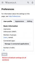
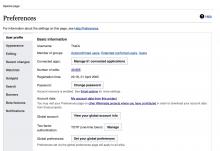
Mobile web editors don't have the same access to user preferences as desktop editors do (people who visit Wikipedia with a laptop or a computer with a large external display). Mobile web editors could still access those "desktop" settings if they know the URL by heart, but the provided experience is not bespoke for mobile consumption, notably:
- Preferences are presented with tabs that scroll horizontally, but there is no clear clue that the section is scrollable.
- The target area and links are not designed for people who interact with their devices via touch.
- There are numerous categories hidden off screen, and no additional detail is provided to support discovery.
Jobs to be done
When I access Wikipedia settings from my mobile device I want to understand the available options so I can use the provided information to find and customize what I need.
Proposed solution
A. In-page menu with icons
In this proposal, we explore if additional icons and text can provide a better navigation experience:
- icons add visual cues to increase discovery
- text descriptions provide information about the content behind
B. Scrollable tabs
We would like to explore possible ways to enhance the existing pattern and potentially bring desktop and mobile closer. In this proposal, we:
- increased the target area to welcome touch input
- increased the space between tabs to avoid any possible mis-touch
- add a gradient to signal that there's something off screen and that the tabs area can scroll
C. In-page blue text buttons
Another assumption that we would like to explore is if icons are necessary to scan and navigate this menu. In this proposal, we:
- use the color blue to signify that text is interactive
- leverage the description to provide addition information and guidance
D. Nested menu
In this proposal, we explore if a nested (or second layer) menu could improve context while navigating the settings, thank to the content being visible in the background while the menu is open in the foreground.
Mocks of proposed designs for usability testing
Steps
- Tap the menu icon (also known as hamburger icon) in the top left corner, next to the Wikipedia logotype
- Tap the "Settings" menu item, look for the small gear cog/wheel
- Navigate the settings on mobile web
English
- In-page menu with icons https://www.figma.com/proto/iAxHL9ay6BK16G7kxcK1ud/%F0%9F%93%B1-Mobile-Web-Preferen[…]1&starting-point-node-id=278%3A10357&hotspot-hints=0&hide-ui=1
- Scrollable tabs https://www.figma.com/proto/iAxHL9ay6BK16G7kxcK1ud/%F0%9F%93%B1-Mobile-Web-Preferen[…]A1&starting-point-node-id=293%3A9757&hotspot-hints=0&hide-ui=1
- In-page blue text buttons https://www.figma.com/proto/iAxHL9ay6BK16G7kxcK1ud/%F0%9F%93%B1-Mobile-Web-Preferen[…]A1&starting-point-node-id=293%3A9883&hotspot-hints=0&hide-ui=1
- Nested menu https://www.figma.com/proto/iAxHL9ay6BK16G7kxcK1ud/%F0%9F%93%B1-Mobile-Web-Preferen[…]A1&starting-point-node-id=318%3A8948&hotspot-hints=0&hide-ui=1
German
- In-page menu with icons https://www.figma.com/proto/iAxHL9ay6BK16G7kxcK1ud/%F0%9F%93%B1-Mobile-Web-Preferen[…]e-id=293%3A9391&hotspot-hints=0&show-proto-sidebar=1&hide-ui=1
- Scrollable tabs https://www.figma.com/proto/iAxHL9ay6BK16G7kxcK1ud/%F0%9F%93%B1-Mobile-Web-Preferen[…]e-id=293%3A9628&hotspot-hints=0&show-proto-sidebar=1&hide-ui=1
- In-page blue text buttons https://www.figma.com/proto/iAxHL9ay6BK16G7kxcK1ud/%F0%9F%93%B1-Mobile-Web-Preferen[…]-id=293%3A10009&hotspot-hints=0&show-proto-sidebar=1&hide-ui=1
- Nested menu https://www.figma.com/proto/iAxHL9ay6BK16G7kxcK1ud/%F0%9F%93%B1-Mobile-Web-Preferen[…]A1&starting-point-node-id=318%3A9217&hotspot-hints=0&hide-ui=1


