Background
Communication is the backbone of collaboration on Wikipedia. The iOS team is looking forward to bringing a more fully featured set of communication and talk page tools into the app. Currently, there is a mix of native and non-native iOS talk page experiences. During this project we are looking to update the existing native user talk page and add native article talk pages so that contributors, across experience levels, can intuitively and confidently communicate with one another on iOS and across platforms.
Design themes
Timeliness & spatial awareness: Where and when is the conversation happening? How might we design features that help Wikipedians (new or old) to have a better intuitive sense of the activeness/freshness of a conversation? How might design help to facilitate better, civil and more timely conversations across Wikipedia?
Modernization, not complete transformation: Improve, don't replace. Talk pages belong to the Wikipedians who use them. How might we honor and respect the years of community work that have gone into the evolution of Talk pages, while improving their utility and civility for all?
Research Goals | Questions
- Create native iOS talk pages that mirror the desktop experience.
- Actions: Do participants have access to the primary actions on talk pages (eg. replying to threads, creating new topics, etc.) Can participants navigate further to their necessary destinations?
- User interface: Does the UI fit with the iOS experience?
- Evaluate feature usability. -Placement: Can the participants find the article/user talk page? Does the location work with their current workflow? -Navigation and orientation: Can participants easily navigate through the feature and find the necessary information? -Can new contributors identify the difference between article vs user talk pages?
- Create a better sense of timeliness and participation -Activity: Do participants understand which topics are active/inactive? -Participation: Can participants easily identify the authors of the threads and topics?
- Check whether the nature of talk pages is known. -Transparency: Do new contributors understand the public nature of talk page messages?
Usability test
- The test will be performed via Usertesting.com
- UserTesting.com will be used to recruit, record sessions, and test the designs.
- The test will be remote, unmoderated, and task-based.
- It will take 10-15 minutes to complete tasks all tasks.
- In the end, they might have 1-3 written questions to complete as well.
Target audience
New contributors: Participants that are new to Wikipedia.
- The audience will include new contributors that are iOS users.
- Platform: Mobile / iPad
- Operating system: iOS
- Wikipedia app: V6.6 or more recent
- Languages: English
Summary of the main usability testing tasks
- Dowload beta version of the iOS app
- Log in into the iOS app
- Navigate to talk pages
- Observe the list of topics on an article talk page
- Open a topic
- Interact with threading
- Add a new comment
- Subscribe to a topic
- Add a new topic
- Open/close overflow menu
For this build we will need:
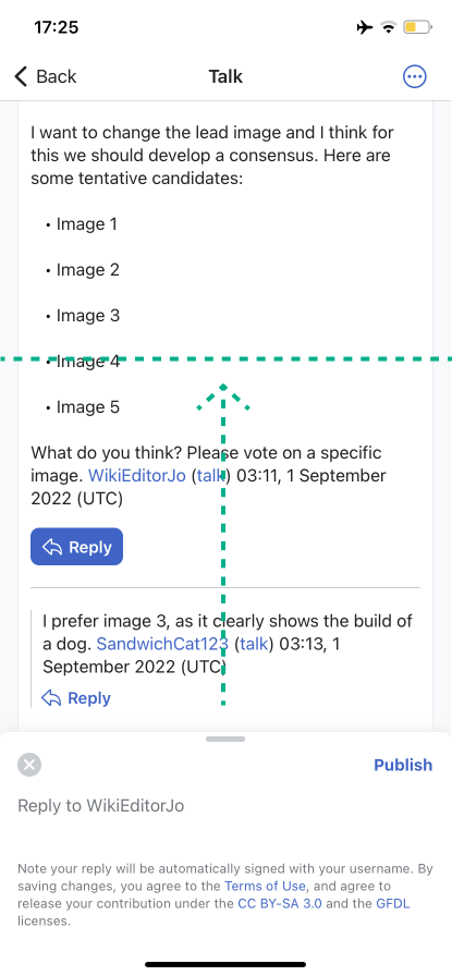
- Basic formatting
- Ability to reply
- Ability to add a topic
- Subscribe/unsubscribe
- Presence of an overflow menu
Won't need:
- Offline mode
- Deep linking
- Formatting toolbar
- Find in page feature
Link to script for Usertesting.com - First-time editors
Results
- Number of participants: 10 (one participant couldn't do the full test because they landed on the old talk page half way through the test)
😀100% of participants successfully concluded topic creation & publishing and said it was easy.
😀100% of participants said adding a comment was easy, and they would have been successful if not for the bug mentioned below.
😀78% could understand who was replying to whom, however only 42% of those participants actually used the lines, the rest used the content of the comments/common sense. It feels like the ones who were familiar with the ‘line’ UI, found it super easy, the ones who were not familiar with this didn’t really consider looking at the lines for help (but again could have been different if the comments were nested more in the thread).
😀 22% of the people used dark/black mode and the talk pages looked great.
😀 44% said that they thought that the topics & comments were well separated and well organized.
😕 40% of the participants thought it was hard to find the article’s talk page and expected to find it as an icon in the tab bar (half of whom thought it would be under the ‘table of contents’ icon)
- 20% expected it to be at the top of the page.
- 20% were not sure where to find the article talk page.
😕67% of participants expected the topics to be sorted newest to oldest
- 33% expected to be able to sort/filter the comments & topics.
- 11% expected topics to be organized in alphabetical order.
😕67% found no issues with finding the overflow menu
- 22% expected to find additional features on the bottom of the page not the top (makes sense because of the tab bar).
😕67% of participants expected to have a way to see and filter through their own comments or replies from the overflow menu.
😔The one participant who used dynamic type said that the topic page was ‘very convoluted, confusing and scattered’
Bugs
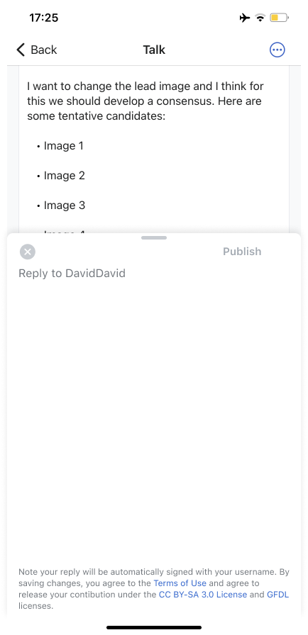
😔 When a person is in the middle of replying and right before publishing a comment switches to another app and then goes back to the reply card the card ends up disappearing but the keyboard gets stuck on the screen.
😔 Because of dynamic type the text input field (when trying to respond to a comment) disappears. The license/copyright text seems to be too big and takes up all of the space. Even one other participant said that they first missed the initial reply card.
- We should make the whole initial card taller (maybe already have it as tall as what it would be with the keyboard).
- And ensure that the area between the copyright text and the top of the card has a min. height.
| Issue | Current with keyboard | Current without keyboard | Proposed | |
 |  |  |  | |
The usability testing questions & responses can be found here