Page MenuHomePhabricator

[QA task] comparison testing for Special: Search
Closed, ResolvedPublic

Description

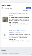
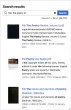
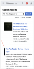
(1) When audio/video and other media (pdf, djvu) are returned in Search, the thumbnails are vertically centered instead of being aligned at the top of the row.

enwiki betalabscurrent production wmf.3
audio files
Screen Shot 2022-10-03 at 7.23.56 PM.png (1×840 px, 249 KB)
Screen Shot 2022-10-03 at 7.24.04 PM.png (1×1 px, 231 KB)
video files
Screen Shot 2022-10-03 at 7.27.57 PM.png (1×708 px, 235 KB)
non-media files
Screen Shot 2022-10-03 at 7.47.57 PM.png (1×690 px, 180 KB)
Screen Shot 2022-10-03 at 7.49.45 PM.png (1×826 px, 269 KB)
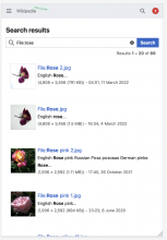
CORRECT img files
Screen Shot 2022-10-03 at 7.24.57 PM.png (1×818 px, 249 KB)
Screen Shot 2022-10-03 at 8.05.03 PM.png (1×846 px, 345 KB)

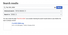
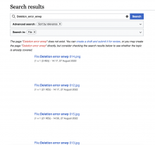
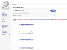
(2) Two small images (img_size <100) display a blank placeholder. Images with img_size >300are displayed correctly.

enwiki betalabsproduction wmf.3
Screen Shot 2022-10-03 at 8.10.52 PM.png (826×1 px, 117 KB)
Screen Shot 2022-10-04 at 9.40.47 AM.png (1×1 px, 211 KB)

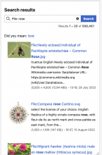
An example from enwiki betalabs when the returned results are mixed types of files:

Screen Shot 2022-10-04 at 9.38.17 AM.png (1×1 px, 467 KB)

(3) Placeholder grows along with the height of the search result's table if content ends up being larger:
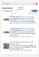
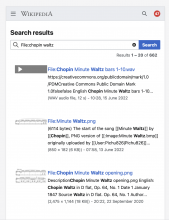
Screenshot 2022-10-04 at 10.04.28.png (403×274 px, 44 KB)

Event Timeline

Etonkovidova renamed this task from [QA task] check Special search on mobile to [QA task] comparison testsing for Special: Search.Oct 4 2022, 7:48 AM
Etonkovidova updated the task description. (Show Details)
Etonkovidova added subscribers: matthiasmullie, Sneha.

Change 838071 had a related patch set uploaded (by Matthias Mullie; author: Matthias Mullie):

[mediawiki/core@master] Search thumbnails visual tweaks

https://gerrit.wikimedia.org/r/838071

#2 is unrelated to this work; looks like that image is simply corrupt: https://en.wikipedia.beta.wmflabs.org/wiki/File:SVG_XSS4.svg

I also added a #3.
Have a patch in CR to fix #1 & #3.

Change 838071 merged by jenkins-bot:

[mediawiki/core@master] Search thumbnails visual tweaks

https://gerrit.wikimedia.org/r/838071

Quiddity renamed this task from [QA task] comparison testsing for Special: Search to [QA task] comparison testing for Special: Search.Oct 20 2022, 8:39 PM
Quiddity added a project: User-notice.
Quiddity moved this task from To Triage to In current Tech/News draft on the User-notice board.

Re-checked in enwiki wmf.6:

#2 is unrelated to this work; looks like that image is simply corrupt: https://en.wikipedia.beta.wmflabs.org/wiki/File:SVG_XSS4.svg

I also added a #3.
Have a patch in CR to fix #1 & #3.

Thx, @matthiasmullie ! #1 & #3 look good in wmf.6. However, it seems that #1 has sort of regression in displaying the thumbnails for non-media files on mobile - filed as T321362

wmf.3wmf.6
Screen Shot 2022-10-03 at 7.49.45 PM.png (1×826 px, 269 KB)
Screen Shot 2022-10-20 at 1.19.45 PM.png (1×750 px, 230 KB)

For (2) I checked enwiki - the files which size<100 will be displayed as a blank squares - https://en.wikipedia.org/w/index.php?fulltext=1&profile=default&search=File%3Adeletion+error+enwp&title=Special%3ASearch&ns0=1

However, there are only few files of such small size and displaying them as a blank squares is somewhat better than before:

wmf.3wmf.6
Screen Shot 2022-10-04 at 9.40.47 AM.png (1×1 px, 211 KB)
Screen Shot 2022-10-20 at 3.20.17 PM.png (1×2 px, 401 KB)

@matthiasmullie are the file thumbnails going to be square too? I thought we will keep them as is because it helps with, perhaps, highlighting the difference in interactions with thumbnails on article vs files. For files it would be good to see the entire image since thats's what the user searched for.

Right now, file thumbnails are indeed also square.

There were a couple of thumbnail changes that kind of necessitated changing those as well (e.g. they became smaller & whitespace changed a bit)
Since there was no explicit indication of how to adjust file thumbnails in response, I assumed we'd be making the same changes there (see T306883#8202831 for more context)

We can go back and change file thumbnails if we wanted to; e.g. containing them within the bounding box like they used to, instead of filling.
That said, I don't think that would be particularly useful WRT "highlighting the difference", since a square-ish file thumbnail would still look like a square article thumbnail.

Can you create a new ticket with details for what we want file thumbnails to look like?

okay thanks for the background. Based on what you said, we can leave file thumbnails as they are for now. This is only my assumption that it may cause some interaction confusion but it may not as user's may have different expectations of what they do based on the type of results. If we hear any concerns we can re-evaluate.