Page MenuHomePhabricator

Text editor formatting buttons don't align
Closed, ResolvedPublicBUG REPORT

Description

Steps to reproduce

  1. Edit a page in Wikipedia editor
  2. Look at text formatting bar

Expected results

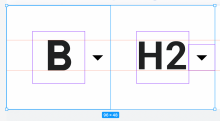
Buttons have the same height and align vertically

Actual results

They don't

PSX_20221015_082311.png (43×370 px, 5 KB)

Environments observed

App version: 2.7.50421-alpha-2022-10-13
Android OS versions: 11
Device model: Fairphone 4
Device language: German

APK: https://github.com/wikimedia/apps-android-wikipedia/pull/3639/checks

Details

Other Assignee
Sharvaniharan

Event Timeline

Discostu renamed this task from Text editor formatting doesn't align to Text editor formatting buttons don't align.Oct 15 2022, 7:02 AM

Not much better in my opinion:

photo_2022-10-17_22-42-04.png (66×188 px, 5 KB)

(buttons further right also affected)

In my opinion, these should all have he same height and the same y position.

@Discostu thanks for your involvement, appreciate it. We use icons from Google Material Design when available.

In your screenshot, the icon for Bold and List derive from Material. We don’t manipulate icons from Material to achieve a native and consistent platform experience. This makes learning the Wikipedia app easier for users. Read more about how we approach app design. in our guidelines.

The H2 icon is custom and uses Roboto Bold 18sp to fit the other icons from Material. I optimized the custom H2 icon slightly to align it vertically (and optically) with the other icons:

Screenshot 2022-10-18 at 11.26.38.png (670×1 px, 252 KB)

On another (design) note: measured vs. optical alignment are two pairs of shoes. The H2 icon uses more horizontal space, compared to e.g. the Bold icon (two letters vs. one). This means it needs to be adapted in height to be optically perceived as the same size.

@Sharvaniharan can you replace the h2-h5 icons used in the editor with these, please:

Thanks all!

@scblr Thank you! That makes sense. Will change the icons accordingly.

Have made the updates @scblr . Please let me know how it looks now.

ABorbaWMF subscribed.

Looks fixed to me on 2.7.50422-beta-2022-10-24

Screenshot_20221027-153421.png (257×1 px, 222 KB)

Note the bullet and numbering drop downs appear a bit lower than the text and heading ones, but that appears to be expected.