Page MenuHomePhabricator

Save space on Mismatch Finder main page and results page to make call to action easier to see
Closed, ResolvedPublic2 Estimated Story Points

Description

As a mismatch reviewer I want to browse mismatches on smaller desktop screen with less scrolling to get to the calls to action more quickly.

Problem:
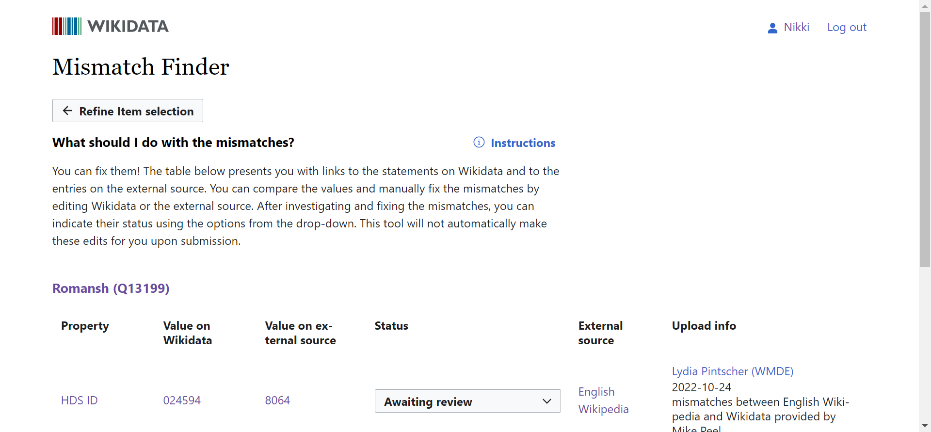
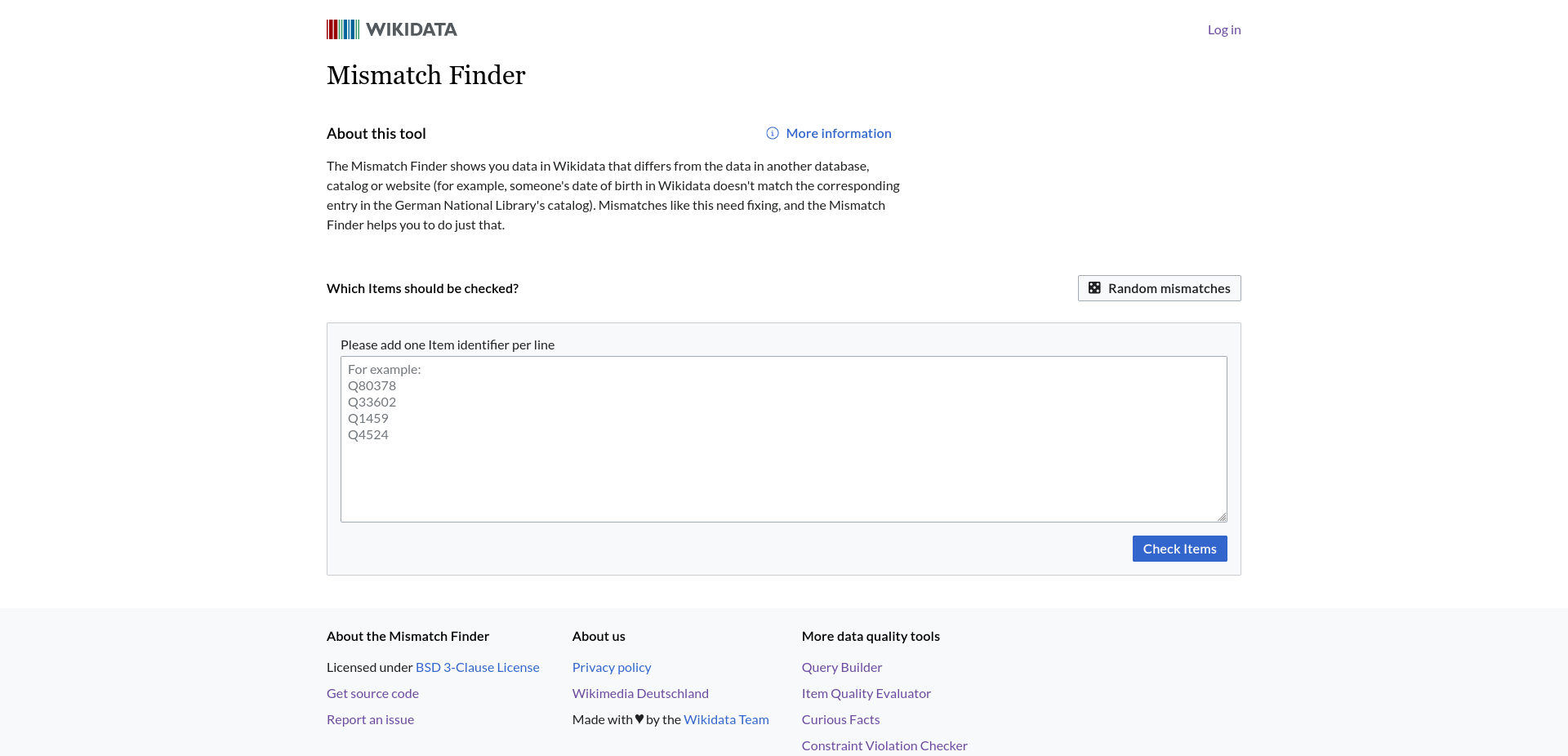
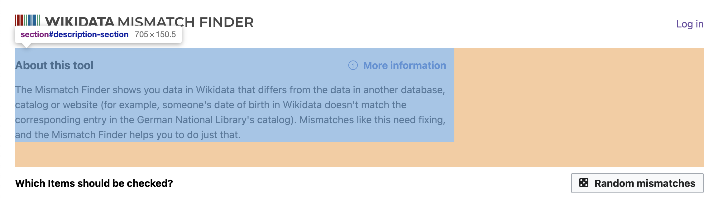
The call to action on the main Mismatch Finder is below the fold on smaller screens (see screenshots). To make it easier to notice and navigate the page we want to bring it above the fold. The same issue exists on the results page.
We want to solve this by decreasing the size of the header by combining the logo and tool name in one line instead of having them below each other.

Screenshot:
Screenshot of the main page on nikki's laptop:

2022-11-23 10.17.09 mismatch-finder.toolforge.org 4eead698e80e.png (892×1 px, 116 KB)

Screenshot of a results page on nikki's laptop:
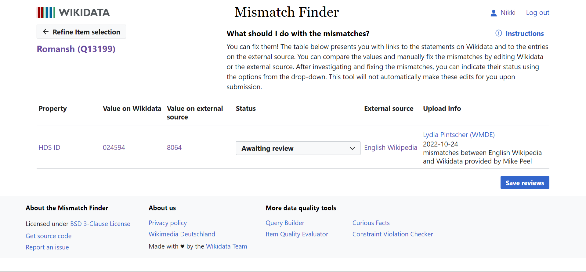
2022-11-23 10.04.18 mismatch-finder.toolforge.org 2d11f11031c5.png (891×1 px, 117 KB)

Mockups:
See Figma
New logo:

BDD
GIVEN the Mismatch Finder main page or results page
THEN the logo and title is shown in one line instead of two

Acceptance criteria:

  • the logo and title of the Mismatch Finder is merged into one line (both on the main page and the results page)
  • the spacing is adjusted to be more compact (see mockup for reference)

Event Timeline

Oops I saved so much space with some browser CSS that now I can see below the footer. 😇

2022-11-23 10.38.11 mismatch-finder.toolforge.org add90c054b5d.png (892×1 px, 201 KB)

Lydia_Pintscher moved this task from Backlog to Needs work on the Mismatch Finder board.
Lydia_Pintscher subscribed.

@Sarai-WMDE Can you please add the mockup for the combined header here? Thanks!

Lydia_Pintscher renamed this task from Mismatch Finder should be easier to use on laptops to Save space on Mismatch Finder main page and results page to make call to action easier to see.Nov 28 2022, 11:08 AM

I feel obliged to point out that the screenshot in the task description is at 150% zoom; at 100%, only a few pixels below the footer are cut off on a maximized non-fullscreen browser on a 1080p screen (which seems to be where the screenshot was taken):

image.png (926×1 px, 123 KB)

Mh, this means we're dropping the <h1>, right? Not sure that this is ideal

Mh, this means we're dropping the <h1>, right? Not sure that this is ideal

The Figma link in T323680 has a screenreader-only <h1> (for sighted users, the clickable header image takes over the role of the heading).

@Sarai-WMDE I could use some clarifications on Figma, sorry…

  • In Figma, the header has a vertical margin of 1.25em. In the app, it currently has $dimension-layout-xsmall (1rem), or $dimension-layout-small (1.5rem) above the tablet breakpoint. Which breakpoint does Figma correspond to? And should I hard-code the 1.25em (1.25rem?), or is there another variable I’m missing?
  • In Figma, the “find more mismatches” button has a vertical margin of 1.5em, which apparently doesn’t collapse with the header margin. In the app, it currently has no margin of its own, but its surrounding elements produce a margin of 1.5rem (header, above) and 1rem (description section heading, below) respectively. Do we want to increase that?
  • In Figma, the description section has a lower margin of 3em; in the app, it’s currently 2.5rem. Do we want to increase that?
  • In Figma, the mismatches form footer (with the “save reviews” button) has an upper margin of 1.5em and a lower margin of 3.5em; in the app, it currently has an upper margin of 1rem, a lower margin of 2.5rem, and additionally a minimum height of 5em. I assume we want to remove the min-height (it doesn’t collapse with the margin, and I see nothing corresponding to it in Figma), but do we want to increase the margins?

Basically, a lot of the differences I can see in Figma seem to be adding more space, not saving it 😅 though it’s very possible that I’m missing or misunderstanding something.

I assume we want to remove the min-height (it doesn’t collapse with the margin, and I see nothing corresponding to it in Figma)

Looks like the minimum height is there to ensure that there’s enough space for the message when the reviews are saved – the message can appear without changing the layout:

Screenshot from 2022-11-29 12-55-15.png (325×1 px, 36 KB)

Screenshot from 2022-11-29 12-55-13.png (325×1 px, 44 KB)

And this seems to be important because the message of one set of mismatches disappears as soon as you submit the next set of mismatches (when reviewing mismatches of multiple items on one page), so I guess you don’t want the page to jump around in that case as the older message disappears… but maybe we can instead only reserve that space for messages that have been shown at some point (e.g. by setting old messages to visibility: none instead of removing them), not for all potential messages?

Summary of what's causing confusion: rather than fully adhering to creating a 'compact' look, the spacing changes included in the mock have the purpose of fixing the heading dimensions, and solving some spacing inconsistencies between the main and the results pages, and the original designs. The course of action from my side should have consisted of creating a separate ticket. If that's preferable, I'll go ahead and create a new task!

  • In Figma, the header has a vertical margin of 1.25em. In the app, it currently has $dimension-layout-xsmall (1rem), or $dimension-layout-small (1.5rem) above the tablet breakpoint. Which breakpoint does Figma correspond to? And should I hard-code the 1.25em (1.25rem?), or is there another variable I’m missing?

Sorry about that. Although 1.25em corresponds to the original designs, this value is part of the Codex sizing & spacing scale, but not WiKit's. Let's keep using $dimension-layout-small. Regarding the tablet breakpoint: I'm not able to find any mention of the spacing change in the header specs 🤔 The header seems to stay the same, or at least that's what's documented in the original MVP designs and the SPA consolidation specs (which now need to be updated to reflect the right spacing). I'm not sure why this distinction was made, but it could be related to trying to fix some layout issues (see #100)? If possible, the header spacing should remain the same regardless of the device size in both the Mismatch website and the store.

  • In Figma, the “find more mismatches” button has a vertical margin of 1.5em, which apparently doesn’t collapse with the header margin. In the app, it currently has no margin of its own, but its surrounding elements produce a margin of 1.5rem (header, above) and 1rem (description section heading, below) respectively. Do we want to increase that?

We should add some spacing between the header and the back button to keep the main page and the results pages similarly spaced, yes. The specs suggested adding the same (slightly increased) spacing between the header (which should be considered a unit that includes its margins: should these actually be paddings?) and the next element below it. Given the increase of the header spacing from 1.25 to 1.5, I think it's fair to reduce that spacing to 1rem now: this means that no change is required in the main page, but yes, the button shouldn't be adjacent to the header.

  • In Figma, the description section has a lower margin of 3em; in the app, it’s currently 2.5rem. Do we want to increase that?

This had the intention of making both pages consistent again: the description in the main page has technically a bottom margin of 2.5rem applied to it, but that spacing increases due to the extra margin applied to the elements placed right below it. Looking at it now with the intention of making the UI more 'compact', maybe we could attempt to adjust the spacing between the description and the 'message section' in the main page to really be 2.5rem? (Updating specs too)

Screenshot 2022-11-29 at 15.22.38.png (638×2 px, 166 KB)

  • In Figma, the mismatches form footer (with the “save reviews” button) has an upper margin of 1.5em and a lower margin of 3.5em; in the app, it currently has an upper margin of 1rem, a lower margin of 2.5rem, and additionally a minimum height of 5em. I assume we want to remove the min-height (it doesn’t collapse with the margin, and I see nothing corresponding to it in Figma), but do we want to increase the margins?

The specs suggested increasing the margin between the 'Save reviews' button and table to 1.5rem (again, to keep spacing homogenous) while reducing the min-height to 3.5rem* to condense a little bit the view (doing this gave a pass to add a bit of extra spacing between table and button). Now, thanks to your comment regarding the message: that's right. I remember this conversation and us going for the default increase in space. So we should leave this as is.

*em was wrongly specified all along, as rem should be used for layout spacing! That was corrected now.

Regarding the tablet breakpoint: I'm not able to find any mention of the spacing change in the header specs 🤔 The header seems to stay the same, or at least that's what's documented in the original MVP designs and the SPA consolidation specs (which now need to be updated to reflect the right spacing). I'm not sure why this distinction was made, but it could be related to trying to fix some layout issues (see #100)?

It looks like the different header margin was added in #82 (specifically this commit), part of porting to Wikit; I don’t see why, though. Let’s always use small then, I guess.

We should add some spacing between the header and the back button to keep the main page and the results pages similarly spaced, yes. The specs suggested adding the same (slightly increased) spacing between the header (which should be considered a unit that includes its margins: should these actually be paddings?) and the next element below it. Given the increase of the header spacing from 1.25 to 1.5, I think it's fair to reduce that spacing to 1rem now: this means that no change is required in the main page, but yes, the button shouldn't be adjacent to the header.

I see what you mean – makes sense 👍

This had the intention of making both pages consistent again: the description in the main page has technically a bottom margin of 2.5rem applied to it, but that spacing increases due to the extra margin applied to the elements placed right below it. Looking at it now with the intention of making the UI more 'compact', maybe we could attempt to adjust the spacing between the description and the 'message section' in the main page to really be 2.5rem? (Updating specs too)

Okay, so removing the margin-top from the querying section’s heading so that it’s not added to the previous section’s margin-bottom… makes sense, I think.

Thanks so much for all the changes and for your patient support, @LucasWerkmeister! 🙏🏻
After taking a look at the specs and changes again, I realized that we might need to increase the spacing under the 'Find more mismatches' button. This is not contributing to the condensed look, but we should prevent the button from being visually grouped with the introductory title + text after adjusting the header and the space at the top. I think the increase could be applied as a 1rem margin-bottom. That would be the last needed change. Thanks again!