User story:
As a Product Manager, I want to explore the difference in activation rates between the new and old Impact module's empty state on mobile, because I want to be sure all Growth features improve activation and retention.
Background & research:
Impact module leading indicators seem healthy and we've received positive feedback about the new design from newcomers and experienced editors. However when we look at Activation data we see that is appears there is a slightly lower activation rate for the new impact module on mobile:
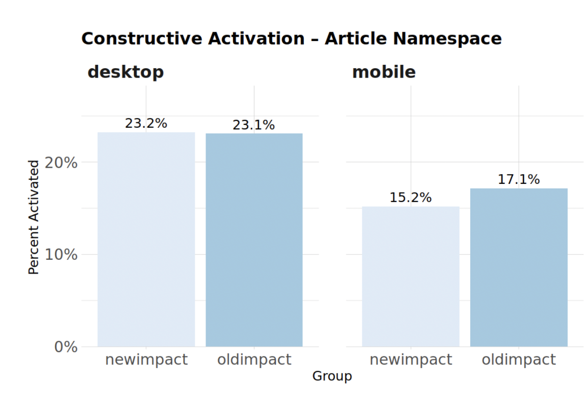
Before a newcomer has activated (edited for a first time) they will only see the impact module's empty state. So this change in activation only relates to the empty state, not the actual new impact module. The old empty state design is very similar to the new empty state design, so we would expect to see no change in the Activation rate.
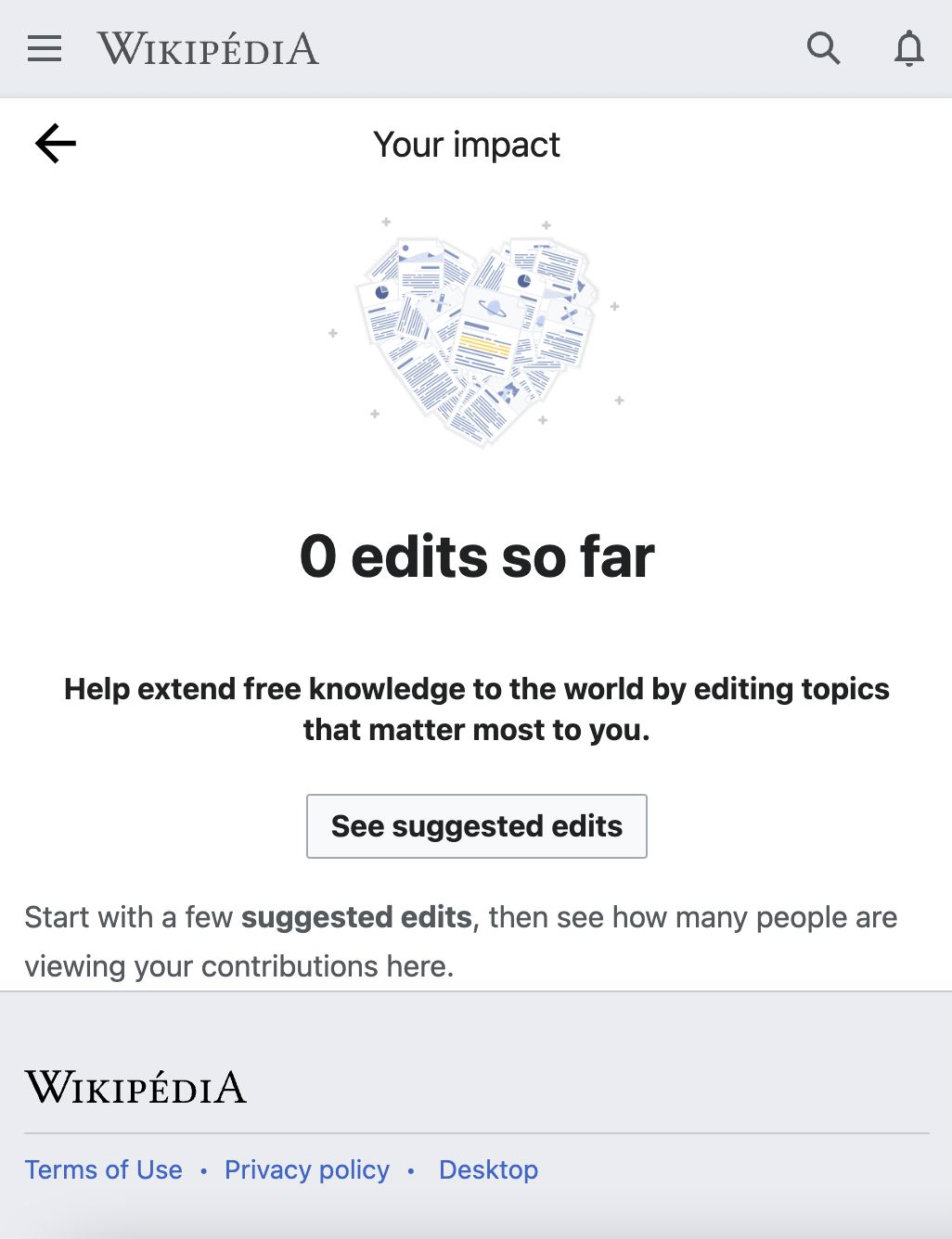
| Old Impact module | New Impact Module |
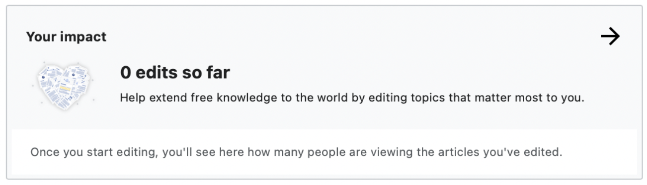 | 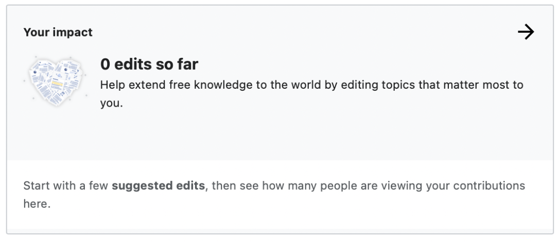 |
 | 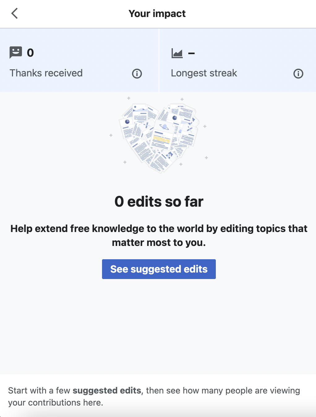 |
Design:
Figma Designs for Impact Module
Questions:
- Could minor design or copy differences explain the activation discrepancy?
- The new module shows the blank scorecards: 0 thanks and a blank streak.
- The new design has lower contrast (background isn't white) and the 0 edits so far text is smaller.
- The new design doesn't have the suggested edits explanation close to the "See suggested edits" button.
Acceptance Criteria:
- Compare new and old Impact module designs and consider the pros and cons of each
- Iterate on the designs of the Impact module "empty state" on mobile (both for the mobile preview and the the impact module view)