Page MenuHomePhabricator

Dialog: automatically display dividers when content is scrollable
Closed, ResolvedPublic3 Estimated Story Points

Description

Background

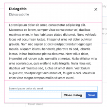
In T324708#8694562 we decided to implement the dialog's dynamic divider behavior in a separate task, so we should implement the following changes in the Dialog:

Captura de Pantalla 2023-03-15 a las 11.12.28.png (1×1 px, 271 KB)

Design spec

Open questions

Add here the questions to be answered in order to design and implement the component

Acceptance criteria (or Done)

Design

  • Design the Figma spec sheet and add it in this task
  • Update the component in the Figma library. This step will be done by a DST member.

Code

  • Update the Dialog's scrolling in Codex:
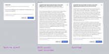
    • Dividers will be displayed only when the body content of the dialog is scrollable.
    • 16px padding on Header and Footer when dividers are shown.
    • Update Dialog documentation to provide an example of a dialog with dividers / scrollable body content.

Event Timeline

bmartinezcalvo renamed this task from Update Dialog's scroll in Codex to Update Codex Dialog component when scrolling.Mar 15 2023, 10:16 AM
bmartinezcalvo moved this task from Inbox to Needs Refinement on the Design-System-Team board.

I still have some questions about how the subheading would appear and disappear in this design:

  • If the heading is fixed with a subheading below it, I assume that we don't want it to slide out of the top of the dialog frame as the user scrolls – the two lines of text would collide and it would look jarring. So would the subheading just disappear immediately (maybe with a quick fade) on scroll?
  • I assume we want to keep the text inside the main dialog content area from jumping around when the subheading disappears and later re-appears. This means that we probably will need to use fixed positioning for the header and footer sections of the dialog – this ensures that these elements won't impact the layout of the main content area as they change. But using fixed positioning for the header and footer might cause other issues, and could complicate the ability of users to provide custom header/footer content and have things just work as expected.

My gut feeling is that this proposed design is going to require a lot of effort to implement and may produce side-effects that force us to re-think other aspects of the Dialog component. My recommendation would be to consider an alternative (simpler) approach that does not necessitate multiple elements appearing and disappearing on scroll. Maybe we should just re-introduce the optional dividers and avoid other changes for now?

I agree @egardner but I think there's validity to some element of auto-applying the divider. I wonder if instead of dynamically showing them based on whether or not the content is currently being scrolled, we would just add the dividers on render if we calculate that the content will be scrollable. So, the dividers won't come in and out, but they would only show when the content was long enough. The designer/developer then doesn't need to only choose between "always showing" and "never showing" the dividers.

I think this comes down to what the underlying motivation is for the dynamic behavior. If it's about solving for the use case where the content is dynamic and might be scrollable but isn't guaranteed to be, then I stand by my above suggestion. If it's something else, then maybe it doesn't apply.

I agree @egardner but I think there's validity to some element of auto-applying the divider. I wonder if instead of dynamically showing them based on whether or not the content is currently being scrolled, we would just add the dividers on render if we calculate that the content will be scrollable. So, the dividers won't come in and out, but they would only show when the content was long enough. The designer/developer then doesn't need to only choose between "always showing" and "never showing" the dividers.

This is different from my understanding of the original design proposed here, but I just want to say that such an approach is easily doable thanks to the IntersectionObserver API. We do something similar for horizontal overflow in the heading of the Tabs component.

I've updated the task description based on DST conversation that determined the behavior as originally described would be unnecessarily complex to implement.

Restricted Application raised the priority of this task from Medium to High. · View Herald TranscriptMay 5 2023, 3:41 PM
egardner set the point value for this task to 3.
egardner renamed this task from Update Codex Dialog component when scrolling to Dialog: automatically display dividers when content is scrollable.May 5 2023, 5:45 PM

Change 916560 had a related patch set uploaded (by Eric Gardner; author: Eric Gardner):

[design/codex@main] Dialog: automatically display dividers when content is scrollable

https://gerrit.wikimedia.org/r/916560

You can see the deploy preview for this patch here: https://916560--wikimedia-codex.netlify.app/components/demos/dialog.html.

To test, I recommend pasting in a paragraph of lorem ipsum into the body content field for the configurable dialog demo and resizing your browser window height – you should see a fairly seamless transition between scrollable layout with dividers vs non-scrollable layout without.

@egardner I've checked the dialog patch and there are some things to fix:

  1. Subtitle should be hidden when scrolling. This is because the head could have a long title and then when title and subtitle the head would occupy a lot of space on the screen (especially on small screens). I mean, subtitle would be displayed when the dialog contains scroll and then when scrolling the head would display just the title. Not sure if this should be done in this or a separate task.
    Captura de pantalla 2023-05-08 a las 11.10.40.png (1×2 px, 494 KB)
  2. There should be 8px padding between footer text and buttons to avoid long footer text being too close to the buttons.
    Captura de pantalla 2023-05-08 a las 11.04.37.png (1×1 px, 365 KB)

The rest looks good to me!

  1. Subtitle should be hidden when scrolling. This is because the head could have a long title and then when title and subtitle the head would occupy a lot of space on the screen (especially on small screens). I mean, subtitle would be displayed when the dialog contains scroll and then when scrolling the head would display just the title. Not sure if this should be done in this or a separate task.
    Captura de pantalla 2023-05-08 a las 11.10.40.png (1×2 px, 494 KB)

@bmartinezcalvo I had updated this ticket to be only about the dividers. @egardner still had concerns (above) about automatically showing/hiding the subtitle based on scroll:

I still have some questions about how the subheading would appear and disappear in this design:

  • If the heading is fixed with a subheading below it, I assume that we don't want it to slide out of the top of the dialog frame as the user scrolls – the two lines of text would collide and it would look jarring. So would the subheading just disappear immediately (maybe with a quick fade) on scroll?
  • I assume we want to keep the text inside the main dialog content area from jumping around when the subheading disappears and later re-appears. This means that we probably will need to use fixed positioning for the header and footer sections of the dialog – this ensures that these elements won't impact the layout of the main content area as they change. But using fixed positioning for the header and footer might cause other issues, and could complicate the ability of users to provide custom header/footer content and have things just work as expected.

My gut feeling is that this proposed design is going to require a lot of effort to implement and may produce side-effects that force us to re-think other aspects of the Dialog component. My recommendation would be to consider an alternative (simpler) approach that does not necessitate multiple elements appearing and disappearing on scroll. Maybe we should just re-introduce the optional dividers and avoid other changes for now?

I would suggest we keep this ticket focused on the dividers. If we do believe the header part is still necessary, we should create a separate ticket for that and discuss the tradeoffs of the added technical complexity. My preference would be to ground our decision based on real-world examples of dialogs with long subtitles.

I would suggest we keep this ticket focused on the dividers. If we do believe the header part is still necessary, we should create a separate ticket for that and discuss the tradeoffs of the added technical complexity. My preference would be to ground our decision based on real-world examples of dialogs with long subtitles.

@CCiufo-WMF I've created this separate task T336182 to discuss the subtitle when scrolling and implement the changes if needed.

@egardner I've checked the dialog patch and there are some things to fix:

  1. There should be 8px padding between footer text and buttons to avoid long footer text being too close to the buttons.
    Captura de pantalla 2023-05-08 a las 11.04.37.png (1×1 px, 365 KB)

@egardner so this is the only fix needed in this task.

I've updated the patch to ensure that correct spacing exists between the various elements.

Screenshot 2023-05-15 at 2.55.31 PM.png (1×1 px, 203 KB)

Attention to @Sgs – my latest update to this patch has changed how the Dialog layout is achieved in CSS; I've moved away from using gap to create space between the Dialog header / body / footer in favor of just using a traditional padding-based approach. Unless this changes during code review, you might need to make some small updates to your onboarding dialog styles based on changes here. Sorry for the inconvenience – my hope is that these kinds of changes will become less common as the core components stabilize.

Got you, thanks for the heads up. cc @VYanez-WMF

I've updated the patch to ensure that correct spacing exists between the various elements.

Screenshot 2023-05-15 at 2.55.31 PM.png (1×1 px, 203 KB)

@egardner great! It looks good now in both the dialog with and without scroll. Thank you!

Captura de pantalla 2023-05-25 a las 15.34.05.png (938×1 px, 165 KB)
Captura de pantalla 2023-05-25 a las 15.34.46.png (1×1 px, 314 KB)

@bmartinezcalvo thanks for design review – I'm going to address a few small code comments and then this will be good to go.

Change 916560 merged by jenkins-bot:

[design/codex@main] Dialog: automatically display dividers when content is scrollable

https://gerrit.wikimedia.org/r/916560

Change 927786 had a related patch set uploaded (by Eric Gardner; author: Eric Gardner):

[mediawiki/core@master] Update Codex from v0.11.0 to v0.12.0

https://gerrit.wikimedia.org/r/927786

Test wiki created on Patch demo by ATomasevich (WMF) using patch(es) linked to this task:
https://patchdemo.wmflabs.org/wikis/8ca78d2715/w

Change 927786 merged by jenkins-bot:

[mediawiki/core@master] Update Codex from v0.11.0 to v0.12.0

https://gerrit.wikimedia.org/r/927786

Test wiki on Patch demo by ATomasevich (WMF) using patch(es) linked to this task was deleted:

https://patchdemo.wmflabs.org/wikis/8ca78d2715/w/