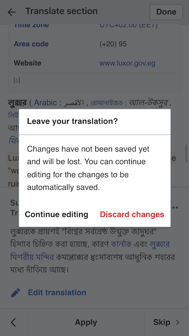
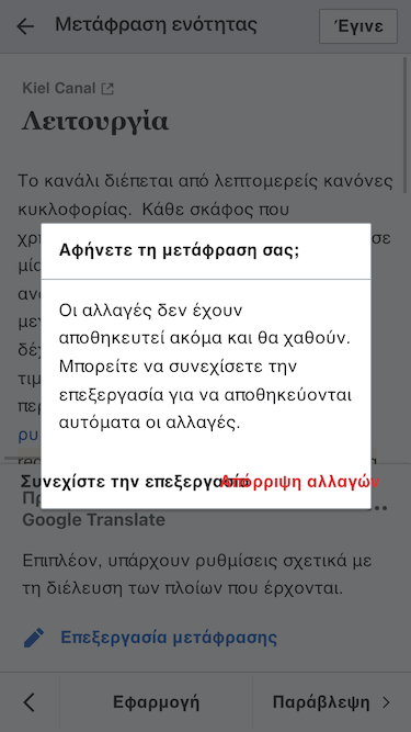
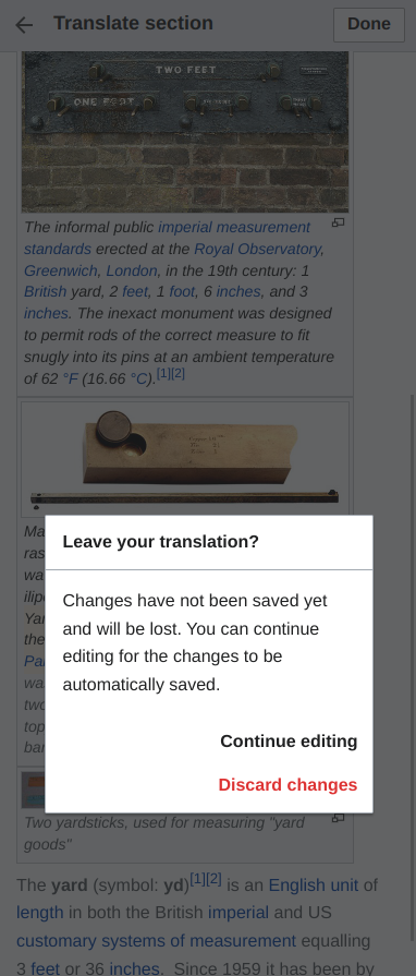
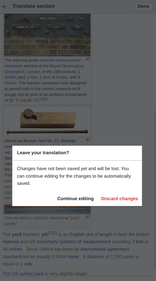
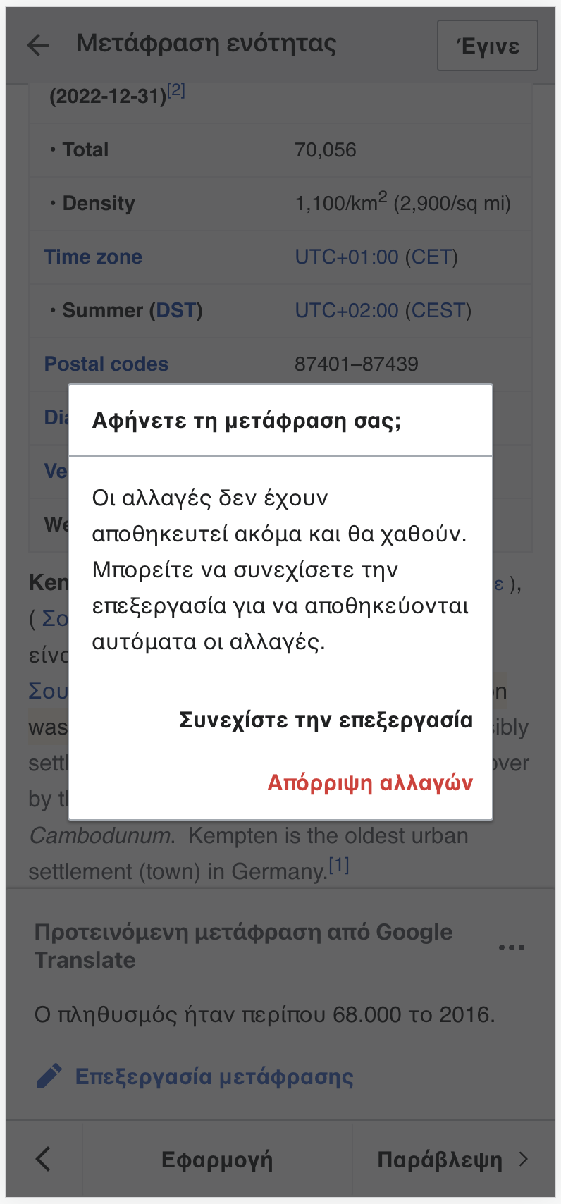
After the adjustments to add clarity to the dialog that is shown when trying to leave an unsaved translation (T336849), the actions are more explicit but also result in buttons with longer labels. Depending on the device and language these may fit well or overlap as shown in examples below where the UI is in English and Greek using a 375px wide screen:
| English: action labels fit in a single row | Greek: action labels overlap |
|---|---|
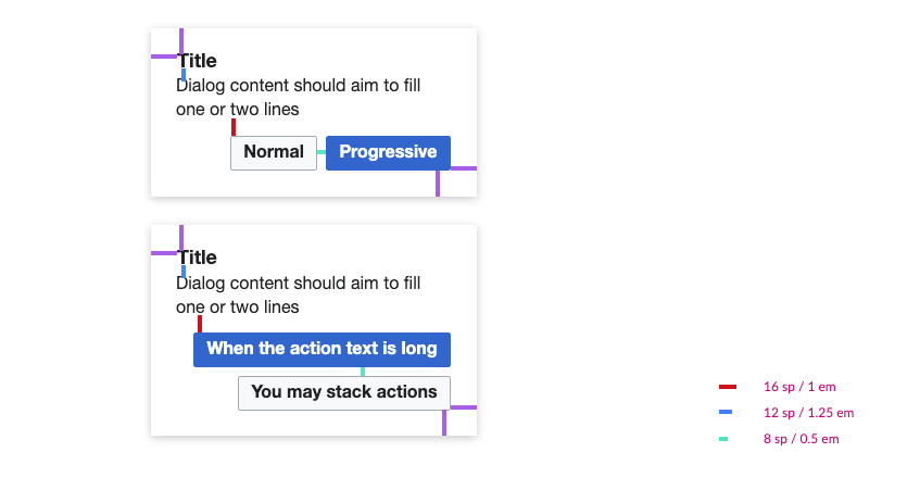
This ticket proposes to make the row of buttons to wrap when it i needed. As a result the example in english above will remain as it is, and the Greek example will have the second action moved to a new line, being placed below the first action (with an 8px vertical separation).
This is aligned with the Design System guidelines for dialogs:
