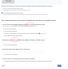
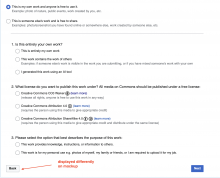
The list of minor issues below is based on discrepancies between figma design and the UI on beta (Upload Wizard-Release rights step).
This task is for Design review. If any of the issues need to be addressed - the task might be split up.
(1) (based on @Sneha's comment in Slack:
all the questions in both own and not own work, show colon at the end of it instead of period. But that is minor and not a blocker.
(2) mockups refer to "work" rather than "media" (I assume it's fine; there was a comment on using "media" rather than "work" on some of the UploadWizard tasks):
| mockup | beta |
|---|---|
(3) #1 question "(You may find this information on the page where you found the work.)" the dot in parentheses is missing in beta, but present in the mockup
| mockup | beta |
|---|---|
(4) #3 question for not own work- "Enter the name of the original author of this work" has the text:"This is public domain and the author is now unknown" vs the mockup's text: "I do not know who the author is"
| mockup | beta |
|---|---|
(5) The license icons seem to be a little bigger than in the mockup; it creates an impression that they are not well-balanced with the text in the line:
| mockup | beta |
|---|---|
(6) (for not own work) Mockup doesn't have license descriptions after the license's title. However, the current production match the beta, i.e. the license descriptions are present:
| mockup | beta | production commons wmf.7 |
|---|---|---|
(7) the Back button is displayed blue on mockup
| mockup | beta |
|---|---|
(8) Underline looks more prominent on mockup. I checked the contrast (as part of Accessibility test) - no complaints.
| mockup | beta |
|---|---|
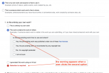
(9) (the own work path, option #2) When a user clicks on "This contains the work of others", the warning "Selection is required" appears automatically:
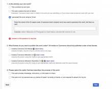
Another example of an automatic warning - when a user selects "I generated this work using an AI tool".
Note: In a sense, the warning might serve as an additional guidance to a user to indicate that the selection is required.


