Page MenuHomePhabricator

[Design needed] Bytes added on history, contribute, watchlist and recent changes have color contrast issues and is inconsistent with colors on diff pages
Closed, ResolvedPublicBUG REPORT

Description

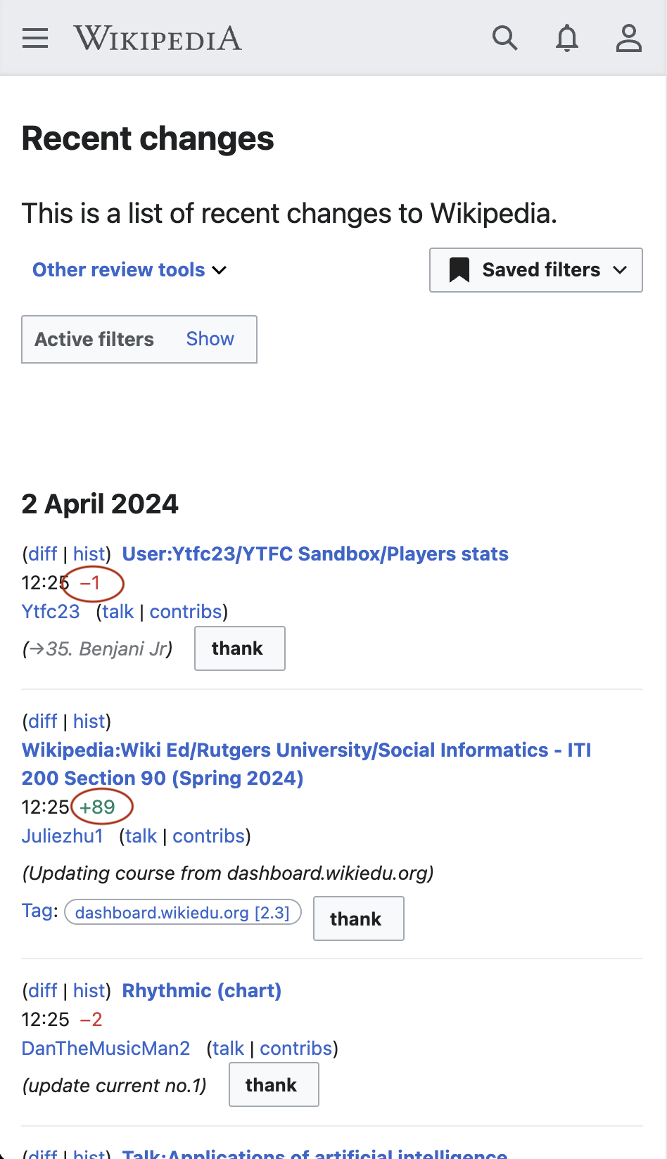
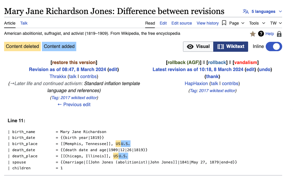
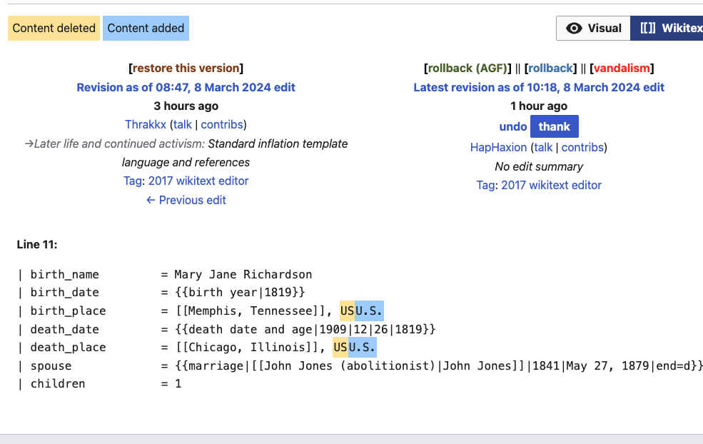
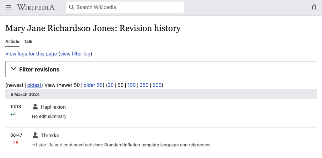
As discussed in T358402#9613452 the bytes added and bytes removed on recent changes, watchlist, contribute and history page are shown in green/red, however on diff pages they are shown in blue/yellow.

The blue/yellow is seen as more accessible. Context is provided in T13374.

We need to standardize these colors as design tokens and then design an equivalent night mode theme.
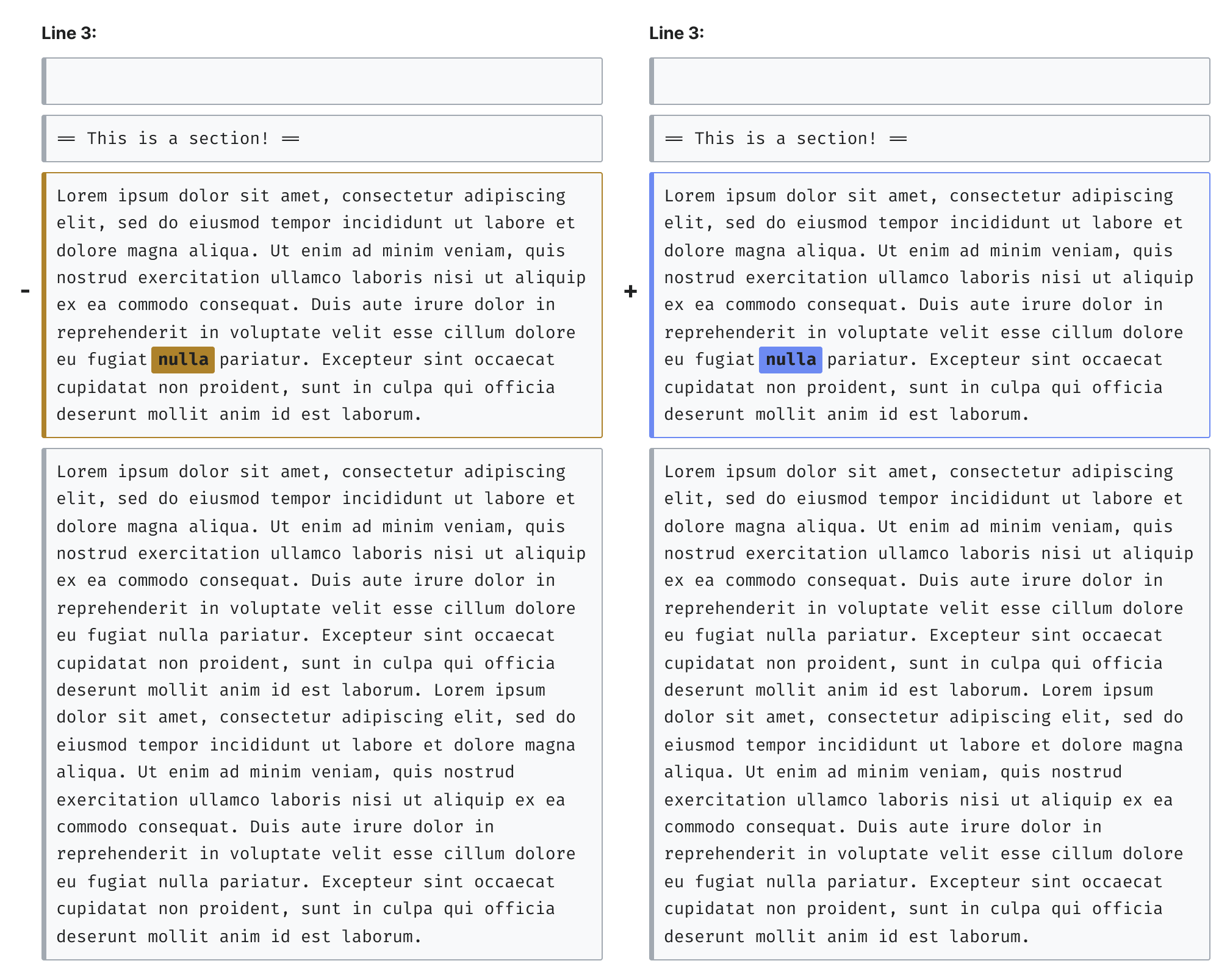
on desktop

Screenshot 2024-03-08 at 11.41.07 AM.png (119×964 px, 51 KB)
Link
Screenshot 2024-03-08 at 11.40.44 AM.png (619×999 px, 131 KB)
Link

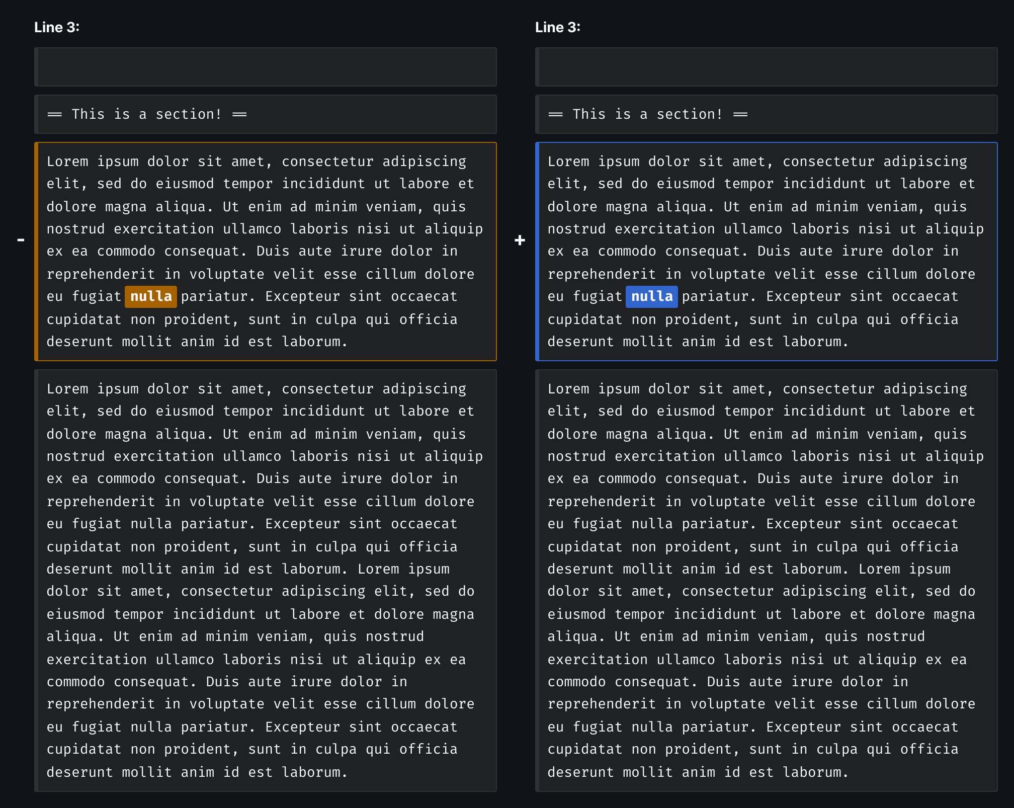
same pages on mobile

Screenshot 2024-03-08 at 11.41.48 AM.png (622×985 px, 115 KB)

Screenshot 2024-03-08 at 11.42.21 AM.png (504×1 px, 64 KB)

Steps to replicate the issue (include links if applicable):

What happens?:
Color contrast issues relating to bytes added/removed
{F42074129}

What should have happened instead?:
No color contrast issues (See T356434 for solutions)

Software version (skip for WMF-hosted wikis like Wikipedia):

Other information (browser name/version, screenshots, etc.):

Diff colors are not defined by design tokens and probably should be?:

.mw-plusminus-pos {
	color: #006400; /* dark green */
}

.mw-plusminus-neg {
	color: #8b0000; /* dark red */
}

.mw-plusminus-null {
	color: #a2a9b1; /* gray */
}

As a short term fix we could define colors for the night mode theme.
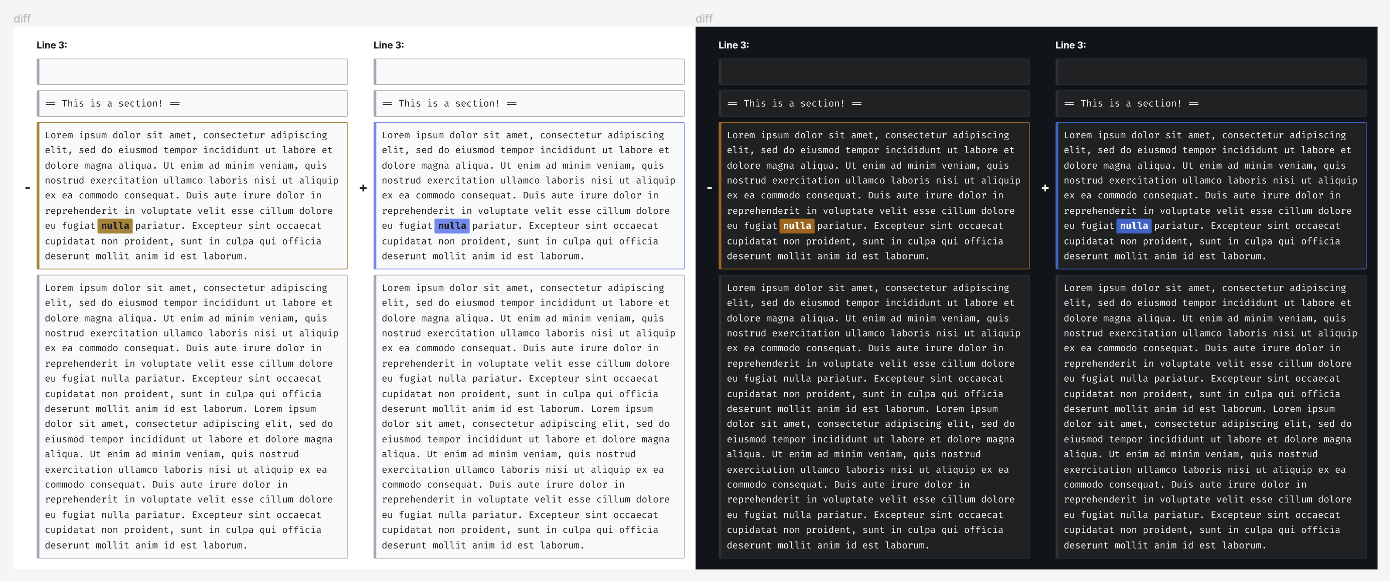
Intended designs

addedday modenight mode
byte content@color-blue-600 #3366cc@color-blue-400 #6d8af2
diff background@color-blue-400 #6d8af2@color-blue-600 #3366cc
diff content@content #202122@content #F8F9FA
diff border@color-blue-400 #6d8af2@color-blue-600 #3366cc
removedday modenight mode
byte content@color-yellow-700 #a66200@color-yellow-650 #ad822b
diff background@color-yellow-650 #ad822b@color-yellow-700 #a66200
diff content@content #202122@content #F8F9FA
diff border@color-yellow-650 #ad822b@color-yellow-700 #a66200

image.png (292×1 px, 49 KB)

image.png (1×2 px, 263 KB)

image.png (1×2 px, 265 KB)

Sign off step

  • Create a ticket for implementation with the required design spec.

Related Objects

Event Timeline

Jdlrobson updated the task description. (Show Details)
ovasileva triaged this task as Medium priority.Feb 29 2024, 2:06 PM
Jdlrobson renamed this task from Bytes added on history, contribute, watchlist and recent changes have color contrast issues to [Design needed] Bytes added on history, contribute, watchlist and recent changes have color contrast issues and is inconsistent with colors on diff pages.Mar 8 2024, 7:43 PM
Jdlrobson assigned this task to JScherer-WMF.
Jdlrobson added a project: Design-System-Team.
Jdlrobson updated the task description. (Show Details)

Something we need to determine is if it is more important to have enough color contrast between the blue and the yellow to tell they are different colors (i.e. a 3:1+ contrast ratio) or if it is more important to see the background of the diff highlight on the background of the page. Since the color is not the main thing that is noting whether something has been added or removed, and a "+" or "-" is doing that, then I would opt for the the latter of prioritizing sufficient contrast ratios for the background of the highlight on the background of the page. This means having a 4.5:1 contrast ratio for the text and a 3:1 contrast ratio for the background. This ensures that the highlights can be seen clearly on their respective backgrounds, in both day and night modes. But this means a less than 3:1 contrast ratio between the blue and yellow. In my opinion, that is okay and it is more important to opt for more clearly seeing the highlight at all.

FYI -- I think this is sort of a duplicate of T333681, but with a focus on night mode.

ovasileva added subscribers: JScherer-WMF, ovasileva.

Discussed with DST during our sync - @DTorsani-WMF will take a pass on this first and we'll discuss next steps together

With my comment above in mind, this is where I have landed on the diff colors.

Screenshot 2024-03-12 at 15.37.08.png (1×2 px, 560 KB)

This does two things:

  1. Determines that the diff colors should be yellow/blue
  2. Ensures sufficient color contrast between the text and background for both diffs on both light and dark modes. That being said there is not sufficient contrast between the yellow and blue themselves. However, I think this is less of a problem than ensuring the color can be clearly seen on the page background.

The colors for text only would be slightly different, but within the same realm to convey the same message. This would all be built into Codex decision tokens.

cc @JScherer-WMF

CCiufo-WMF raised the priority of this task from Medium to High.Mar 13 2024, 5:27 PM

With my comment above in mind, this is where I have landed on the diff colors.

Screenshot 2024-03-12 at 15.37.08.png (1×2 px, 560 KB)

This does two things:

  1. Determines that the diff colors should be yellow/blue
  2. Ensures sufficient color contrast between the text and background for both diffs on both light and dark modes. That being said there is not sufficient contrast between the yellow and blue themselves. However, I think this is less of a problem than ensuring the color can be clearly seen on the page background.

The colors for text only would be slightly different, but within the same realm to convey the same message. This would all be built into Codex decision tokens.

cc @JScherer-WMF

Looks great!

What is our plan for the colors in recent changes {F42074129} ? Should we be thinking of them as different colors altogether?

@Jdlrobson can you link to the context you're referring to?

Ah I understand now. Thanks for that context @Jdlrobson!

Those would adopt the notification colours as in T358736 because they don't have a background highlighting to call them out from a body of text.

@DTorsani-WMF is the palette for those notification colours documented somewhere? If so, please point me there, and I can pull the right one out for the spec.

What is our plan for the colors in recent changes {F42074129} ? Should we be thinking of them as different colors altogether?

Is there a ticket somewhere to address the recent changes pages?

So there seems to be a couple things we are landing on:

  1. For diff colors across all instances of modified content, we will use yellow (not red) for removed and blue (not green) for added.
  2. The values for these colors will be the following:
addedday modenight mode
content@color-blue-600 #3366cc@color-blue-400 #6d8af2
background@color-blue-400 #6d8af2@color-blue-600 #3366cc
border@color-blue-400 #6d8af2@color-blue-600 #3366cc
removedday modenight mode
content@color-yellow-700 #a66200@color-yellow-650 #ad822b
background@color-yellow-650 #ad822b@color-yellow-700 #a66200
border@color-yellow-650 #ad822b@color-yellow-700 #a66200

For your information, we have added in these option tokens into Codex, and are currently working on adding these in as new decision tokens. If you are using the hex values for now, those are also included in the table above.

Moving to next sprint and un-assigning @DTorsani-WMF. We need to write an implementation ticket.

Jdrewniak subscribed.

moving to sign off assuming the design portion of this ticket is sufficient. @Jdlrobson feel free to move back to doing or design review if this is not the case. Needs implementation tickets for sign-off.

I can set up some tickets.
@JScherer-WMF I'm a little confused on how to use T358406#9639324 - could you add some mocks?
I'm still a little confused about what we're doing for recent changes etc which seems to be the more pressing concern here! T358406#9638914 seems to be focused on usage on the diffs themselves or am I misunderstanding how it applies to the other pages?

I'm still a little confused about what we're doing for recent changes

I see the confusion here. The designs focus on content diffs as in the screenshot below

Screenshot 2024-03-08 at 11.40.44 AM.png (619×999 px, 131 KB)

Those "diffs" have a background color, but the designs don't fully address the +/- bytes colors in the Recent Changes page. e.g. screenshot below:

Screenshot 2024-04-02 at 12.25.52 PM.png (1×948 px, 205 KB)

These numbers are red/green and don't have a background color, but they also represent diffs in the sense that it's bytes added/removed.

@JScherer-WMF To review and provide clarity on design and Recent Changes list, etc.

Spoke to @DTorsani-WMF yesterday. I will make mocks for this this morning and unblock it.

Added intended designs to description.
Created implementation ticket T361717 for next sprint.
Moving to sign off and assigning to you @Jdlrobson to make sure that the spec makes sense.

Yep spec looks great! Thank you!