Page MenuHomePhabricator

Blockquote styles look off in Minerva
Open, LowPublicBUG REPORT

Description

Steps to replicate the issue (include links if applicable):

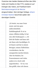
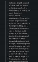
Screenshot_2024-03-28-23-01-53-468-edit_org.mozilla.firefox.jpg (1×1 px, 130 KB)

What happens?:
Seems like in some CSS changes the margin reset wasn’t applied and the existing padding mixed with margin made for some really unreadable quotes. Current blockquote CSS:

blockquote {
	border-left: 3px solid var(--border-color-subtle);
	padding: 8px 24px 8px 32px;
	font-family: 'Linux Libertine','Georgia','Times','Source Serif Pro',serif;
	font-size: 1.1em;
}

If margin: 0 gets added, the quotes become readable again. Otherwise it is very hard to read on any mobile phone screen because of the paddings added by browser engines.
Event Timeline

The combination of

  1. increased font size
  2. left margin of the quote
  3. left padding of the quote
  4. right margin/padding of the quote

created a perfect storm where you sometimes have two words on a line ("intolerable and" on the screenshot).

Thanks for raising this @stjn! This is definitely not ideal.

Would you mind letting me know the device / viewport width with which that screenshot was taken so I can replicate it on our end?

This is also related to T356532. Even without the block quote styling, the new large text setting can create less optimal character per line numbers, especially in languages with longer words.

Playing around with the CSS on my end a bit. We don't want the margin to be 0 because we want the block quote to have some margin / indent on the left and right compared with the typical paragraph styles. So if we trim those down and trim down the padding between the text and the border on the left, we get something much more readable, even at larger type sizes.

As a first draft, I landed here:

blockquote {
    border-left: 3px solid var(--border-color-subtle);
    padding: 0px 0px 0px 1em;
    font-family: 'Linux Libertine', 'Georgia', 'Times', 'Source Serif Pro', serif;
    font-size: 1.1em;
    margin: 0.5em;
}

Which looks like this:

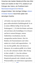
Screenshot 2024-04-17 at 11.01.12 AM.png (1×750 px, 274 KB)

Basically, the indentations are maintained but much less extreme and the CPL is back within accessible/readable ranges.

Here's the before/after on a German language article, which typically have longer words:

Before

Screenshot 2024-04-17 at 11.06.35 AM.png (1×752 px, 217 KB)

After

Screenshot 2024-04-17 at 11.08.11 AM.png (1×752 px, 256 KB)

Would you mind letting me know the device / viewport width with which that screenshot was taken so I can replicate it on our end?

This is also related to T356532. Even without the block quote styling, the new large text setting can create less optimal character per line numbers, especially in languages with longer words.

This was just my Android device. Obviously the most glaring problems would be seen on 360px, this is somewhere like 480px width and 720px height.

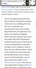
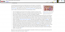
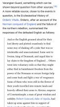
I don’t think maintaining a margin is necessarily required to do, https://web.archive.org/web/20230116110600/https://en.m.wikipedia.org/wiki/New_England_(medieval) demonstrates this styling, which makes the new styling seem like much more of an error:

image.png (960×510 px, 103 KB)

image.png (940×1 px, 385 KB)

Thanks for this. Just so I understand, is there potential tech debt or complications that we would incur if we kept the smaller margin? Ideally, the block quote would be inset from both sides of the main paragraph, including the vertical stroke that demarcates it from the other sections.

Thanks for this. Just so I understand, is there potential tech debt or complications that we would incur if we kept the smaller margin? Ideally, the block quote would be inset from both sides of the main paragraph, including the vertical stroke that demarcates it from the other sections.

There is no potential tech debt, but I would argue that mobile format should use as much space as is allowed. Tablet+ can obviously have margins. I just don’t think it necessarily makes sense for a mobile layout (especially since not everyone has big smartphones).