There are well-established readability norms for CPL measurements, and during the recent typographic upgrades, I've been paying close attention to CPL to make sure it doesn't get too big or too small, especially on mobile.
While I was doing this, I noticed that in languages like German that have many long words, the functional CPL is actually much lower than the max available on the screen. The result is that many lines only have 1 or 2 words on them with large, jagged spaces to their right.
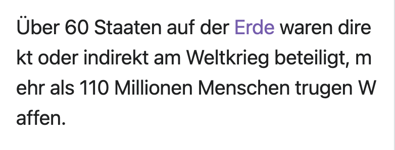
For example:

Using a simple word-break: break all in the CSS is not an ideal solution either. It recovers most of the screen width for a better CPL, but it breaks the words in non-optimal ways, often leaving a single letter on one line with the rest of the word on the following line, and doesn't append a "-" character as is normally the practice in typography.

Typically, typographers go through a book or manuscript line-by-line and manually adjust these kinds of things so that the ragged right edge of the text remains proportionally correct. Obviously we're not going to do that.
I'm wondering, could we write a script that would change the layout of the main article body content such that words would break only when at least 3 letters are on the upper line, followed by a "-" and the rest of the word on the line below?
From
To

This wouldn't get us to optimal typography, but it will go a long way in articles that have a lot of long words that are being read on mobile.