Page MenuHomePhabricator

Community Configuration: spacing compliance
Closed, ResolvedPublic

Description

Background

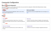
We need to apply the spacing (see https://doc.wikimedia.org/codex/main/style-guide/constructing-forms.html#spacing) that is suggested in the Codex forms + improve the spacing of the dashboard.

Spacing for dashboard

  • 24px between 'Community Configuration' page title and 'What is Community Configuration?' title
  • 8px between 'What is Community Configuration?' title and its description
  • 16px between 'What is Community Configuration?' description and 'Learn more' + 'Send us your feedback' boxes.
  • 12px of left, right, bottom and top padding in 'Learn more' + 'Send us your feedback' boxes.
  • 4px of spacing between 'Learn more' and 'Send us your feedback' titles and their respective descriptions.
  • 24px of spacing between 'Learn more' + 'Send us your feedback' boxes and 'Features' title.
  • 16px of spacing between 'Features' title and features modules.

dashboard spacing.png (599×985 px, 103 KB)

Spacing for forms

  • Spacing between elements of a form should be 16px (spacing-100 token)

Example:

spacing 16px.png (456×982 px, 93 KB)

  • Spacing between a label and its respective field should be 4px (spacing-25 token)
  • (when we implement more than one section in forms) Spacing between sections should be 24px (spacing-150 token)

Example (between 'Mentorship' and 'Personalized Praise'):

spacing 24px.png (270×1 px, 21 KB)

Event Timeline

Change #1026966 had a related patch set uploaded (by Urbanecm; author: Catrope):

[mediawiki/extensions/CommunityConfiguration@master] Remove unnecessary wrapper divs

https://gerrit.wikimedia.org/r/1026966

Change #1028787 had a related patch set uploaded (by Sergio Gimeno; author: Sergio Gimeno):

[mediawiki/extensions/CommunityConfiguration@master] Dashboard: fix some spacing issues

https://gerrit.wikimedia.org/r/1028787

The form specification is achieved thanks to Roan's patch which fixed a miss-use of the Codex fields. The issue was preventing the default Codex spacing rules to apply so now that's fixed. Regarding the Dashboard specification I updated the Guideline and Feature boxes to comply with the specified spacing. However the specified spacing for headings requires overwriting default MW and skin (Vector) styles. Is that intentional or we can rely on the MW default and skin spacing rules?

Change #1026966 merged by jenkins-bot:

[mediawiki/extensions/CommunityConfiguration@master] Remove unnecessary wrapper divs

https://gerrit.wikimedia.org/r/1026966

Change #1028787 merged by jenkins-bot:

[mediawiki/extensions/CommunityConfiguration@master] Dashboard: update horizontal spacing

https://gerrit.wikimedia.org/r/1028787

Etonkovidova subscribed.

@JFernandez-WMF - please review the following. Also, it could be that I didn't measure the spacing quite correctly. To the screenshots from eswiki beta I added only the spacing that seemed incorrect to me.

When the Tools menu is collapsed, the page would have an additional space - not sure if it should be considered in the design.

Screen Shot 2024-05-24 at 4.16.58 PM.png (1×3 px, 321 KB)

Spacing for dashboard

Task description screenshoteswiki beta
dashboard spacing.png (599×985 px, 103 KB)
Screen Shot 2024-05-24 at 4.16.39 PM.png (1×2 px, 266 KB)

Spacing for forms

  • Spacing between elements of a form should be 16px (spacing-100 token)
  • Spacing between a label and its respective field should be 4px (spacing-25 token)
Task description screenshoteswiki beta
spacing 16px.png (456×982 px, 93 KB)
spacing 8px.png (456×982 px, 93 KB)
Screen Shot 2024-05-24 at 4.39.09 PM.png (984×2 px, 222 KB)
  • we don't yet have forms with additional sections

Thanks, @Etonkovidova!

I am getting different spacings using Chrome's inspect/Developer tools:

Spacing for dashboard

The one thing I am not seeing is accurate is the 'Learn more' and 'Send feedback' pieces. I tried editing the spacing in the Developer tools. Here's the ideal spacing:

  • Top, bottom, left, and right padding should be 12px. Right now left and right are correct, but I think top and bottom are slightly off. Bottom for example is measuring 7px.
  • Spacing between, for example, 'Learn more' and the body text should be of 4px. At the moment it looks like there is a bottom margin in 'Learn more' of 3.500 px plus a top margin in the body text of 7px.
CurrentIdeal
es.wikipedia.beta.wmflabs.org_wiki_Especial_CommunityConfiguration (3).png (1×2 px, 452 KB)
es.wikipedia.beta.wmflabs.org_wiki_Especial_CommunityConfiguration (2).png (1×2 px, 452 KB)

The difference is very minor as you can see, so I am fine with re-visiting this later on if we want to focus on other stuff. @KStoller-WMF what do you think?

Spacing for forms

I am getting the correct spacing (16px) for in-between elements and 4px for a label and its field. See screenshots:

Group 5203.png (938×1 px, 309 KB)
Group 5204.png (953×1 px, 306 KB)

The difference is very minor as you can see, so I am fine with re-visiting this later on if we want to focus on other stuff. @KStoller-WMF what do you think?

@JFernandez-WMF If you think it's worth pursing further spacing improvements, will you create a separate task for that work?
I prefer for engineers to focus on release blocking tasks and revisit this later if needed. Thanks!

Sure, that sounds good, thank you!