Page MenuHomePhabricator

Better icon images for Special:PageMigration
Open, LowPublic

Description

Author: pr4tiklahoti

Description:
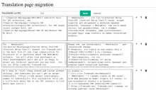
The icon images used currently at Special:PageMigration for various operations like edit, delete, swap, adding a new unit need to be improved. They need to be replaced with better and consistent icons to improve the look and feel.

Also, when some of the icons are disabled (for example, when a particular unit is opened for editing), they can be replaced with images of lighter gray level to give the disabled effect.
Details

Reference
bz65764

Event Timeline

bzimport raised the priority of this task from to Low.Nov 22 2014, 3:23 AM
bzimport set Reference to bz65764.

Change 141711 had a related patch set uploaded by BPositive:
New icon images for Special:PageMigration

https://gerrit.wikimedia.org/r/141711

Created attachment 15927
Screenshot of proposed version

Attaching screenshot originally provided by BPositive at https://i.imgur.com/zrNDPzf.png before it gets lost.

Attached:

zrNDPzf.png (600×1 px, 119 KB)

There is weird pixel in middle of the switch arrow. Is it there on purpose?

Change 141711 merged by jenkins-bot:
New icon images for Special:PageMigration

https://gerrit.wikimedia.org/r/141711

pr4tiklahoti wrote:

(In reply to Niklas Laxström from comment #3)

There is weird pixel in middle of the switch arrow. Is it there on purpose?

Nope, I have fixed it at https://gerrit.wikimedia.org/r/#/c/152951/

Please have a look.

Change 152951 had a related patch set uploaded by Nemo bis:
Unwanted pixel fixed for switch.svg and switch.png

https://gerrit.wikimedia.org/r/152951

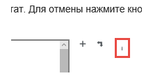
Current icon for deleting is very small and unclear:

image.png (90×245 px, 3 KB)

Maybe "minus" sign will be better.

Which browser are you using? It looks like a rendering issue. There has been recent changes to the images so it there is a good chance it is a regression.

Which browser are you using? It looks like a rendering issue. There has been recent changes to the images so it there is a good chance it is a regression.

Win10 + Google Chrome, Yandex browser, Edge

As the width of the window decreases, the icon decreases.

image.png (97×188 px, 2 KB)