Page MenuHomePhabricator

Add width-expanding toggle on Topic pages
Closed, ResolvedPublic2 Estimated Story Points

Description

Right now, Topic pages don't have a side rail, and there's no way to expand/collapse the content width. This can be confusing for users who don't know/care about the board/topic distinction.

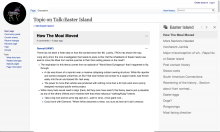
For Topic pages, add a toggle switch on the side according to the mockups below. The content-width functionality is the same as the side rail on board pages.

Note: Use the same sticky preference for both boards and topic pages. If a user has collapsed the side rail on boards, collapse it on topic pages, and vice versa.

topic-expand.png (796×1 px, 192 KB)

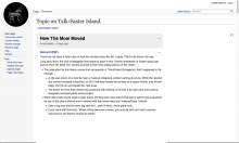
topic-expanded.png (809×1 px, 201 KB)

(original ticket by He7d3r):
The sidebar toggle which allows the users to make the messages to occupy the full width of the page is not available anymore on Portuguese Wikipedia. It is still visible on MediaWiki.org:
https://www.mediawiki.org/wiki/Talk:Flow
https://pt.wikipedia.org/wiki/Topic:Sa9rk9u0j4k63ohv
Event Timeline

He7d3r raised the priority of this task from to Needs Triage.
He7d3r updated the task description. (Show Details)
He7d3r added a project: StructuredDiscussions.
He7d3r subscribed.
Restricted Application added a subscriber: Aklapper. · View Herald Transcript

I think what you're seeing is not the difference between mw.org and ptwiki, it's the difference between a full page/board view and a topic view. Topic views do not have the side bar at all, even on mw.org (see https://www.mediawiki.org/wiki/Topic:Sjh61at6k8mz21oy ) , whereas board views do have it, even on ptwiki (see https://pt.wikipedia.org/wiki/Wikip%C3%A9dia:Flow/Testes ).

I could swear there was already a task about making the side rail available on topic views, but there doesn't seem to be one yet.

It was decided against adding the sidebar to the topic page until there is something relevant to put in there.

Danny says: in spite of there not being any sidebar content, there should be a way to toggle full-width.

Catrope set Security to None.

Yeah, let's talk about it.

I think that the full-width toggle should work the same way on topic pages, using the same sticky preference for people who want to hide the rail and see the posts full-width. Keeping topic pages fixed-width gives the impression that the feature is broken on some pages.

But -- I don't want to create topic-specific content in the topic page rail that disappears when you see that topic on a board. We may end up putting something in that space, but I only want to do that when we have something useful to put there. We shouldn't create features just to fill up space.

So, question for @Pginer-WMF: What could we do as a side rail/toggle on topic pages, when we know the rail will be empty? We can take out the pencil and "Edit description" easily, but the "About this discussion" text anchors the tabs icon that we use for "reopen the closed side rail". Can we still use that icon and the X without text?

At the board level, expanding the right rail was meaningful to provide the general info on a board and also provided an indirect way to expand content. However, if we lack that info at the topic level it may be better to provide direct support for expanding the content if really needed. Otherwise, the main action (expanding an empty right rail) may seem irrelevant.

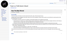
One idea would be to provide expand and collapse controls in a way that the interaction is similar to the one we provide at the board level, but connected with the content (without a right rail):

topic-expand.png (796×1 px, 192 KB)

topic-expanded.png (809×1 px, 201 KB)

In order to have a better idea of the number of users impacted, it would be great to measure the percentage of users that currently access boards with the right-rail collapsed and expanded. That may be helpful to decide whether to wait until we have meaningful content to show for a topic level right-rail or to provide a more immediate solution based on expanding/collapsing the content itself.

In terms of surfacing existing content, we can consider to highlight that the current topic is part of a bigger conversation by anticipating other topics from the board. That will allow lateral navigation and would help the users that reach a specific topic to discover that there are other related topics that may be of their interest:

topic-with-toc.png (796×1 px, 244 KB)

Oh, good -- yes, making it a specific expand-content switch is much better than expanding/collapsing an empty side rail.

I think it's worth doing, because the experience that Helder had is pretty jarring -- it feels like the rail is broken, because they're not thinking of it in terms of "topic page" and "board page".

Making a ToC for the topic page side rail is definitely a possibility. I don't want to put stuff there just for the sake of filling the space, because I'm pretty sure the world will provide us with something important to put there. It usually does. :)

DannyH renamed this task from Flow full width toggle disappeared to Add width-expanding toggle on Topic pages.Jul 27 2015, 11:06 PM
DannyH updated the task description. (Show Details)

Here are the icons to expand/collapse the topic view:

Change 229996 had a related patch set uploaded (by Mooeypoo):
Allow for expanding/collapsing single topic view

https://gerrit.wikimedia.org/r/229996

@Mooeypoo, @DannyH

This patch adds the collapse/expand button to the single topic page, the old revision topic page and the diff topic page but not to the old rev and diff for board description or topic summary. I understand why it works like that technically but I'm wondering if it's going to feel too arbitrary and not logical to the users.

One option would be to show it only on the single topic page so the board and topic have this feature but the old rev and diff stay the same.

Another option would be to have the expand/collapse on all old rev and diff pages since they're all narrow with some space on the right (in ltr, that is).

I don't think there's a reason to have the big margin on old rev and diff pages at all, actually. Those could just be regular full width; I'm not sure why they bothered to make those pages fixed width in the first place.

If it's not too difficult and out of scope, then I'd say just make those pages full width and don't bother with the collapse/expand. But it's not worth spending a ton of extra time on that, if it's hard.

Change 229996 merged by jenkins-bot:
Allow for expanding/collapsing single topic view

https://gerrit.wikimedia.org/r/229996

Checked in betalabs

  1. the width-expanding toggle affects all Talk page(and all topics on those pages) for a user.

e.g. if a user expands one topic on one Talk page, all topics on the same page and other pages for that user will have the same preference - expanded.

  1. The following tooltips(with angled brackets) are displayed: <flow-sidebar-expand> and <flow-sidebar-collapse> Should the angled brackets be there?
  2. pages viewed via View history do not have the width-expanding toggle.

Note: Use the same sticky preference for both boards and topic pages. If a user has collapsed the side rail on boards, collapse it on topic pages, and vice versa.

Works as described. However, it feels strange to tie these two to the same action - I expand a topic's text and my board description, in fact, collapses.

Change 231476 had a related patch set uploaded (by Catrope):
Clean up width toggle styles

https://gerrit.wikimedia.org/r/231476

Change 231477 had a related patch set uploaded (by Catrope):
Use messages that actually exist for tooltips in SidebarExpandWidget

https://gerrit.wikimedia.org/r/231477

Change 231476 merged by jenkins-bot:
Clean up width toggle styles

https://gerrit.wikimedia.org/r/231476

Change 231477 merged by jenkins-bot:
Use messages that actually exist for tooltips in SidebarExpandWidget

https://gerrit.wikimedia.org/r/231477

Checked in betalabs - tooltips "Read at fixed width" and "Read at full width" are in place.