Page MenuHomePhabricator

Avoid the dashboard layout breaking on small screens
Closed, ResolvedPublic

Description

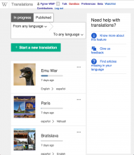
When the window size is reduced, the dashboard layout breaks:

Screen Shot 2015-07-22 at 12.39.31.png (1×1 px, 451 KB)

Some possible ideas (more to be explored):

  • Make the language controls more compact when there is less room. For example, users may not need the whole language name to know which languages are selected.
  • The help column can be rearranged when there is little room. For example, showing as a small floating element at the bottom-right corner that can be expanded into the whole column on demand.

This was reported in the project discussion page.
Event Timeline

Pginer-WMF renamed this task from Avoif the dashboard layout ot break in small screens to Avoid the dashboard layout ot break in small screens.
Pginer-WMF raised the priority of this task from to Needs Triage.
Pginer-WMF updated the task description. (Show Details)
Pginer-WMF set Security to None.
Amire80 renamed this task from Avoid the dashboard layout ot break in small screens to Avoid the dashboard layout breaking on small screens.Jul 28 2015, 6:30 PM
Amire80 moved this task from Needs Triage to CX6 on the ContentTranslation board.

Change 247514 had a related patch set uploaded (by Jarrettmunton):
Dashboard: Fix broken layout on small screens

https://gerrit.wikimedia.org/r/247514

@Jarrettmunton, you may improve your patch using the advantages of our grid system. It has multiple break points to support various screensizes. Using that you can control the behavior of UI elements without adding java script code. Here is some quick code example:

diff --git a/modules/dashboard/styles/ext.cx.dashboard.less b/modules/dashboard/styles/ext.cx.dashboard.less
index ab53784..54e65fc 100644
--- a/modules/dashboard/styles/ext.cx.dashboard.less
+++ b/modules/dashboard/styles/ext.cx.dashboard.less
@@ -31,6 +31,9 @@ body {
 .cx-dashboard {
        padding: 20px 50px;
        color: @gray-darker;
+       @media @palm {
+               .mw-ui-one-whole;
+       }
 }
 
 .cx-dashboard__sidebar {
@@ -47,6 +50,25 @@ body {
                .cx-sidebar {
                        min-height: 100vh;
                }
+               @media @palm {
+                       display: none;
+               }
+       }
+       @media @palm {
+               .collapse_to_side;
+       }
+}
+
+
+.collapse_to_side() {
+       position: fixed;
+       top: 0;
+       right: -400px;
+       width: 100%;
+       &:hover {
+               right: 0;
+               width: 80%;
+               z-index: 9999;
        }
 }

@@ -122,6 +144,9 @@ body {

        padding: 0 10px 0 0;
        background-color: #f0f0f0;
+       @media @palm {
+               .mw-ui-one-whole;
+       }
 }

 .cx-translationlist-container.sticky .translation-filter {
@@ -134,6 +159,9 @@ body {
        width: 66%;
        padding-left: 50px;
        padding-right: 15px;
+       @media @palm {
+               .mw-ui-one-whole;
+       }
 }

 .cx-translationlist-container.sticky {

With this, at small sceens, you get

pasted_file (771×474 px, 82 KB)

Only the help icons are shown at this size,

pasted_file (365×462 px, 31 KB)

on hover you get the full widh side bar

pasted_file (588×455 px, 55 KB)

Note that the above examples are just for illustration. @Pginer-WMF can give the expected UX behavior

@Jarrettmunton This part of code is changing a lot recently. So please let us know if you want to continue on this. If delayed, it will be difficult to merge

Change 247514 abandoned by Nikerabbit:
Dashboard: Fix broken layout on small screens

Reason:
This patch has not been updated in a long time to address the comments. Anyone feel free to unabandon if this patch is worked on, or start a new patch.

https://gerrit.wikimedia.org/r/247514