Page MenuHomePhabricator

[Story] When editing quantities, allow units to be entered directly into the text input field.
Open, HighPublic

Assigned To
None
Authored By
daniel
Sep 10 2015, 10:40 AM
Referenced Files
F8870555: Frame2.png
Jul 27 2017, 4:41 PM
F8870554: Frame1.png
Jul 27 2017, 4:41 PM
F8870556: Frame3.png
Jul 27 2017, 4:41 PM
F8833377: kmpaste.gif
Jul 24 2017, 3:07 PM
Tokens
"Burninate" token, awarded by Liuxinyu970226."Burninate" token, awarded by Esc3300.

Description

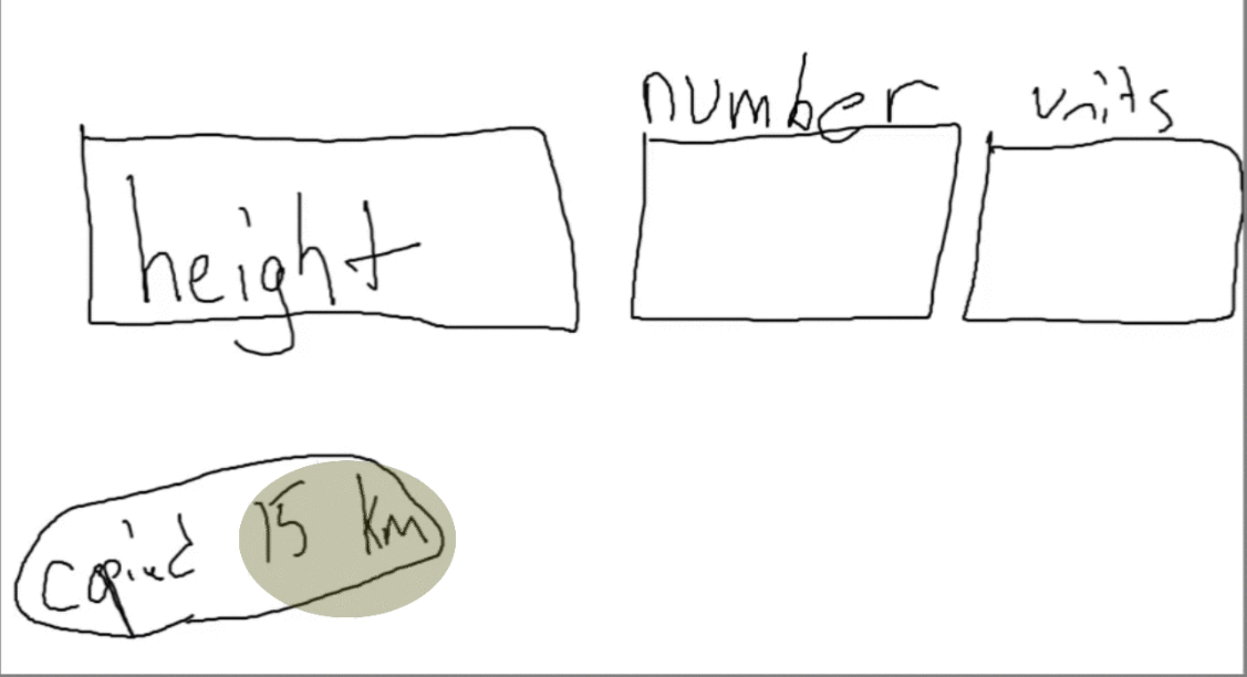
When entering units, it would be very convenient if one could type the desired unit directly into the input field, instead of relying on a separate selector widget. This is useful for copy&pasting quantities that are already given with a unit ("2m", "7.2kg", etc), and for power users that want to save a few keystrokes/clicks.

There are several options for what "names" would be accepted for unit input:

Another open question is the placement of units - are units to be entered after the number(s), or may the be entered before the number, too? Would that depend on the locale, or the unit? Some units are traditionally prepended, especially currency symbols.


Possible approach ( from T170146 , added July 2017) ;

When preferred units are defined on a property and the abbreviation given matches this, parse the units directly. Sample:
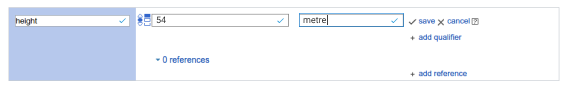

Workaround:

  • add QIDs/numbers to spreadsheet
  • use QuickStatements to upload

Event Timeline

daniel raised the priority of this task from to High.
daniel updated the task description. (Show Details)
daniel added subscribers: Jc3s5h, Lydia_Pintscher, Jonas and 2 others.

We found this need in our 2017-7 Usability test (T170273). Alternatively to having parsing, we could also adjust the UI to make it more clear that units need to be given AND improve the unit suggestions (T170406, T110673)

it's really easier to do it one field

I think that there is a lot of value in keeping 2 fields.

  1. the second field labeled as units makes it obvious to a user that units can (and should?) be provided (could even show an error state highlighting that field if no units provided)
  2. it gives a specific area for feedback to be given to a user. For example: a mistyping of "mm" instead of "m" could be highlighted for the user in the second field in an understandable way (by showing that it will be interpreted as millimeters and not meters in this case). Or in one of the cases that came up in our user testing, including the input in the numerical field, it could highlight the numerical field as being incorrect and provide feedback.
  3. if we ignore the copy paste use case for a moment, having a second field shouldn't add any keystrokes to the process of entering a value since the place where one might enter a space in "10 m" would be replaced by typing the tab key. (This based on the premise that typing 10m is incorrect which isn't necessarily a good argument if users do it anyway)

If we come back to the case of a copy paste, a potential way of making that work in a 2 field case might be to capture a paste event and parse it into both fields if there are characters in it.
It could be a cool accelerator for power users without sacrificing the parts of the two field system that are important for less advanced users. Here's a gif showing what I'm talking about.

kmpaste.gif (612×1 px, 1 MB)

An issue might be that it wouldn't be very discoverable, which might be fine and might not.

Here are some quick mock-ups of what I'm talking about. Poke some holes in them please.

Frame1.png (90×572 px, 5 KB)

Frame2.png (90×572 px, 7 KB)

Frame3.png (90×572 px, 5 KB)

I'd also like to hear more about why people prefer one field as long as it isn't for strictly technical reasons. (Not to say that these aren't often valid, I just think this is a usability question and not a technical one)

@James_Budday Thanks. If we do want separate fields, they should probably look like this. The strange popup mechanism we currently use for units and and language selection is really a hack working around the assumption that there can only be one input box.

I for one really like it if i can just type what i mean, without stepping through various input fields. I really appreciate interfaces that understand syntax - and considering the use of @ and # for marking up keywords on twitter, facebook, phabricator & co, I think this is quite common, at least for power users.

In any case, please note that we already support special syntax for specifying the uncertainty or precision of the input. And we require people to use that syntax to express precision. input examples:

  • 123 (unspecified precision)
  • 123.5+/-0.2 (uncertainty range is 0.4)
  • 7e3 (7000 with three insignificant digits)

I don't think we should mix "use syntax" with "use fields". We should do either syntax for everything, of fields for everything, or both for everything. But syntax for precision but a separate field for units seems... odd.

I think we need to keep consistency in mind here. We have at least one other place where we use the same mechanism right now: selecting a language for monolingual text values. We should also think about selecting globes, precision and time zone in the future. Which of those should behave the same and which differently?

Gut feeling: I like two fields better because it makes it a bit clearer that you are selecting an existing item for the unit and can't just type anything.

At least make the interface better for keyboard users. I don't think you can easily add one statement with only keyboard that has a widget?

@Sjoerddebruin, you can go to the input of the widget using the tab. There are many things that aren't nice with this (like the drop downs not being removed when you go to the widget or not being able to save pressing enter in the widget) but I usually do it only with the keyboard and there are no major problems other than a few usability improvements that I noticed.

@Sjoerddebruin, you can go to the input of the widget using the tab. There are many things that aren't nice with this (like the drop downs not being removed when you go to the widget or not being able to save pressing enter in the widget) but I usually do it only with the keyboard and there are no major problems other than a few usability improvements that I noticed.

The things you mentioned are exactly what makes it more harder to enter units and other things.

I think we need to keep consistency in mind here. We have at least one other place where we use the same mechanism right now: selecting a language for monolingual text values. We should also think about selecting globes, precision and time zone in the future. Which of those should behave the same and which differently?

Gut feeling: I like two fields better because it makes it a bit clearer that you are selecting an existing item for the unit and can't just type anything.

@Lydia_Pintscher asked which should behave the same and which differently.

      • Precision: we should decide if precision, which will ultimately be translated into a decimal upper and lower bound, should attempt to mimic the precision stated in the source, or should be a round decimal number that approximates the precision stated in the source. For example, if a source states latitude and longitude is accurate to +/- 1 arcsecond, should that be represented by making the lower bound less than, and the upper bound greater than. the nominal value by 0.0002777777777° or by 0.0003°?
    • Time zone: since most sources do not provide time zones, and it can be challenging to determine what time zone offset was in effect at the time of an event, there should be an ability to state the time zone is local time. The current documentation of the data model describes the time zone as an integer. This won't do in the future.
  • Globe: fairly straightforward for objects on the surface of the earth, but different notation and applicability for celestial objects (right ascension and declination for stars and galaxies, not applicable for position of planets and comets as seen from Earth).

Gut feeling: I like two fields better because it makes it a bit clearer that you are selecting an existing item for the unit and can't just type anything.

I'd agree with this "semantics" approach.

(like the drop downs not being removed when you go to the widget or not being able to save pressing enter in the widget)

@Sjoerddebruin, @Agabi10 : Thanks for sharing! Do you know if there is an issue for these problems?

T96160, also see T40968 for other keyboard related tasks.

Gut feeling: I like two fields better because it makes it a bit clearer that you are selecting an existing item for the unit and can't just type anything.

Instead of "gut feeling", maybe we could each try entering 100 values with different methods and then compare our experiences .. GUI testers already had enough of it after 1 value entered.

@Esc3300 Yes, good idea. Alternatively (in case we can't find the people or so) I made good experiences with Keystroke Level Modeling to predict the efficiency of an interface. I used it for modeling keyboard interaction for voice.mozilla.