…instead of the pending animated texture.
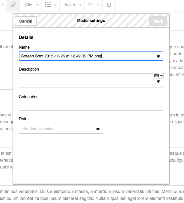
Description
Description
Details
Details
| Status | Subtype | Assigned | Task | ||
|---|---|---|---|---|---|
| Open | None | T115858 Design improvements for mw.ForeignStructuredUpload.BookletLayout | |||
| Resolved | • Prtksxna | T115861 Show determinate progress bar for the image upload in mw.ForeignStructuredUpload.BookletLayout |
Event Timeline
Comment Actions
It is. mw.api.upload handles the gnarly details and gives you progress notifications on the promise it returns. In mw.Upload.BookletLayout, you should be able to just do this.uploadPromise.progress( function ( fraction ) { ... } ) after this.uploadPromise is set (fraction is a number between 0 and 1).
Some design and UI work will be needed, ProcessDialog doesn't really have a place to display a progress bar right now.
Comment Actions
Great! I'll try it out.
Some design and UI work will be needed, ProcessDialog doesn't really have a place to display a progress bar right now.
I have some ideas here. Will make mock ups.
Comment Actions
(For any progress bar implementations I recommend keeping in mind the task summary in https://phabricator.wikimedia.org/T95137 )
Comment Actions
VisualEditor's loading progress bar is basically all fake, or an educated guess at the progress at best. Here the progress bar state would actually reflect the number of bytes transmitted and left to transmit.
Comment Actions
With progress indication we should not aim for 100% accuracy but for clarity and consistency.
As @Aklapper pointed, it may be desirable to make progress indicator not linear (ensuring it keeps moving and goes faster at the end).
In this case, the big issue I see is that for large files (or not so large files in not so fast networks), an indeterminate indicator creates the uncertainty of not knowing how much it takes (minutes? hours? days? is it frozen?). Even if it is not accurate, a progress indicator helps to set some expectations on whether is better to stay in front of the device or go for a coffee.
Comment Actions
@Pginer-WMF, looking at @matmarex's comment, this seems technically possible, that too at a much better granularity than what you were expecting!
(click to see animation)
| Blue bar with texture | Blue bar without texture | Moving texture |
|---|---|---|
 |  |  |
Comment Actions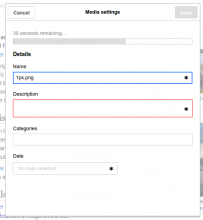
We could make it even clearer and use a full progress widget. UploadWizard uses the extra space to show an ETA / % complete:
Comment Actions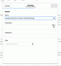
I like the idea of showing the ETA and the %, but dislike the proper progress bar on top (visual, not UX). How about we show the same information and a subtitle of the dialog? Just thinking out loud.
Comment Actions
While the thin progress bar does look smart - I think it risks become too small. I think when we have thumbnail preview on this page it might look less odd having a progress bar at the top.
Comment Actions
While the thin progress bar does look smart - I think it risks become too small.
I think it provides a good balance between communicating progress and not distracting from the main user task of filling the file details. Communicating the progress is achieved through color and movement: I created a quick prototype so that movement can be appreciated better than in a static mockup.
The main risk of ignoring the progress bar is when users fill the description information and try to proceed before the progress bar completed. In that context, having the progress bar closely connected to the save button can also help users to understand why is it disabled.
Comment Actions
I'm with @Pginer-WMF on the position and size of the progress bar. Wondering if ETA is easily achievable, @Prtksxna? What do you think about integrating ETA here from a UX perspective @Pginer-WMF?
Comment Actions
As @Prtksxna mentioned in T115861#1777555, the remaining time can be shown as part of the dialog title. I think it is conceptually connected with the main purpose of the dialog so the integration makes sense. It can be done in its own line as Prateek illustrated or integrated after the title itself.
From the UX perspective, one key element is the consistency of the time communication. Even if time is not precise, we should avoid it to be inconsistent (e.g., going back or telling you that it will take more time than initially announced, or evolve independently from the progress bar). That is, I'd prefer to display "a few seconds" rather than keeping the indicator at "3 seconds" for several minutes. Thus, getting some idea of how reliable is the information about the remaining time the upload will take is helpful to decide how to present it.
Comment Actions
@matmarex, should this be part of OOjs UI core or part of the upload dialog subclass?
Comment Actions
I'd keep it in the upload dialog for now. If we run into anything else
that could use it, we can always upstream it.
Comment Actions
Change 260574 had a related patch set uploaded (by Prtksxna):
mw.Upload.BookletLayout/Dialog: Add determinate progress bar
Comment Actions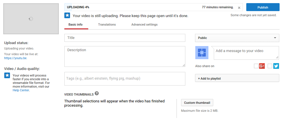
The upload progress is one of the primary pieces of information on this page. I don't see the need to hide it away. Compare, for example, the YouTube upload page:
Comment Actions
I think it's important that we have a thumbnail on this page, with the progress bar near that thumbnail so it's clear what the progress bar is for. At the moment it isn't clear that it represents the upload. Am I just waiting for the dialog to load something, is my processor doing something?
Comment Actions
I actually like the design. I don't think it's "hidden away", the bright blue draws the eye. But I agree it would be good to clearly say "Uploading…" somewhere next to the progress bar.
Comment Actions
Another issue is introducing yet another design for indicating progress (in addition to ooui progress widgets and the "pending" animated background). We should try and stick to standardised widgets where possible.
Comment Actions
Adding to this, I think the question is whether the upload is a background process or a foreground process. Showing progress on the header or footer is commonly used to indicate a non-blocking background process such as a web page loading. In this case I think the blocking nature of the upload, combined with the likelihood of it taking 10s of seconds, makes it a foreground process, and so the progress should be part of the body, not the header.
Comment Actions
I'd recommend to get some clarity based on the user behaviour.
- If the concern is that the proposed version is not very prominent and that would make people to abandon the upload before it is completed, maybe we can take a look at the number of abandoned uploads for the current version (which is also not displaying a very prominent bar).
- If the concern is about users getting confused about why the upload button remains inactive for a while after they selected a file and filled the details for it (or induces them to not fill the details right away), maybe observing some users uploading images with the tool will help to understand such issues.
Regarding the Youtube example, it is not clear to me why they are not following the material design guidelines about progress yet, but I'm not completely familiar with their specific context. From their guidelines:
A linear progress indicator should always fill from 0% to 100% and never decrease in value. It should be represented by bars on the edge of a header or sheet that appear and disappear.
Comment Actions
If you look at the actual examples that place the loading bar at the edge they are background loading processes. The one example they use of a blocking foreground process ("Loading content for the first time.") shows the progress bar in the centre of the body.
While in an ideal world we could back up all of our arguments with user tests, with our limited resources we should try and make a decision here based on our best judgement otherwise this bug will get endlessly filibustered.
Comment Actions
If you look at the actual examples that place the loading bar at the edge they are background loading processes. The one example they use of a blocking foreground process ("Loading content for the first time.") shows the progress bar in the centre of the body.
That's probably not the only example. This one seems loading new content for the first time with the loading indicator at the top of it.
In any case, I just wanted to highlight that thinner loading bars may be considered noticeable enough (i.e., there are no thick bars in Google guidelines and I don't think that all these loading indicators are intended to go unnoticed by users). I think that we don't want to hide the progress bar, but I don't think we are doing so.
The definition of "blocking" is also a bit blurry in our case. One of the ideas of the uploading tool was to allow the user to fill the details of the file while it is being uploaded, and while you cannot move to the next step until the uploading complete, I think we are providing enough freedom of movement to not consider this at one extreme of the blocking spectrum.
While in an ideal world we could back up all of our arguments with user tests, with our limited resources we should try and make a decision here based on our best judgement otherwise this bug will get endlessly filibustered.
I'm not proposing doing tests for every single feature discussion. At the same time I think it is our responsibility to observe how a solution is used by some users before exposing it to millions (and it often results in saved time). I'm just pointing this aspect as something worth paying attention to when general tests for the whole uploading tool are planned, not organising specific research around this.
As I've said, I think that one important design goal is not to get in the way of the user filling the image details while informing that the upload is going on. After selecting an image and clicking "upload" I don't expect to get disoriented by not knowing what the progress bar is about (especially if the dialog label becomes "Uploading..." just above it).
Comment Actions
There are two issues here:
- Redesigning the progress bar to be thin. The 2px bar isn't necessarily not visible enough, but if we are going to change the design of the progress bar it should be done upstream and to all progress bars.
- The bar not being labelled. I notice in your example you have put 'Uploading...' in the title, and then squeezed in extra information in a small font size underneath, however this approach feels hacky: the header bar contains the title, not a status bar, but it is being hijacked for this purpose with the assumption that the title is not required, which may not always be the case. If we use a progress widget, there is plenty of space of labels without overriding the title. Also if we show a thumbnail there will be a natural space for one.
Comment Actions
The bar not being labelled. I notice in your example you have put 'Uploading...' in the title, and then squeezed in extra information in a small font size underneath, however this approach feels hacky
I'm seeing this in the following way: there is a dialog with a main purpose (uploading), the title should reflect that purpose (the current "Media settings" may be misleading), and it makes sense to attached the loading indicator to the main panel since it is about the progress of the main activity of the panel.
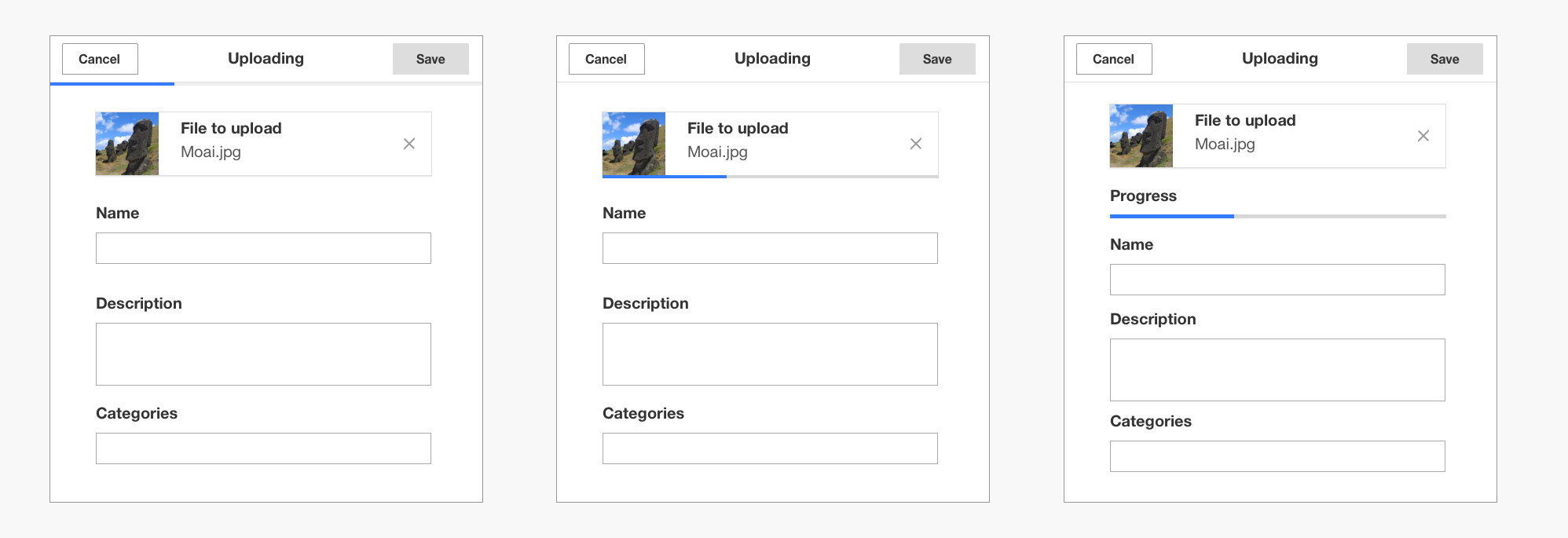
The whole panel represents the media element which is being uploaded with some data pending to be filled. That makes me prefer to keep the progress connected to the whole panel. Keeping it connected to the preview makes also sense, but I'm not in favour of presenting the progress bar as if it was one additional element of the media file (at the same leve as the image title or the description). I created a set of wireframes to illustrate the idea with the different configurations (the progress attached to the whole panel representing the whole media element, attached to the file preview and as a property of the media element):
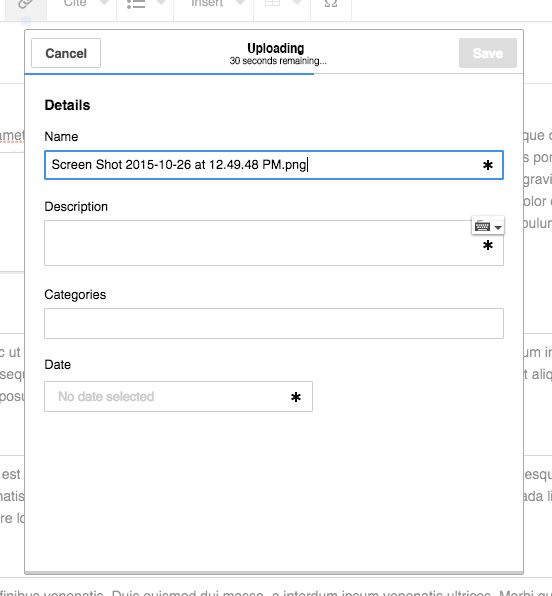
Regarding the textual indicators of progress ("30 seconds remaining"), I agree that it seems too detailed information for the title. That probably highlights that is not essential for the main activity and we can probably remove it.
Redesigning the progress bar to be thin. The 2px bar isn't necessarily not visible enough, but if we are going to change the design of the progress bar it should be done upstream and to all progress bars.
Yes. It makes sense to review the different uses, standardise and define the guidelines on how to better use the component.
Regarding the approach to follow we can (a) apply it in this case and tweak it to check how it works before being incorporated to the catalog or (b) do the standardisation work first and apply it later. That probably depends on how confident we are in the solution, but I'll let that call to those in charge of the standard UI components.
Comment Actions
I don't agree. Just because the upload is the "main" async action on the page doesn't mean the user will automatically associate it with the first progress bar. If there were more async actions on the page this would be even more confusing. I don't think it's a scalable design.
I created a set of wireframes to illustrate the idea with the different configurations (the progress attached to the whole panel representing the whole media element, attached to the file preview and as a property of the media element):
I think something like #2 would be good as well. As long as the progress is clearly associated with the file upload.
Regarding the textual indicators of progress ("30 seconds remaining"), I agree that it seems too detailed information for the title. That probably highlights that is not essential for the main activity and we can probably remove it.
I'm not sure I see how your second statement follows from the first. Just because the information doesn't fit, doesn't mean it isn't essential. For large uploads on a slow connection (where ETA is in many minutes), showing an ETA is very important.
Redesigning the progress bar to be thin. The 2px bar isn't necessarily not visible enough, but if we are going to change the design of the progress bar it should be done upstream and to all progress bars.
Yes. It makes sense to review the different uses, standardise and define the guidelines on how to better use the component.
Such a change would have widespread effects so may take some time to agree on and complete. It would be good if we had a design using the existing bar so this task doesn't get blocked on a redesign of the progress bar.
Comment Actions
Change 269979 had a related patch set uploaded (by Prtksxna):
mw.Upload.BookletLayout/Dialog: Add determinate progress bar
Comment Actions
Change 260574 abandoned by Prtksxna:
mw.Upload.BookletLayout/Dialog: Add determinate progress bar
Reason:
See I0fd7f21f3fc1ef042330b7571c247e09c24d1a5c instead
Comment Actions
Change 269979 merged by jenkins-bot:
mw.Upload.BookletLayout/Dialog: Add determinate progress bar
