Page MenuHomePhabricator

Timelines break mobile skin, not taking up full viewport width
Closed, ResolvedPublic

Description

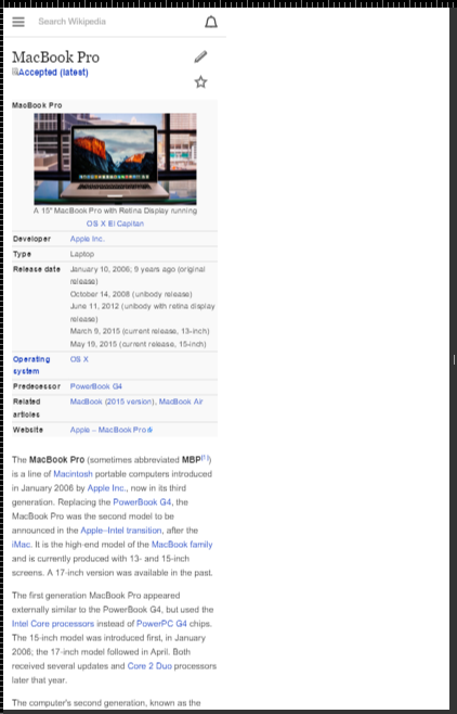
@JKatzWMF discovered the following problem:

[20:58] <JonKatz> joakino phuedx|afk jhobs florian hey websperts(?), I'm seeing a gnarly bug on iphone where the zoom is getting fucked up. Just sent an email about it to internal list (should have been public in retrospect)

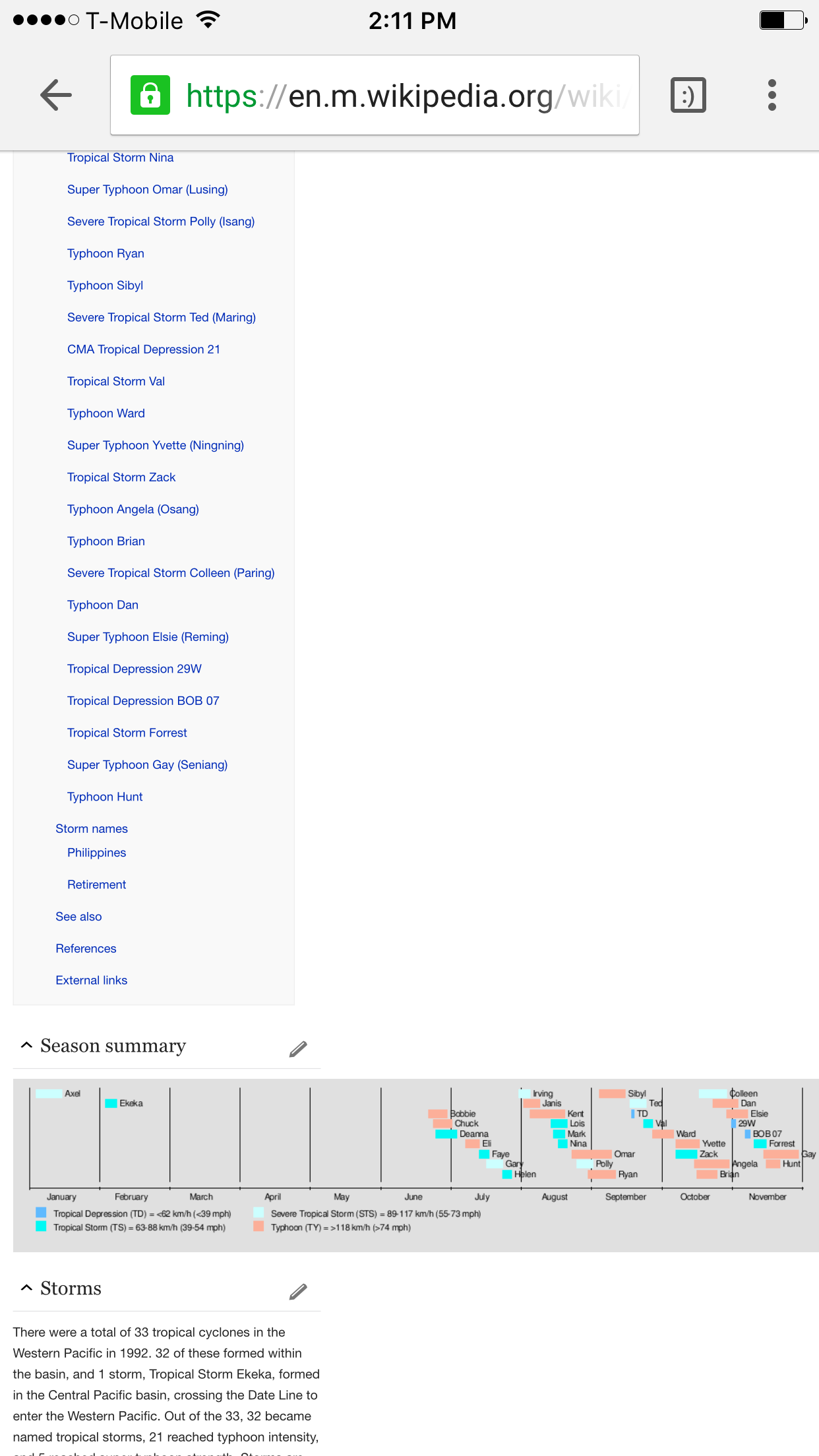
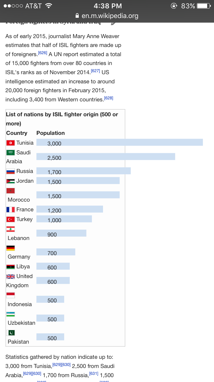
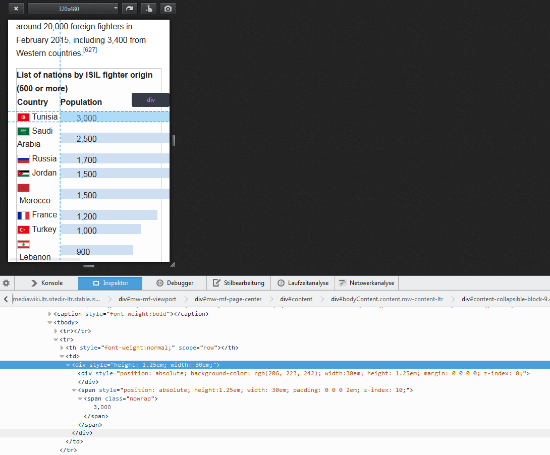
Look at these examples:

Unbenannt.PNG (658×422 px, 91 KB)

Unbenannt1.PNG (658×421 px, 82 KB)

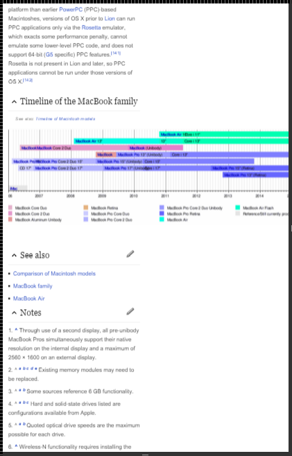
The timeline looks really big and breaks the mobile skin, it should be minimized or scrollable (I prefer the last solution).

Event Timeline

Florian claimed this task.
Florian raised the priority of this task from to High.
Florian updated the task description. (Show Details)
Florian added subscribers: Florian, JKatzWMF.

Change 253035 had a related patch set uploaded (by Florianschmidtwelzow):
Wrap timeline images and map into a div element

https://gerrit.wikimedia.org/r/253035

Change 253036 had a related patch set uploaded (by Florianschmidtwelzow):
Fix timeline overflow

https://gerrit.wikimedia.org/r/253036

Comment copied from T118600

From BrowserStack tests, it more broadly affects iOS 9.
Reproducible there on iPad Air 2.

T118600_Minerva-not-using-viewport_image3.png (921×1 px, 1021 KB)

Copied comment from T118600:

@floria I replicated this morning on my iphone 6 ios9, but cannot anymore...could be a caching issue. Did a release go out between last night at 10pm and this morning?

Did a release go out between last night at 10pm and this morning?

Not that I know any, the last SWAT was yesterday 17 pm PST. I still can replicate this issue :) Maybe you collapsed the section with the timeline?

Volker_E renamed this task from Timelines break mobile skin to Timelines break mobile skin, not taking up full viewport width.Nov 13 2015, 10:19 PM
Volker_E set Security to None.

@Mhurd commented at T118600#1804758

I couldn't reproduce the issue this afternoon, but I just tried loading "enwiki > 1992 Pacific typhoon season" and I'm seeing the issue again. Appears to be related to the table in the "Season Summary" section:

IMG_1582.PNG (2×1 px, 445 KB)

IMG_1581.PNG (2×1 px, 240 KB)

I could reproduce this on Chrome on Windows 10, so let me explain what I did (because some asked me :P):

  • Open Chrome
  • Open devtools (Ctrl + Shift + J)
  • (maybe enable user agent spoofing and viewport rendering)
  • select an appropriate device from the list (top left), I choosed Nexus 6
  • Load a page with a large timeline ("Mac book pro" or "1992 Pacific typhoon season" both on english WP)
  • See what happens (you need to open the section with the timeline, if it's collapsed)

Read more about that (and get some pictures and a video :P):
https://developer.chrome.com/devtools/docs/device-mode

Btw.: There was only one change related to the collapsible feature (there are no other changes, where I would say, that they could result in such a regression):
https://gerrit.wikimedia.org/r/#/c/250838/

Even, if I think, that this can't be the cause of the problem, I tested it and reverted the commit locally, with the same problem as a result. I assume, that we've this problem since MF and the Timeline extension exists.

That's actually a great example for the importance of a visual regression tool. @Jdlrobson

@Florian @Volker_E, @Tnegrin pointed out that this page has it as well: https://en.wikipedia.org/wiki/Islamic_State_of_Iraq_and_the_Levant

IMG_6517.PNG (1×750 px, 136 KB)

Related to another graphical feature. Am I right in thinking this is related to a bug that is also showing the sections un-collapsed for some pages on the iphone?

^ in other words these issues were always there for anybody who uncollapsed the sections and we just didn't notice?

@Jhernandez, just pulled it into the sprint since it is breaking a good number of pages. Florian has a patch in, but I think we should consider a swat deployment given it's scope.

I agree with the SWAT deployment. Thanks for the quick response all.

-Toby

The mentioned example of https://en.wikipedia.org/wiki/Islamic_State_of_Iraq_and_the_Levant isn't a timeline, it's a table with fixed width div's:

Unbenannt.PNG (902×1 px, 263 KB)

So, the usages of "Bar chart" templates will not be fixed with this change.

Hi,

Thanks a lot for your help @Florian

Do we know if this is a regression? Doesn't seem like it is, but it is important to know.

See SWAT_deploys#Guidelines for information on what is swattable:

  • No new features/extensions
  • Fixes of regressions

This issue at hand doesn't break the experience (you can still zoom in to see the content) and it probably affects a really small percentage of pages (specially taking into account only the timeline fix, when it seems like the problem is of a broader nature).

I'm against swat deploying the timeline fix, specially since the train rolls tomorrow, and it is effectively in prod in 2 days and this is a non-critical fix (tiny percentage of articles, with a portion of visits (ios9 on small screens)). We'll talk about this in standup at the beginning of SF day.


I'm really thankful about @Florian's patch, and we'll merge it and have it ride the train,
But it seems to me that there is a more complex issue regarding how iOS 9's Safari respects the initial zoom level and certain elements in pages with a big width specified.

We should focus on understanding to actually solve the issue properly:

  • What's changed in Safari in iOS9. Why is this an issue now and not before.
  • What templates are affected. Searching for inline styles with width should help track them down.
  • Find ways forward:
    • Find a fix/hack for iOS9's problems (every iOS release breaks the site in multiple ways)
      • Enforce a max-width: 100% on page content?
    • Find a way to help editors fix templates what specify fixed widths so that they work in mobile:
      • Change to % width instead
      • Add max-width: 100%
      • Etc.

cc/ @jhobs @bmansurov @phuedx

I think we shouldn't mix up the problems here. This task was created to fix the timeline problem. Timelines are generated by another extension with a parser tag, which creates an image and embeds it to the wiki page. The problem, that the whole page is scrollable (and zoom-able) occurs in any brwoser (that's why I was able to fix it, remember, I have no iOS device ;)). Now, I think, that iOS devices zoom out of the page to show the entire image, right? (I can't test that). I don't know, how this was handled in older iOS versions, or maybe in older MediaWiki/MobileFrontend revisions, but this should be easy to test with an iOS device and a local development mediawiki installation (with MobileFrontend and the timeline extension). Finding pages, that are affected by this issue, would be a bit complicated. AFAICT, you can't search for parser tags in elasticsearch, and mwgrep works for MediaWIki: pages, only. But I think, that finding affected pages isn't really important, we have at least one to test :P

Another, second, problem is, that some pages uses a template, which creates div-elements in table's to visualize a distribution of something. That's another task, which will not be fixed with any timeline fix :) But, I agree with you, that it seems, that the core problem seems to be the same: Safari in iOS 9 tries to show the whole content without the need of scrolling, which breaks our design and differs from any other browser/OS I tested :(

Change 253036 abandoned by Florianschmidtwelzow:
Fix timeline overflow

Reason:
Not needed anymore. see https://gerrit.wikimedia.org/r/#/c/253035/

https://gerrit.wikimedia.org/r/253036

I just wanted to say I was surprised at the activity on this bug and sense of urgency.

The timeline tag has been a known problem (just like anything table based on mobile) and I think the timeline tag needs to be completely revisited on mobile. A scrollable div is a great short term solution but not the best long term one.

Has anyone evaluated what % of pages use the timeline tag? I think this would have been a good first step.

Jdlrobson lowered the priority of this task from High to Medium.Nov 30 2015, 9:21 PM

I have experienced this bug multiple times over the last few weeks. It
causes the article to be unreadable on my iphone. From my perspective this
is a high priority issue.

The mentioned example of https://en.wikipedia.org/wiki/Islamic_State_of_Iraq_and_the_Levant isn't a timeline, it's a table with fixed width div's:

Unbenannt.PNG (902×1 px, 263 KB)

So, the usages of "Bar chart" templates will not be fixed with this change.

@JonKatzWMF what @FlorianSW said. Have notified the editors as not quite sure how best to fix:
https://en.m.wikipedia.org/wiki/Template:Bar_chart#/talk/5

Change 253035 merged by jenkins-bot:
Wrap timeline image into a div element and style it for tiny screens

https://gerrit.wikimedia.org/r/253035