I believe the top 10 countries on the portal dashboard are fixed right now, and we should make that list dynamic. But also, the "other" is right now around 40% and we should break it down even further. This will help us better understand where our users are coming from on Portal.
Description
Description
Event Timeline
Comment Actions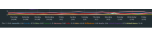
- I agree.
2 more wishes:
- I find it hard to read the data in one line:
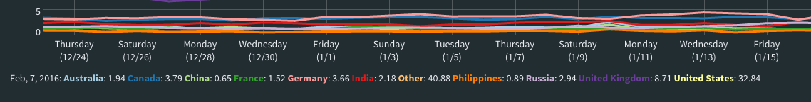
I'd prefer to see the data in a table, like http://reportcard.wmflabs.org/
- Can we allow toggling series on the graph?
Could be good to filter out the US to zoom into the other countries.
Comment Actions
We discussed this in the Analysis meeting. Our understanding is that the primary issue here is that the top 10 countries are hard-coded. This was a temporary solution that was implemented to get this graph out of the door because we were having visualisation issues. It's correct that that isn't helpful in the long run.
Based on the above, we agreed to repurpose this task to be a spike to explore ways of making the list more dynamic rather than hard-coded. Let me know if this doesn't sound right, or sounds like we've misunderstood.
Comment Actions
Sounds good. Feel free to keep me in the loop when you start to "explore ways of making the list more dynamic rather than hard-coded".
Looking forward.
Comment Actions
Moving this to the Portal Backlog board for now, until Discovery-Analysis can triage it.
Comment Actions
We met as a team to discuss how to move forward with this ticket. The following is the notes taken during this meeting, documented here so as to not lose good information and ideas.
This ticket is complete - as a spike - and the work will be done in this ticket.
Portal Dashboard Top-10 countries
2016-06-17Deb, Mikhail, Jan, Kevin
https://phabricator.wikimedia.org/T126564
http://discovery.wmflabs.org/portal/#country_breakdownM: This was done this way originally to get the dashboards up quickly. MVP.
M: If countries came in and out, they might show up as dots or short lines, and other countries might have lines with gaps.
M: If we decided to have a finer breakdown by country, it would probably have to be a rolling window of the last 30 days.
D: I think I would be fine with 30 days. It would be interesting, but I wonder if it would be better to have something where there would be a table--wouldn't have to be graphical. At any point in time, you could pick a country and see its traffic and trends.
J: What do we want to learn with this data? How would looking at a country help us? I remember in a report, there were countries with high and low clickthrough rates. That seems interesting, but how would this information be used?
D: Maybe there's a country with 10,000 articles, and portal traffic has 5%, or none. Comparing articles to visitors would be interesting. For example, are Russians using enwiki or ruwiki? It's good data to know. With the reading team and new readers, if they give presentations and talk to people in specific countries, do we see a bump in traffic as a result? This is only showing the wp portal, so not a complete picture.
J: I see some value in that. The correlation between country and project language might also help us understand if they are setting their browser to their preferred language. Might help us measure the value of the translation stuff we're doing. Help measure whether translating the top-10 links helped bring traffic in those languages.
D: This wasn't meant to be a huge thing. Can we just have a simple table for the last 30 days for these countries. Advertise it out to see if others find it interesting or useful. I know there are other dashboards out there that give broader strokes of visitors from different countries. But this would be specific for us.
J: At only 30 days, we won't be able to go back and see results from features delivered in the past.
D: Right, but let's start small. It will help us moving forward.
M: I could change it to not completely throw away the old summary data, but each month take an average for that month and store it. So for past months we would have an average, and we would have 30 days of daily averages.
D: That would be helpful for looking at year-over-year. Averages would be enough. We don't need daily details far in the past.
K: How easy or hard would it be to put up a table?
M: Easy. But I'm worried about the performance of the dashboard, after doing ZRR by project/language pairs. That had a performance impact. Would you be OK setting up a totally separate dashboard to handle the finer country breakdown? I suspect adding it here might be slow to load on first load, because it would be a large data set to download, and then a lot of processing.
D: It could be a button that says "this will take a while", and only generate the data at that point.
M: We have an experimental dashboard. That's where I do the forecasting. It's separate, so doesn't take resources from the main dashboard. Maybe having this exist as a completely separate project, in that experimental space. Or maybe in production but separate.
D: That would work, as long as it's linked to it from production. That would be totally fine.
J: Another question: What per-country data would we want to show? Just page views? Click-through rates?
D: I want it all! :) Geo breakdown would be fine. Clicks would be fantastic, even if just for the top actions like search. Don't need browser breakdowns, dwell time. Doesn't have to be super-integrated.
M: I think I can make it for every country we have pageviews, landing events, and clickthroughs.
K: On the existing page, I would like to avoid the term "top 10", since it's not really the top 10.
D: It's a generic top 10, not exactly the top 10 at any moment. They are hard-coded, not dynamic. So we could find different wording.
D: So how difficult will this be to set up?
M: It's a moderately big project. Dashboard is made up of tabs. Adding a new tab, with new data set, is always moderately big. Write automated script to fetch data, process, write it out. Then taking that data and visualizing it. It would take a couple days of work.
D: Is this something our new analyst might work on?
M: This could be an interesting project to get a new analyst started on the dashboard.
D: Were you thinking the new analyst would work on the dashboard, so could do things like this?
K: I assume we want redundancy, where any analyst would be able to work on the dashboads.
M: This would be an appropriate project. I did a lot of dashboard work when I started.
D: It's cool work, but not urgent, not the focus of a ton of attention so lower pressure.
M: Would you be comfortable having this wait until we have hired a new analyst? I'm worried that if we wait, and at some point the portal gets de-emphasized, will it get dropped?
D: We'll keep working on the portal at some level. Even if we take a hiatus from major work, we'll get back to it. It's still important stuff. I think the dashboard can wait and be a side project for a new person. Maybe 25% of their time; good learning experience. I don't need it tomorrow, or next month. Have been thinking about it for a while. I think it would be good to do, not urgent, just expands our knowledge. Global south (or whatever it will be called) is important to the WMF, so this is a way that we can help track that.
M: Makes sense. I'm with you. Just thinking about what we might actually see in the results.
D: The results might look completely un-spectactular. But in the future if we focus on a country, at least we'll have some data.
K: So this seems feasible, non-urgent, worth doing, suitable for a new hire. We have a phab task for this already.
M: We will need to work out implementation details. Maybe I'll end up working on it.
D: I'll comment in the existing spike task. And I'll create a new task with more details, like that it can just be a table. Then that ticket can be used as the platform for implementation details, and a conversation about specific requirements.