When showing statistics to the current user we provide information about the current month and the total of translations. This is represented by both numbers and a graph.
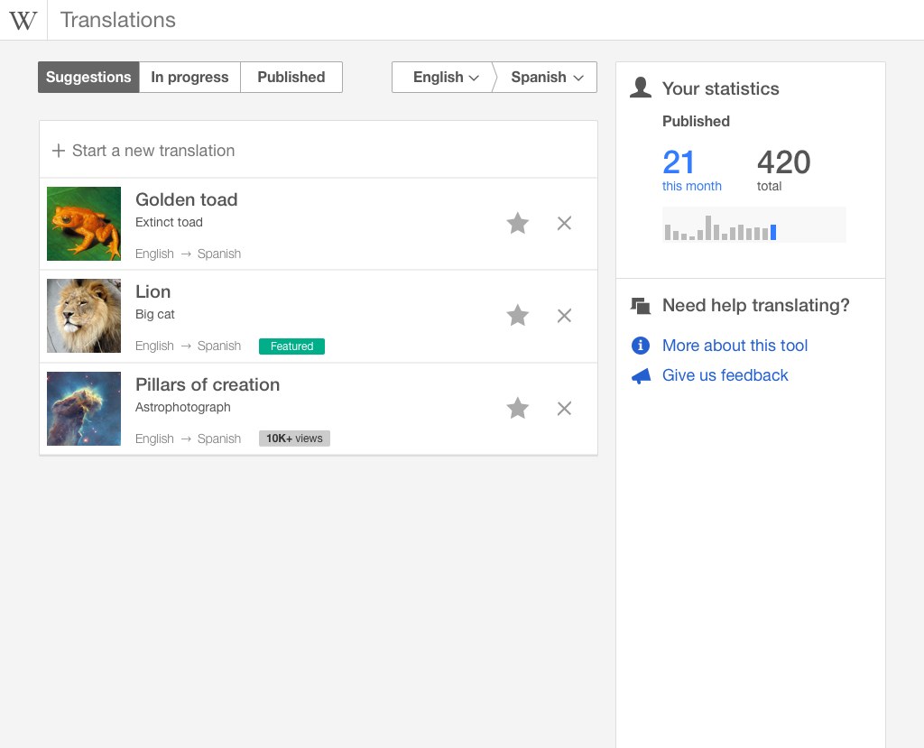
In the designs it was proposed to use different colours on both text and the graphs to highlight the current month info (in blue) with respect to the rest (in grey). that would help to easily understand the connection between the data and the visual representation of it.
this aspect was postponed from the initial implementation of T111776: Show basic user stats in the translation dashboard, as shown below: