Page MenuHomePhabricator

Adjust label layout inside cross-wiki notification bundles
Closed, ResolvedPublic

Description

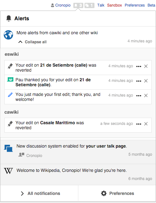
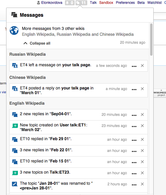
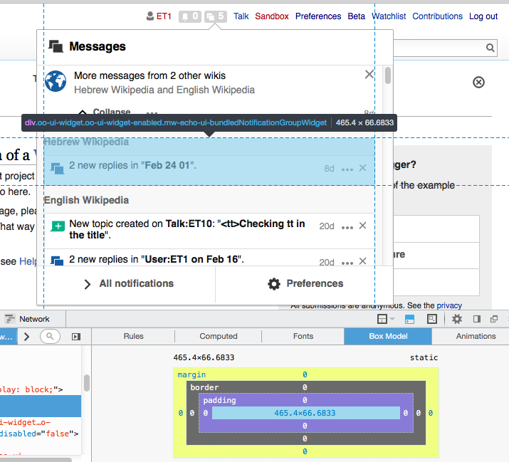
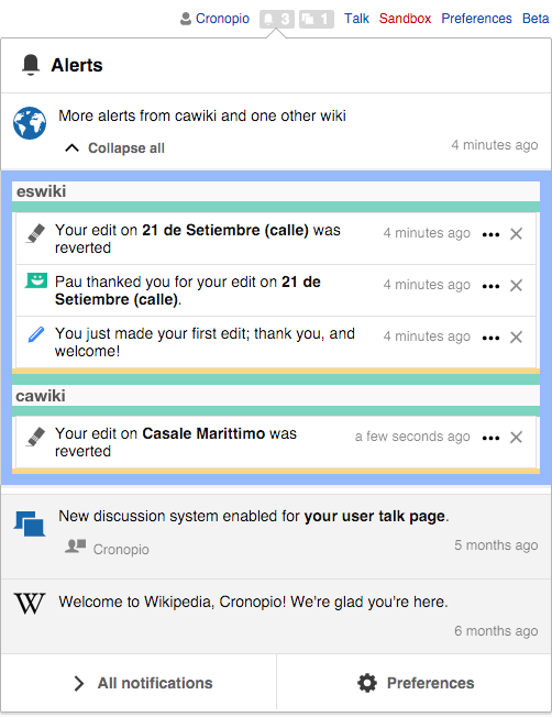
Currently, there is very little separation between the labels (e.g., "eswiki" in the example below) and the list of items below it:

cross-wiki-several.png (627×502 px, 77 KB)

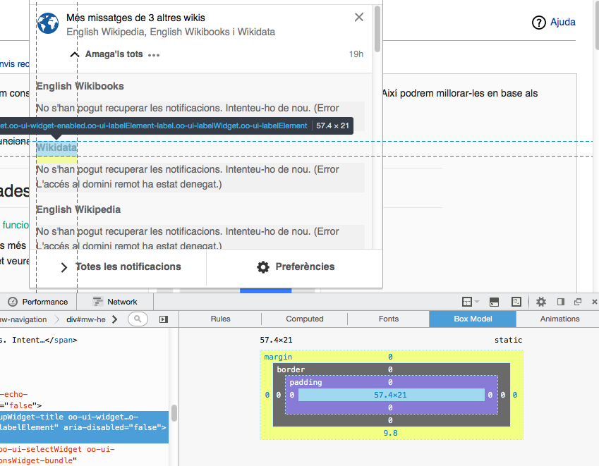
I' propose to make apply the following layout adjustments:

cross-wiki-labels-layout.png (652×502 px, 80 KB)

  • Keep a 10px distance around the cross-wiki items (in blue). Currently the distance is bigger than that.
  • Keep a 10px separation below labels (in green).
  • Keep a 10px separation between the blocks of information about different wikis. That is, above all labels except for the first (in green).
  • Keep an extra 5px separation (in yellow) at the end of each list of notification items.

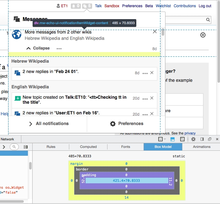
The final result is shown below:

cross-wiki-labels-layout-result.png (652×502 px, 79 KB)

Event Timeline

For the sake of consistency, and, more importantly, for the sake of Mobile (which might use different font size) I am using em's instead of pixels. Since the font size is 14px, that would make 10px = 0.7em.

@Pginer-WMF any strong reservations against this?

Change 273533 had a related patch set uploaded (by Mooeypoo):
Adjust group bundle stules

https://gerrit.wikimedia.org/r/273533

For the sake of consistency, and, more importantly, for the sake of Mobile (which might use different font size) I am using em's instead of pixels. Since the font size is 14px, that would make 10px = 0.7em.

@Pginer-WMF any strong reservations against this?

I'm ok with any unit to be used on implementation. Just some thoughts:

  • CSS pixels are density-independent which makes them not to be affected by the different pixel densities of mobile devices.
  • In terms of design, we may still need bigger margins as well as font-sizes on mobile, so it makes sense to connect those together. However, it seems that the notification content on mobile currently has a computed size of 14.4px (according to Chrome tools), which I'm not sure is going to make a big difference from the 14px font-size used on desktop. It seems also that for different viewport sizes on mobile, the margin sizes are different which makes it unclear whether a single value in Ems would fit all sizes.
  • Ems can result in inconsistent measurements when containment relationships enter into play.

Change 273533 merged by jenkins-bot:
Adjust group bundle styles

https://gerrit.wikimedia.org/r/273533

The space after wiki names has been increased (rather a little big?)

Screen Shot 2016-03-02 at 4.24.50 PM.png (665×565 px, 105 KB)

The space after wiki names has been increased (rather a little big?)

Screen Shot 2016-03-02 at 4.24.50 PM.png (665×565 px, 105 KB)

Yes, the spacing does not seem to meet the spec.
Using "Chinese Wikipedia" in your example, the space above it should be 15px (which is already), the space below it 10px (which is not). That would make the label to be coser to the elements it is labelling. Currently, 15px seems to be the distance used both above and below.
The spacing layout is summarises in the image below (green and blue are 10px distances and yellow is 5px):

cross-wiki-labels-layout.png (652×502 px, 80 KB)

Yes, the spacing does not seem to meet the spec.
Using "Chinese Wikipedia" in your example, the space above it should be 15px (which is already), the space below it 10px (which is not). That would make the label to be coser to the elements it is labelling. Currently, 15px seems to be the distance used both above and below.

What I see in master is 10px both above and below.

It turned out the code did try to accomplish this, but it did so by putting 10px of top margin on the header and 5px of bottom margin of the group above it. This was thought to add up to 15px, but with margin collapsing it doesn't. That's easy enough to fix by changing margin to padding; patch inbound.

Change 274853 had a related patch set uploaded (by Catrope):
Use padding instead of margin to separate cross-wiki sections from each other

https://gerrit.wikimedia.org/r/274853

Change 274853 merged by jenkins-bot:
Use padding instead of margin to separate cross-wiki sections from each other

https://gerrit.wikimedia.org/r/274853

Please re-check the layout according @Pginer-WMF comment( and the screenshot):

The spacing layout is summarized in the image below (green and blue are 10px distances and yellow is 5px)

@Etonkovidova and I looked at this, decided it is probably wrong, and returned it to me. But now I looked again, and I am fairly sure that's the way it is supposed to be.

This is super confusing, so I am hoping this settles things (sorry for the ping pong) here:

Right now, with this fix merged, we have the title distance: above is 15px, below is 10px - that seems to be what the ticket asks for.
The only place where we don't have 15px above the title (only 10px) is the FIRST notification item -- which is also according to the spec above.

Is this right, or is this again requiring change? I am not sure if we're talking about the same thing anymore.

@Pginer-WMF - if anything else needs to be done?

The first screenshot shows Box model for "oo-ui-widget oo-ui-widget-enabled mw-echo-ui-bundledNotificationGroupWidget" - padding=9.8px

Screen Shot 2016-03-09 at 11.09.37 AM.png (637×841 px, 130 KB)

The second screenshot shows "mw-echo-ui-bundledNotificationGroupWidget-title oo-ui-widget oo-ui-widget-enabled oo-ui-labelElement-label oo-ui-labelWidget oo-ui-labelElement" -- padding=9.8px

Screen Shot 2016-03-09 at 11.19.50 AM.png (661×849 px, 130 KB)

@Pginer-WMF - if anything else needs to be done?

there is a bit of distortion in the distances, and I think I found what is producing it.
The labels have a line height of 1.5em which adds some extra space (the distances were calculated for a default line height). Would it be possible to avoid that or deduct such extra space from the current padding/margin?

While looking at this, I also found T129469 which may be related.

@Mooeypoo, moving this back to Development. Are you able to address Pau's request?

Change 277693 had a related patch set uploaded (by Mooeypoo):
Adjust line-height of bundle group titles

https://gerrit.wikimedia.org/r/277693

@Pginer-WMF - if anything else needs to be done?

there is a bit of distortion in the distances, and I think I found what is producing it.
The labels have a line height of 1.5em which adds some extra space (the distances were calculated for a default line height). Would it be possible to avoid that or deduct such extra space from the current padding/margin?

Good catch, thank you! I made line height 1em.

I think that solves the issue now (with the pending commit) -- please approve once it's merged!

Change 277693 merged by jenkins-bot:
Adjust line-height of bundle group titles

https://gerrit.wikimedia.org/r/277693

Checked in betalabs -- for @Pginer-WMF to take the final look .
Showing the same type screenshots (after the fix) as in my comment.
The Box model for "oo-ui-widget oo-ui-widget-enabled mw-echo-ui-bundledNotificationGroupWidget"

Screen Shot 2016-03-22 at 1.33.40 PM.png (649×715 px, 124 KB)

The box model for "mw-echo-ui-bundledNotificationGroupWidget-title oo-ui-widget oo-ui-widget-enabled oo-ui-labelElement-label oo-ui-labelWidget oo-ui-labelElement"

Screen Shot 2016-03-22 at 1.28.14 PM.png (651×702 px, 117 KB)

Also, please take a look - the 14-space is ok after the Collapse label?

Screen Shot 2016-03-22 at 1.28.14 PM.png (651×702 px, 117 KB)

Just an overall view of foreign notifications.

Screen Shot 2016-03-22 at 1.28.58 PM.png (656×720 px, 121 KB)

I checked this in beta and it looks good. Labels are connected to the list they describe without making it look crowded as happened in the original screenshot at the ticket description.
Great work. Thanks!