Page MenuHomePhabricator

Adding/Editing references is confusing
Closed, ResolvedPublic

Assigned To
Authored By
Jan_Dittrich
Jun 14 2016, 8:24 AM
Referenced Files
F4249520: Screenshot_20160707_164713.png
Jul 7 2016, 2:47 PM
F4249477: references-addstatement.png
Jul 7 2016, 2:38 PM
F4249467: Screenshot_20160707_162656.png
Jul 7 2016, 2:28 PM
F4248635: Screenshot_20160707_124713.png
Jul 7 2016, 11:37 AM
F4248637: Screenshot_20160707_125936.png
Jul 7 2016, 11:37 AM
F4248636: Screenshot_20160707_125245.png
Jul 7 2016, 11:37 AM
F4248638: Screenshot_20160707_125424.png
Jul 7 2016, 11:37 AM
F4191432: blueBoxes.png
Jun 22 2016, 11:46 AM

Description

We try to make this bug more clear and easer to understand from a technical perspective too, currently it is mostly from user perspective. Please support us making this more clear.

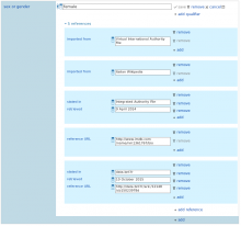
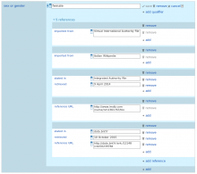
Screenshot from 2016-06-14 10-06-28.png (245×577 px, 25 KB)

When adding references there are several likely problems for users:

  • After the click on "add reference" the interface changes – a blue bar, two remove links, one input field and one add are added. Problem is, that is it hard to understand what they are for.
  • The blue bar below the toggler: I assume this is some sort of headline, signifying that all below is part of one reference. However, this is vague and may be interpreted differently.
  • There is no cancel button at the reference inputs. This may cause confusion if a user wants to discard changes that he/she did on the references. The save/cancel buttons of the statement work for everything in that statement, but this may not be clear for the user.
  • The first property's remove action in the list of references seems always to be inactive. This may be because the "remove" of the statement in general would have the same results, but this is something the user may not know (given that I guess right what is means)
  • Add: To add a property to a reference, there is only add, but not "add property" (see also: T137774)

Event Timeline

Jan_Dittrich moved this task from Incoming to Ready to go on the WMDE-Design board.

I'll create a prototype/mock for that.

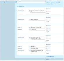
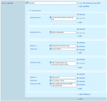
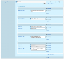
Three approaches to structuring the references more clearly

whiteBoxes.png (663×1 px, 79 KB)

blueBoxes.png (663×1 px, 80 KB)

whiteFrames.png (663×1 px, 79 KB)

I do like the changes in the 1st mock very much:

whiteBoxes.png (663×1 px, 79 KB)

There is no cancel.

There is a cancel button. Please be more specific what you are missing and what you expect.

The first property's remove action in the list of references seems always to be inactive.

I don't think there is anything wrong with the behavior of the remove buttons. You can not remove the last snak in a reference. When there are two or more, all remove buttons are enabled. Possible solution: Hide dysfunctional remove buttons instead of disabling them.

there is only add, but not "add property"

What you add is, technically, a "reference snak", so "add property" would be misleading and just cause other confusion. But I agree that "add" alone is problematic.

There is a cancel button. Please be more specific what you are missing and what you expect.

Tried to clarify the reference to lack of a cancel function: There is no cancel button at the reference inputs. This may cause confusion if a user wants to discard changes that he/she did on the references. The save/cancel buttons of the statement work for everything in the whole statement, but this may not be clear for the user.

Possible solution: Hide dysfunctional remove buttons instead of disabling them.

That would make sense, I assume.

There is no cancel button at the reference inputs.

I still do not get this. Having multiple cancel buttons with no save button seems odd. What would these cancel buttons do, in addition or in contrast to the cancel and remove buttons that are already there? Or do you suggest to rename "remove" to "cancel"?

The concern was/is that users may not know that the buttons on top of the property/value pair save the references, too. I tested with two people, one had the problem, the other not. However, we can postpone this until we have more definitive data.

Three approaches to structuring the references more clearly

blueBoxes.png (663×1 px, 80 KB)

I think mockup 2 helps make things more clear.

We made the changes in CSS so the question is whether one of them should be implemented.
@thiemowmde @Lydia_Pintscher @aude

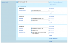
Screenshot_20160707_125424.png (778×827 px, 45 KB)

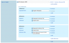
Screenshot_20160707_125936.png (781×824 px, 44 KB)

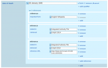
Screenshot_20160707_125245.png (773×824 px, 45 KB)

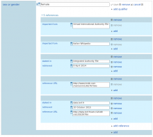
Screenshot_20160707_124713.png (779×834 px, 46 KB)

The first 3 don't work because the "reference" heading from the previous drafts is missing. In all 3 there are multiple "remove" buttons next to each other and it's hard to understand what the difference is.

What about changing number 4 a little bit. Instead of white borders use a white background for each reference, similar to number 2.

@thiemowmde: @Charlie_WMDE’s Mockups were created purely in CSS, thus the lack of the "Reference" headline .

How hard would it be to have "Reference" added in the HTML? I think it would make sense in contrast to the almost empty bar we have now.

some of my errors in adding references as qualifiers or other way I think happen after i add the main snak value, then the think below it is "+add qualifier"

If I am using tab, then after tabbing out of the main snak value input box, it takes me to "+add qualifier". In some cases, maybe this is what i want, but only sometimes.

Ideally, the user always provides a reference when adding a statement.

Though I see the point that qualifiers are grouped closely with with the statement, in the statementview

references-addstatement.png (216×962 px, 9 KB)

I am not sure which of the mockups is best...

Almost, just inverted. I meant number 2 …

Screenshot_20160707_125936.png (781×824 px, 44 KB)

… but with the dark headings.

I find that more confusing. I think it's good to change the color of the things you're editing and not just the background. Also the contrast between the remove and the data is very high now. Is that smth we want?

So after talking about it we've decided on this design:

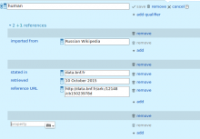
Screenshot_20160707_162656.png (743×828 px, 44 KB)

This does not mean, that the references don't need further redesigning. This is just a easy quick fix to improve the current design, before coming up with a better long-term solution.

If no one has any objections to this I suggest we make it happen \o/

Also we should remember that the primary sources tool also has to be adapted if we change the design, to make them match again.