Page MenuHomePhabricator

Don't group by region when the list of languages is small
Closed, ResolvedPublic

Description

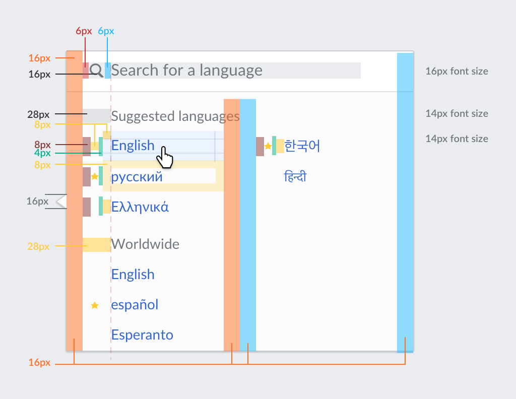
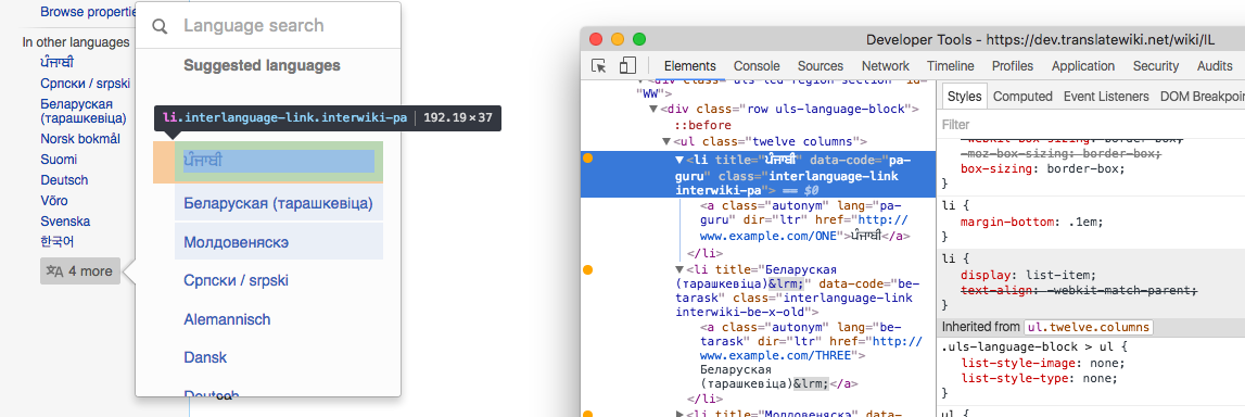
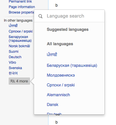
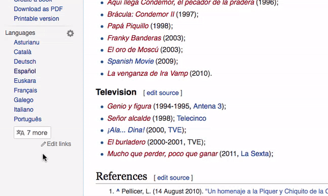
The language selector adapts according to the number of languages. For a big amount of languages, results are shown in 4 columns with a wide selector, but for a smaller number of languages, a much compact two column layout is used. The example below shows an article available in 16 languages:

short-list-looks-long-en.gif (383×640 px, 3 MB)

While grouping languages per region can be convenient for very long lists, when the list is short it may not be that useful since it adds fragmentation and duplication of some languages.

This ticket proposes to keep the grouping by region for long language lists but not do so for shorter lists. In this way, shorter lists will only include two groups: "Suggested languages" and "All languages". The same approach can be used when searching, since filtered lists after search are expected to be short.

Event Timeline

Some comments related to dealing with shorter lists may be relevant to this ticket:

I have to activate a popup just to see what the other languages are, and to choose one I have to "search" by continent (with most languages doubled; scrolling needed)

This comment was removed by Nikerabbit.

I created an animation capturing the issue. Here is an article available in 16 languages, when you open the list of languages the list looks much longer than that because of the duplication of languages on each region:

short-list-looks-long-en.gif (383×640 px, 3 MB)

Arrbee raised the priority of this task from Medium to High.Aug 17 2016, 7:21 AM

If the number of languages are small, does it really make sense to use the dialog box at all? Lets say the number of links are 15-20-25 -ish, wouldn't it be better to just show them all in the sidebar?

If the number of languages are small, does it really make sense to use the dialog box at all? Lets say the number of links are 15-20-25 -ish, wouldn't it be better to just show them all in the sidebar?

I think that the criteria defined for the initial list still applies.

Although many discussions are focused on the first-time use (and it is an important usecase), what really saves time for the user (or creates friction) is the regular repeated use.
In that context, the common languages for the user will be already available in the initial list, and having that list both short enough to check it at a glance (and noticing the access to the rest) and with just enough room to fit as many languages as users usually access seems a good balance.

Change 307504 had a related patch set uploaded (by Nikerabbit):
Update jquery.uls

https://gerrit.wikimedia.org/r/307504

@Pginer-WMF, Please check the below screenshot as per the above patch(https://gerrit.wikimedia.org/r/307504) and review. It adds "All languages" title.

pasted_file (432×530 px, 43 KB)

@Pginer-WMF, Please check the below screenshot as per the above patch(https://gerrit.wikimedia.org/r/307504) and review. It adds "All languages" title.

pasted_file (432×530 px, 43 KB)

the label looks good to me. The separation between the languages seems a bit bigger than intended (maybe extra line-height/padding/marging is being added). I added the reference for spacing below, but we can tweak this once is live:

lang-select-metrics.png (792×1 px, 82 KB)

The spacing looks according to spec to me in https://dev.translatewiki.net/wiki/IL – 8px padding + 14px font size (which results in 34-36px total depending on the actual height of the script, because no explicit line-height).

Santhosh: can you confirm this is the same for you, and if not, can you check which style is adding more?

@Nikerabbit, thanks for link to a living example.
Between the language items there is a small separation while there should be none.

In the screenshot below I forced the hover status in some elements to illustrate the white space between them to be removed. I also inspected the first element, and the 0.1em bottom-margin that the "li" element adds seems to be the cause.

Screen Shot 2016-09-02 at 10.12.19.png (384×1 px, 158 KB)

As a related note based on the above example. If there are no "suggested languages" to show, we should not be showing any section title (neither "suggested" or "all languages") and just list the languages since there won't be groups that need separation.

@Nikerabbit, thanks for link to a living example.
Between the language items there is a small separation while there should be none.

Nice catch. I added overrides for the skin styles to the ULS extension – gerrit patch updated.

As a related note based on the above example. If there are no "suggested languages" to show, we should not be showing any section title (neither "suggested" or "all languages") and just list the languages since there won't be groups that need separation.

This is the case. I tested this manually by not providing suggested languages, as I am not aware where this would occur naturally.

This is the case. I tested this manually by not providing suggested languages, as I am not aware where this would occur naturally.

I see an empty "Suggested languages" section in your example:

Screen Shot 2016-09-02 at 11.09.57.png (434×402 px, 48 KB)

Maybe it's due to a different issue. In any case, as you suggested, it is an edge case. It is unlikely to happen in practice given the number of different criteria we considered here, but we need to consider that it is possible that some Wikipedia articles are not available in any of the languages we considered as suggestions for a given user.

The spacing looks according to spec to me in https://dev.translatewiki.net/wiki/IL – 8px padding + 14px font size (which results in 34-36px total depending on the actual height of the script, because no explicit line-height).

Santhosh: can you confirm this is the same for you, and if not, can you check which style is adding more?

This is what I get for <li> tags for Russian language. That is 22+8+8=38px

pasted_file (172×238 px, 6 KB)

If I give an explicit line height, 1em, I get 18+8+8=34px;

That is Chrome. But in FF, without any modification, I get 18+8+8=34px

pasted_file (313×452 px, 27 KB)

Change 307504 merged by jenkins-bot:
Update jquery.uls to a9dc11b

https://gerrit.wikimedia.org/r/307504

Change 308950 had a related patch set uploaded (by Amire80):
Update jquery.uls from upstream

https://gerrit.wikimedia.org/r/308950

Change 308950 merged by jenkins-bot:
Update jquery.uls from upstream

https://gerrit.wikimedia.org/r/308950

Change 309308 had a related patch set uploaded (by KartikMistry):
Update jquery.uls from upstream

https://gerrit.wikimedia.org/r/309308

Change 309308 merged by jenkins-bot:
Update jquery.uls from upstream

https://gerrit.wikimedia.org/r/309308

Amire80 claimed this task.