Page MenuHomePhabricator

ULS basic visual design issues
Closed, ResolvedPublic

Description

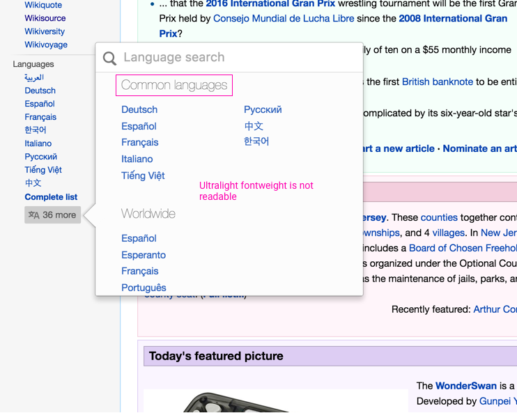
This is the list of basic alignment and polish issues with visual design of ULS

This is a Design's blocker for releasing ULS on wikipedia. Releasing something on English Wikipedia will require polished interface based on the number of people who come in contact with this. This will impact perception of how the tool works or how much work has gone behind building it.

It also needs to follow some of the styleguide principles we have.

Here's a list

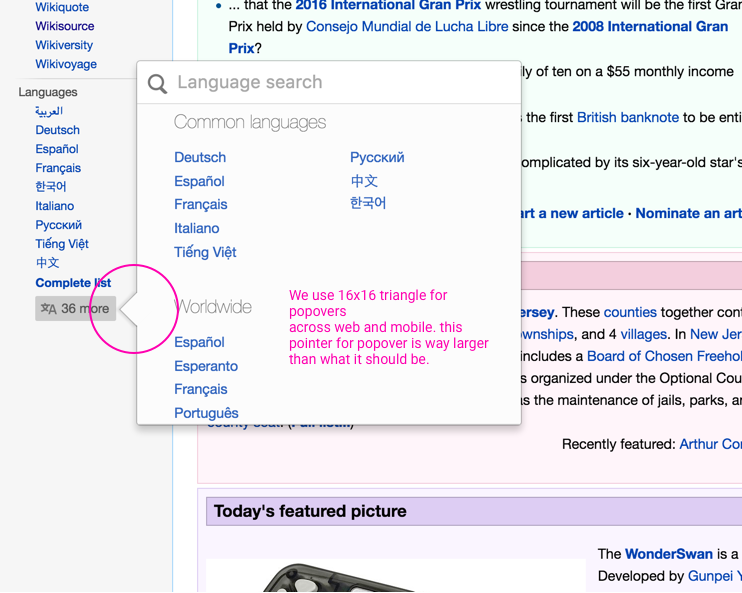
  1. Popover triangle pointer

Artboard 1.png (593×742 px, 201 KB)

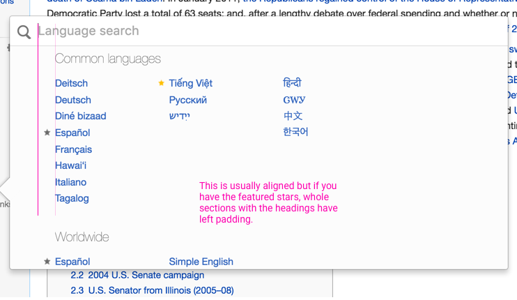
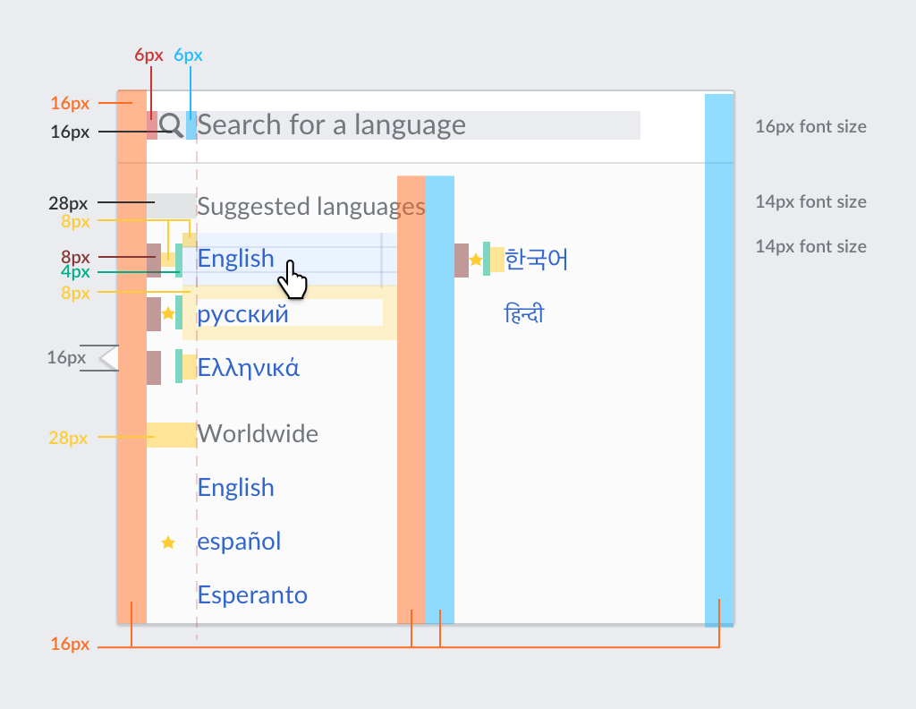
  1. search box alignments

Artboard 1 Copy.png (593×742 px, 197 KB)

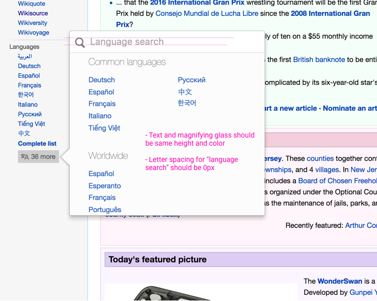
2.1 Note: also the string for placeholder in the searchbox should be "Search for a language" than "Language search"
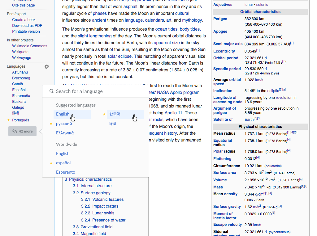
  1. hover for links

Artboard 1 Copy 3.png (593×742 px, 202 KB)

  1. section headers

Artboard 1 Copy 2.png (593×742 px, 190 KB)

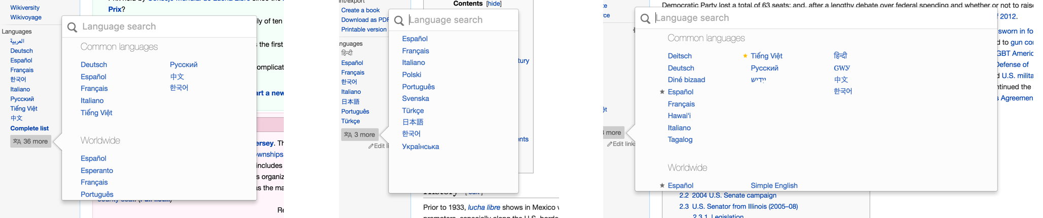
  1. width of the popover

Width of popover changes based on the number of language available creating inconsistency in the same workflow a user has on multiple articles.

Artboard 1 Copy 4.png (430×2 px, 244 KB)

  1. left alignment off with featured articles

Artboard 1 Copy 5.png (430×742 px, 90 KB)

Event Timeline

Hi @Nirzar. Please associate at least one project with this task to allow others to find this task when searching in the corresponding project(s). Thanks.

I tried to illustrate the proposed changes:

lang-select-adjusted.png (764×1 px, 320 KB)

I used the following layout guidelines:

lang-select-metrics.png (792×1 px, 82 KB)

There are a couple of adjustments proposed by @Nirzar that are not completely clear to me:

  • Search bar letter spacing. This seems a strange behaviour of the browser. The search input placeholder text has no special style applied and its letters pacing is computed to 0 already. It's not clear to me why the browser is adding some extra space there.
  • Adapting the width to the number of languages Given that the available languages can vary from tenths to hundreds, I think it's worth it to use additional horizontal space when needed. Maybe we can just use two sizes instead of two. But given the extra room we have on desktop, I think we can take advantage of it when it's useful.

Search bar letter spacing. This seems a strange behaviour of the browser. The search input placeholder text has no special style applied and its letters pacing is computed to 0 already. It's not clear to me why the browser is adding some extra space there.

lets ignore it for now.

Adapting the width to the number of languages

sure, we can just increase one more column if the number of languages > 100 and that could only be the rule?

Change 298415 had a related patch set uploaded (by Santhosh):
Compact language links: Use smaller callout arrow

https://gerrit.wikimedia.org/r/298415

sure, we can just increase one more column if the number of languages > 100 and that could only be the rule?

Makes sense. T137870: Don't group by region when the list of languages is small is also related.

@santhosh is there any way i can see your patch? on a test environment

Change 298415 merged by jenkins-bot:
Compact language links: Use smaller callout arrow

https://gerrit.wikimedia.org/r/298415

My attempt to follow the mock of @Pginer-WMF is at https://dev.translatewiki.net/w/extensions/UniversalLanguageSelector/vendor/jquery.uls/examples/decorator.html (you have to ignore the ssl warning)

Screenshot:

pasted_file (365×718 px, 21 KB)

CSS does not allow me to position the list bullets, so they are where they are. Only way to get around that would be to use background-images, but that would need changes in the badge code not developed by us. One obvious downside is that due to increased whitespace, there is less space for text and many more language names get truncated. Possibly, in relation to the varying width question, it would make sense to consider having less columns or change the column width.

@Nikerabbit looking good :)

why do we have bullets? they also seem on random items?

as far as the width the goes, you are right, reducing columns and giving more space to each item is the way to go. I will let Pau give the spec for how many columns should be there.

Re bullets: they are an approximation for testing the badge icons. The badge styles are only defined as list-style-image so I am trying to accommodate for that.

@santhosh is there any way i can see your patch? on a test environment

Available in production now. Screenshot below

pasted_file (408×207 px, 22 KB)

This looks good.

I agree we can try to reduce the number of columns. Given that we have a compact mode already with 2 columns, we can try to unify to that for both short and long lists. Would it be possible to update the example using the compact 2-column mode?

We can later also consider to use a 1 column layout for short lists (keeping 2 columns for long ones), but for that we may want to have T137870 solved first since grouping of short lists produce fragmentation and repetition that may affect how those lists are perceived.

Great. It seems that the one-column version already skips the region grouping (although it is missing an "All languages" label to separate the full list from the common/suggested languages). I think it is worth using for short lists of languages.

For the modes with several columns, we also need to adjust the vertical separation between blocks (which I think corresponds to the CSS rule ".grid .uls-language-block > ul"): the current bottom margin is 10px and it should become 20px to represent an empty line now that language elements have more spacing.

I increased the margin to 20px. Normally suggested languages is not visible with the narrow mode, so I don't think the missing header issue actually occurs in the practice.

Is there anything else to do style-wise?

I gather you would like us to also change the algorithm for choosing the number of columns. If so, do you have suggestions how it could work? Would it be compact language links specific or apply to all language selections?

I increased the margin to 20px. Normally suggested languages is not visible with the narrow mode, so I don't think the missing header issue actually occurs in the practice.

I was thinking about it in the context of T137870, where we want to keep them. But we can discuss that as part of that ticket.

Is there anything else to do style-wise?

I don't think so.

I gather you would like us to also change the algorithm for choosing the number of columns. If so, do you have suggestions how it could work? Would it be compact language links specific or apply to all language selections?

I think the adjustment should be general for all language selections, since the list of languages is presented for the same purpose (browse when not interested in using search).

For the specific numbers I'd propose to use the one-column version for 0-25 languages, and the 2-column version for lists with more than 25 languages.

We can probably better evaluate it when we can check it in practice with different examples, but articles available in less than ~25 languages is what I found to look too disperse in the current selector.

Just for reference, the current settings are narrow < 12, medium 13-100 and wide 100+. If I make that < 25, 400, 400+ it should work as you described for all practical purposes with minimal code changes.

Just for reference, the current settings are narrow < 12, medium 13-100 and wide 100+. If I make that < 25, 400, 400+ it should work as you described for all practical purposes with minimal code changes.

Agree with the 12 to 25 change for narrow. But the 400+ wide is doubtful. In a default MW installation or wikis, that makes the ULS always in medium(two column) layout since languages are usually < 280 or so. That many languages in two column looks very crowded and lot to scroll to me. In my local MW installation, under Europe, there are 13 sections, each containing two columns with 8 languages each. So to see the languages under Europe, I had to scroll 13 times the height of ULS medium window. Asia had 10 sections.

Just for reference, the current settings are narrow < 12, medium 13-100 and wide 100+. If I make that < 25, 400, 400+ it should work as you described for all practical purposes with minimal code changes.

Agree with the 12 to 25 change for narrow. But the 400+ wide is doubtful.

The intention was to reduce the number of variants of the selector so that is appears more consistently to users from article to article (trying to evaluate if 2 sizes would be enough). While the 4 column layout may be easier to scan, for articles in lots of languages users are probably expected to use search.

Having said that, I'm ok with adjusting the limit for the 4-column layout to ~200, that while is still high enough to not affect many articles (providing a consistent size in most case), it is still available for us to check how it works in practice.

FYI: https://en.wikipedia.org/wiki/Special:MostInterwikis – 300 would cover all compact links pages, 250 would cover all but few and 200 would cover all but ~200 pages.

FYI: https://en.wikipedia.org/wiki/Special:MostInterwikis – 300 would cover all compact links pages, 250 would cover all but few and 200 would cover all but ~200 pages.

Thanks Niklas, this is really useful. It seems that a 100 language limit would cover ~5000 articles, and 150 languages would cover ~1500 articles.

Whichever limit we choose in that range is not going to affect a huge number of articles. However we may want to consider also that:

  • Setting the threshold anywhere below 300 will also cover the cases where the selector is used to chose among all possible languages (e.g., in Content Translation).
  • When thinking on the number of pages available in X number of languages, we may also want to consider their exposition to users. Not only because those are available in more wikis but because these tend to be about topics frequently visited globally. I made a quick experiment with some articles about countries from the top of the language list, and a couple of random articles available in fewer languages.

Thanks for the additional analysis of the data, @Nemo_bis.

I think that numbers indicate that in the range we are considering for the 4-column version (100-200), it won't be exposed too frequently to users to be perceived as inconsistent. It seems an occasional change to adequate to the few cases of exceptionally long articles.

Considering the above, I think we can keep the limit at 100 languages, and keep moving forward with the rest of the changes.

Change 307504 had a related patch set uploaded (by Nikerabbit):
Update jquery.uls

https://gerrit.wikimedia.org/r/307504

Change 307504 merged by jenkins-bot:
Update jquery.uls to a9dc11b

https://gerrit.wikimedia.org/r/307504

Change 308950 had a related patch set uploaded (by Amire80):
Update jquery.uls from upstream

https://gerrit.wikimedia.org/r/308950

Change 308950 merged by jenkins-bot:
Update jquery.uls from upstream

https://gerrit.wikimedia.org/r/308950

Change 309308 had a related patch set uploaded (by KartikMistry):
Update jquery.uls from upstream

https://gerrit.wikimedia.org/r/309308

Change 309308 merged by jenkins-bot:
Update jquery.uls from upstream

https://gerrit.wikimedia.org/r/309308

Amire80 subscribed.

I just verified all the points with the whole team in our sprint closing, and I can see that all the points from the original description are done.

I'm closing this as resolved. Thanks a lot.

Missed the L10n change suggestion about "Search for a language"!

Fixed in https://github.com/wikimedia/jquery.uls/pull/239 .

Change 310236 had a related patch set uploaded (by Amire80):
Change "Language search" to "Search for a language"

https://gerrit.wikimedia.org/r/310236

Change 310236 merged by jenkins-bot:
Change "Language search" to "Search for a language"

https://gerrit.wikimedia.org/r/310236

Amire80 moved this task from In Review to Done on the Language-Q1-2016-17 Sprint 5 board.
Amire80 updated the task description. (Show Details)
Amire80 removed a project: Patch-For-Review.